这篇博客主要是总结一下最近进行的matplotlib可视化实验,内容主要来自于官方文档的实例。
(1)首先最简单的——圆形散点图:
import matplotlib.pyplot as plt
import numpy as np
#绘制一个圆形散点图
t = np.arange(1, 10, 0.05)
x = np.sin(t)
y = np.cos(t)
#定义一个图像窗口
plt.figure(figsize=(8,5))
#绘制一条线
plt.plot(x, y, "r-*")
#使得坐标轴相等
plt.axis("equal")
plt.xlabel("sin")
plt.ylabel("cos")
plt.title("circle")
#显示图形
plt.show()

(2)点图与线图——并且用subplot()绘制多个子图:
"""Matplotlib绘图之点图与线图
并且使用subplot()绘制多个子图
"""
import numpy as np
import matplotlib.pyplot as plt
#生成x
x1 = np.linspace(0.0, 5.0)
x2 = np.linspace(0.0, 2.0)
#生成y
y1 = np.cos(2*np.pi*x1) * np.exp(-x1)
y2 = np.cos(2*np.pi*x2)
#绘制第一个子图
plt.subplot(2, 1, 1)
plt.plot(x1, y1, 'yo-')
plt.title('A tale of 2 subplots')
plt.ylabel('Damped oscillation')
#绘制第二个子图
plt.subplot(2,1,2)
plt.plot(x2, y2, 'r.-')
plt.xlabel('time (s)')
plt.ylabel('Undamped')
plt.show() 
(3)直方图:
"""绘制直方图"""
import numpy as np
import matplotlib.mlab as mlab
import matplotlib.pyplot as plt

#样例数据
mu = 100
sigma = 15
x = mu + sigma * np.random.randn(10000)
print("x:", x.shape)
#直方图的条数
num_bins = 50
#绘制直方图
n, bins, patches = plt.hist(x, num_bins, normed=1, facecolor='green', alpha=0.5)
#添加一个最佳拟合曲线
y = mlab.normpdf(bins, mu, sigma)#返回关于数据的pdf值——概率密度函数
plt.plot(bins, y, 'r--')
plt.xlabel('Smarts')
plt.ylabel('Probability')
#在图中添加公式需要使用LaTeX的语法
plt.title('Histogram of IQ: $\mu=100$, $\sigma=15$')
#调整图像的间距,防止y轴数值与label重合
plt.subplots_adjust(left=0.15)
plt.show()
(4)绘制三维图像:
import numpy as np
import matplotlib.pyplot as plt
from mpl_toolkits.mplot3d import Axes3D
from matplotlib import cm

n_angles = 36
n_radii = 8
# An array of radii
# Does not include radius r=0, this is to eliminate duplicate points
radii = np.linspace(0.125, 1.0, n_radii)
# An array of angles
angles = np.linspace(0, 2 * np.pi, n_angles, endpoint=False)
# Repeat all angles for each radius
angles = np.repeat(angles[..., np.newaxis], n_radii, axis=1)
# Convert polar (radii, angles) coords to cartesian (x, y) coords
# (0, 0) is added here. There are no duplicate points in the (x, y) plane
x = np.append(0, (radii * np.cos(angles)).flatten())
y = np.append(0, (radii * np.sin(angles)).flatten())
# Pringle surface
z = np.sin(-x * y)
fig = plt.figure()
ax = fig.gca(projection='3d')
ax.plot_trisurf(x, y, z, cmap=cm.jet, linewidth=0.2)
plt.show()

(5) 三维曲面图以及各个轴的投影等高线:
"""三维曲面图
三维图像and各个轴的投影等高线"""
from mpl_toolkits.mplot3d import axes3d
import matplotlib.pyplot as plt
from matplotlib import cm

fig = plt.figure(figsize=(8, 6))
ax = fig.gca(projection='3d')
#生成三维测试数据
X, Y, Z = axes3d.get_test_data(0.05)
ax.plot_surface(X, Y, Z, rstride=8, cstride=8, alpha=0.3)
cset = ax.contour(X, Y, Z, zdir='z',offset=-100, cmap=cm.coolwarm)
cset = ax.contour(X, Y, Z, zdir='x',offset=-40, cmap=cm.coolwarm)
cset = ax.contour(X, Y, Z, zdir='y',offset=40, cmap=cm.coolwarm)
ax.set_xlabel('X')
ax.set_xlim(-40, 40)
ax.set_ylabel('Y')
ax.set_ylim(-40, 40)
ax.set_zlabel('Z')
ax.set_zlim(-100, 100)
plt.show()

(6)条形图:
"""条形图"""
import numpy as np
import matplotlib.pyplot as plt
#生成数据
n_groups = 5#组数
#平均分和标准差
means_men = (20, 35, 30, 35, 27)
std_men = (2, 3, 4, 1, 2)

means_women = (25, 32,34,20,25)
std_women = (3, 5, 2, 3, 3)

#条形图
fig, ax = plt.subplots()

index = np.arange(n_groups)
bar_width = 0.35#条形图宽度

opacity = 0.4
error_config = {'ecolor': '0.3'}
#条形图的第一类条
rects1 = plt.bar(index, means_men, bar_width,
                 alpha=opacity,
                 color='b',
                 yerr=std_men,
                 error_kw=error_config,
                 label='Men')
#条形图中的第二类条
rects2 = plt.bar(index + bar_width,
                 means_women,
                 bar_width,
                 alpha=opacity,
                 color='r',
                 yerr=std_women,
                 error_kw=error_config,
                 label='Women')
plt.xlabel('Group')
plt.ylabel('Scores')
plt.title('Scores by group and gender')
plt.xticks(index + bar_width, ('A', 'B', 'C', 'D', 'E'))
plt.legend()
#自动调整subplot的参数指定的填充区
plt.tight_layout()
plt.show()
(7)饼图:
"""绘制饼图"""
import matplotlib.pyplot as plt
#切片将按照顺时针方向排列并绘制
labels = 'Frogs', 'Hogs', 'Dogs', 'Logs'#标注
sizes = [15,30,45,10]
colors = ['yellowgreen', 'gold', 'lightskyblue', 'lightcoral']#颜色
explode = (0, 0.1, 0, 0)#这里的0.1是指第二个块从圆里面分割出来
plt.pie(sizes,
        explode=explode,
        labels=labels,
        colors=colors,
        autopct='%1.1f%%',
        shadow=True,
        startangle=90)
plt.axis('equal')
plt.show()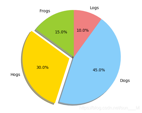
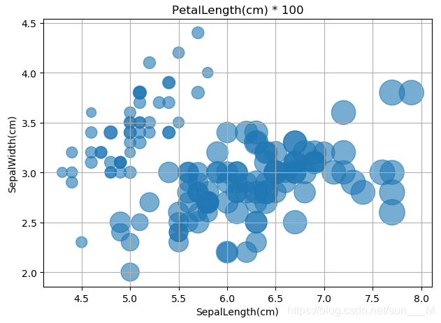
(8)气泡图:
"""气泡图"""
import matplotlib.pyplot as plt
import pandas as pd

#导入数据
df_data = pd.read_csv('https://raw.github.com/pydata/pandas/master/pandas/tests/data/iris.csv')
df_data.head()
#作图
fig, ax = plt.subplots()
#可以自行设置气泡颜色
# colors = ['#99cc01'......]
#创建气泡图SepalLength为x,SepalWidth为y,设置PetalLength为气泡大小
ax.scatter(df_data['SepalLength'],
           df_data['SepalWidth'],
           s=df_data['PetalLength'] * 100,
           alpha=0.6)
ax.set_xlabel('SepalLength(cm)')
ax.set_ylabel('SepalWidth(cm)')
ax.set_title('PetalLength(cm) * 100')

#显示网格
ax.grid(True)

fig.tight_layout()
plt.show()