七夕给我亲爱的一个惊喜,哈哈哈,作为程序员,上班偷偷摸摸地。这里感谢旋之华老师在vue教程中教的es6知识,
很有用,以及https://www.cnblogs.com/sunshine21/p/7757958.html#4044684的博客分享。
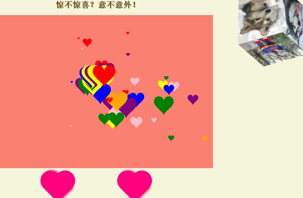
附上代码:
  1 <!DOCTYPE html>
  2 <html lang="en">
  3
  4 <head>
  5     <meta charset="UTF-8">
  6     <title>给我亲爱的</title>
  7     <script src="js/underScore.min.js"></script>
  8 </head>
  9
 10 <body>
 11     <h1>惊不惊喜?意不意外!</h1>
 12     <div class="ourstime">
 13         <img class="opic pic1" src="images/ot1.jpg">
 14         <img class="opic pic2" src="images/ot2.jpg">
 15         <img class="opic pic3" src="images/ot3.jpg">
 16         <img class="opic pic4" src="images/ot4.jpg">
 17     </div>
 18     <canvas></canvas>
 19     <div class="dir">
 20         <div class="heart"></div>
 21         <span>给你的七夕惊喜<br>
 22         最爱的就是你</span>
 23         <div class="heart"></div>
 24     </div>
 25     <!-- 外层最大容器 -->
 26     <div class="wrap">
 27         <!--包裹所有元素的容器-->
 28         <div class="cube">
 29             <!--前面图片 -->
 30             <div class="out_front">
 31                 <img src="images/h1.jpg" class="pic">
 32             </div>
 33             <!--后面图片 -->
 34             <div class="out_back">
 35                 <img src="images/h2.jpg" class="pic">
 36             </div>
 37             <!--左面图片 -->
 38             <div class="out_left">
 39                 <img src="images/h3.jpg" class="pic">
 40             </div>
 41             <!--右面图片 -->
 42             <div class="out_right">
 43                 <img src="images/h4.jpg" class="pic">
 44             </div>
 45             <!--上面图片 -->
 46             <div class="out_top">
 47                 <img src="images/h5.jpg" class="pic">
 48             </div>
 49             <!--下面图片 -->
 50             <div class="out_bottom">
 51                 <img src="images/h6.jpg" class="pic">
 52             </div>
 53
 54             <!--小正方体 -->
 55             <span class="in_front">
 56                 <img src="images/h7.jpg" class="in_pic">
 57             </span>
 58             <span class="in_back">
 59                 <img src="images/h8.jpg" class="in_pic">
 60             </span>
 61             <span class="in_left">
 62                 <img src="images/h9.jpg" class="in_pic">
 63             </span>
 64             <span class="in_right">
 65                 <img src="images/h10.jpg" class="in_pic">
 66             </span>
 67             <span class="in_top">
 68                 <img src="images/h11.jpg" class="in_pic">
 69             </span>
 70             <span class="in_bottom">
 71                 <img src="images/h12.jpg" class="in_pic">
 72             </span>
 73         </div>
 74
 75     </div>
 76     <script>
 77         var canvas = document.querySelector('canvas');
 78         var ctx = canvas.getContext('2d');
 79         canvas.width = 900;
 80         canvas.height = 600;
 81         canvas.style.backgroundColor = 'salmon';
 82
 83
 84
 85         class Heart {
 86             /**
 87              * 构造器
 88              */
 89             constructor(x, y, a, color) {
 90                 this.x = x;
 91                 this.y = y;
 92                 this.a = 3;
 93                 this.color = color;
 94             }
 95
 96             /**
 97              * 绘制心
 98              */
 99             draw() {
100                 ctx.save();
101                 ctx.beginPath();
102                 ctx.translate(-1000, this.y);
103                 this.vertices = [];
104                 for (let i = 0; i < 30; i++) {
105                     var step = i / 30 * (Math.PI * 2);
106                     var vector = {
107                         x: this.a * (15 * Math.pow(Math.sin(step), 3)),
108                         y: this.a * (-(13 * Math.cos(step) - 5 * Math.cos(2 * step) - 2 * Math.cos(3 * step) -
109                             Math.cos(4 *
110                                 step)))
111                     }
112                     ctx.lineTo(vector.x, vector.y);
113                     this.vertices.push(vector);
114                 }
115                 ctx.shadowColor = this.color;
116                 ctx.shadowOffsetX = this.x + 1000;
117                 ctx.fill();
118                 ctx.restore();
119             }
120
121         }
122
123         // 会移动的心
124         class MoveHeart extends Heart {
125             constructor(x, y, a, color) {
126                 super(x, y, a, color);
127
128                 // 量的变化
129                 this.dX = _.random(-5, 5);
130                 this.dY = _.random(-5, 5);
131                 this.dA = _.random(0.1, 2.5);
132             }
133
134             upDate() {
135                 this.x += this.dX;
136                 this.y += this.dY;
137                 this.a -= this.dA;
138                 if (this.a < 0) {
139                     this.a = 0;
140                 }
141             }
142
143         }
144
145         // 实例化心
146         let colorArr = ['red', 'green', 'blue', 'yellow', 'purple', 'pink', 'orange'];
147         let HeartArr = [];
148
149         // 监听鼠标的移动
150         canvas.addEventListener('mousemove', function (e) {
151             HeartArr.push(new MoveHeart(e.offsetX, e.offsetY, 2.5, colorArr[_.random(0, colorArr.length - 1)]));
152         });
153
154         // 开启定时器
155         setInterval(function () {
156             // 清屏
157             ctx.clearRect(0, 0, canvas.width, canvas.height);
158             // 绘制
159             for (let i = 0; i < HeartArr.length; i++) {
160                 HeartArr[i].draw();
161                 HeartArr[i].upDate();
162             }
163         }, 50);
164     </script>
165 </body>
166 <style>
167     body {
168         text-align: center;
169         background-color: beige;
170     }
171
172     h1 {
173         color: #444642;
174         text-shadow: 2px 2px 0 darkgoldenrod;
175     }
176
177     .ourstime {
178         left: 20px;
179         position: absolute;
180         ;
181     }
182
183     .ourstime img {
184         padding: 10px 10px 15px;
185         background: white;
186         border: 1px solid #ddd;
187         box-shadow: 2px 2px 3px rgba(50, 50, 50, 0.4);
188         -webkit-transition: all 0.5s ease-in;
189         -moz-transition: all 0.5s ease-in;
190         transition: all 0.5s ease-in;
191         position: absolute;
192         z-index: 1;
193     }
194
195     opic{
196         height: 200px;
197     }
198
199     .ourstime img:hover {
200         box-shadow: 15px 15px 20px rgba(50, 50, 50, 0.4);
201         -webkit-transform: rotate(0deg) scale(1.20);
202         -moz-transform: rotate(0deg) scale(1.20);
203         transform: rotate(0deg) scale(1.20);
204         z-index: 2;
205     }
206
207
208     #canvas {
209         box-shadow: 0 0 10px #000;
210         margin: 1px auto;
211
212     }
213
214     .dir {
215         display: flex;
216         align-items: center;
217         justify-content: center
218     }
219
220     .heart {
221         width: 160px;
222         height: 200px;
223         position: relative;
224     }
225
226     .dir span {
227         font-family: 幼圆;
228         font-size: 20px;
229         height: 20px;
230         color: beige;
231     }
232
233     @keyframes changecolor {
234         0% {
235             color: red;
236         }
237         20% {
238             color: rgb(199, 19, 64);
239         }
240         40% {
241             color: rgb(133, 45, 10);
242         }
243         60% {
244             color: rgb(61, 9, 13);
245         }
246         80% {
247             color: rgb(185, 27, 88);
248         }
249         100% {
250             color: red;
251         }
252     }
253
254     div span:hover{
255         animation: changecolor 5s ease-out .2s;
256     }
257
258     .heart:before {
259         content: " ";
260         border: 0 solid transparent;
261         -moz-border-radius: 100px;
262         -webkit-border-radius: 100px;
263         border-radius: 100px 100px 0 0;
264         width: 80px;
265         height: 120px;
266         background: #ff007f;
267         transform: rotate(-45deg);
268         position: absolute;
269         left: 20px;
270         box-shadow: 4px 4px 10px #de3163;
271
272     }
273
274     .heart:after {
275         content: " ";
276         border: 0 solid transparent;
277         -moz-border-radius: 100px;
278         -webkit-border-radius: 100px;
279         border-radius: 100px 100px 0 0;
280         width: 80px;
281         height: 120px;
282         background: #ff007f;
283         transform: rotate(45deg);
284         position: absolute;
285         left: 48px;
286         top: 0px;
287
288     }
289
290
291     /*最外层容器样式*/
292
293     .wrap {
294         width: 100px;
295         height: 100px;
296         margin: 150px;
297         position: absolute;
298         top: 0px;
299         right: 0px;
300     }
301
302     /*包裹所有容器样式*/
303
304     .cube {
305         width: 50px;
306         height: 50px;
307         margin: 0 auto;
308         transform-style: preserve-3d;
309         transform: rotateX(-30deg) rotateY(-80deg);
310         animation: rotate linear 20s infinite;
311     }
312
313     @keyframes rotate {
314         from {
315             transform: rotateX(0deg) rotateY(0deg);
316         }
317         to {
318             transform: rotateX(360deg) rotateY(360deg);
319         }
320     }
321
322     .cube div {
323         position: absolute;
324         width: 200px;
325         height: 200px;
326         opacity: 0.8;
327         transition: all .4s;
328     }
329
330     /*定义所有图片样式*/
331
332     .pic {
333         width: 200px;
334         height: 200px;
335     }
336
337     .pic1 {
338         left: 0px;
339         top: 0;
340         width: 180px;
341         transform: rotate(-5deg);
342     }
343
344     .pic2 {
345         left: 250px;
346         top: 0px;
347         width: 180px;
348         transform: rotate(9deg);
349     }
350
351     .pic3 {
352         left: 0px;
353         top: 300px;
354         width: 180px;
355         transform: rotate(-11deg);
356     }
357
358     .pic4 {
359         left: 250px;
360         top: 300px;
361         width: 180px;
362         transform: rotate(20deg);
363     }
364
365     .cube .out_front {
366         transform: rotateY(0deg) translateZ(100px);
367     }
368
369     .cube .out_back {
370         transform: translateZ(-100px) rotateY(180deg);
371     }
372
373     .cube .out_left {
374         transform: rotateY(-90deg) translateZ(100px);
375     }
376
377     .cube .out_right {
378         transform: rotateY(90deg) translateZ(100px);
379     }
380
381     .cube .out_top {
382         transform: rotateX(90deg) translateZ(100px);
383     }
384
385     .cube .out_bottom {
386         transform: rotateX(-90deg) translateZ(100px);
387     }
388
389     /*定义小正方体样式*/
390
391     .cube span {
392         display: block;
393         width: 100px;
394         height: 100px;
395         position: absolute;
396         top: 50px;
397         left: 50px;
398     }
399
400     .cube .in_pic {
401         width: 100px;
402         height: 100px;
403     }
404
405     .cube .in_front {
406         transform: rotateY(0deg) translateZ(50px);
407     }
408
409     .cube .in_back {
410         transform: translateZ(-50px) rotateY(180deg);
411     }
412
413     .cube .in_left {
414         transform: rotateY(-90deg) translateZ(50px);
415     }
416
417     .cube .in_right {
418         transform: rotateY(90deg) translateZ(50px);
419     }
420
421     .cube .in_top {
422         transform: rotateX(90deg) translateZ(50px);
423     }
424
425     .cube .in_bottom {
426         transform: rotateX(-90deg) translateZ(50px);
427     }
428
429     /*鼠标移入后样式*/
430
431     .cube:hover .out_front {
432         transform: rotateY(0deg) translateZ(200px);
433     }
434
435     .cube:hover .out_back {
436         transform: translateZ(-200px) rotateY(180deg);
437     }
438
439     .cube:hover .out_left {
440         transform: rotateY(-90deg) translateZ(200px);
441     }
442
443     .cube:hover .out_right {
444         transform: rotateY(90deg) translateZ(200px);
445     }
446
447     .cube:hover .out_top {
448         transform: rotateX(90deg) translateZ(200px);
449     }
450
451     .cube:hover .out_bottom {
452         transform: rotateX(-90deg) translateZ(200px);
453     }
454 </style>
455
456 </html>
效果: