1、给图形添加数据标签
plt.plot(datat.index,datat)
plt.xlabel('index', fontsize=15)
plt.legend(['t_bottom','t_top'],loc = 'upper_right',fontsize = 10)
plt.show()
2、
将标签置于最右边
plt.legend(bbox_to_anchor=(1.05, 1), loc=2, borderaxespad=0.)
3、显示中文字体出现方块
# coding: UTF-8
import matplotlib.pyplot as plt
plt.rcParams['font.sans-serif']=['SimHei'] #用来正常显示中文标签
plt.rcParams['axes.unicode_minus']=False #用来正常显示负号#有中文出现的情况,需要u'内容
4、画热力图
import pandas as pd
import numpy as np
import matplotlib.pyplot as plt
import seaborn as sns
d ={'1':[0.87,0.95],'2':[0.86,0.91],'3':[0.86,0.93],'4':[0.86,0.92],'5':[0.86,0.93]}
df = pd.DataFrame(d,index = [2,1])
df
### annot是表示显示方块代表的数值出来 cmap颜色
sns.heatmap(df,annot = True,cmap="YlGnBu")
plt.show()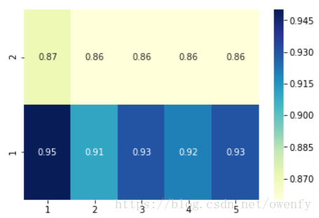
5、画散点图,并多个图重合在一起
import matplotlib.pyplot as plt
import seaborn as sns
color = sns.color_palette()
sns.set_style('darkgrid')
%matplotlib inline
plt.rcParams['font.sans-serif']=['SimHei'] #用来正常显示中文标签
plt.rcParams['axes.unicode_minus']=False #用来正常显示负号#有中文出现的情况,需要u'内容'

plt.figure(figsize=[9,6])
plt.plot(datat.index,datat_.t_bottom,color = 'r')
plt.plot(datat.index,datat_.t_top,color = 'c')
plt.scatter(datat.index,datat_.bottom,marker='.',c='g')
plt.scatter(datat.index,datat_.top,marker='.',c='b')
plt.legend(('t_bottom','t_top','noise_bottom','noise_top'),loc = 'upper right',fontsize=15)
plt.xlabel('index', fontsize=15)
plt.ylabel(u'温度', fontsize=15)
#plt.legend(['t_bottom','t_top'],loc = 'upper_right',fontsize = 10)
plt.show()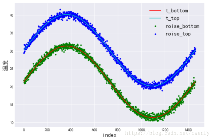
6、画图颜色
color =

| character | color |
|---|---|
'b' |
blue |
'g' |
green |
'r' |
red |
'c' |
cyan |
'm' |
magenta |
'y' |
yellow |
'k' |
black |
'w' |
white |
7、画靠在一起对比的柱状图
import matplotlib.pyplot as plt
import seaborn as sns
color = sns.color_palette()
sns.set_style('darkgrid')
%matplotlib inline
n_groups = 2
MLKNN = (0.44, 0.66)
DT = (0.59,0.60)
RF = (0.61, 0.63)
MLP = (0.48,0.58)

# create plot
fig, ax = plt.subplots()
index = np.arange(n_groups)
bar_width = 0.22
opacity = 0.8

rects1 = plt.bar(index, MLKNN, bar_width,
                 alpha=opacity,
                 label='MLKNN')

rects2 = plt.bar(index + bar_width, DT, bar_width,
                 alpha=opacity,
                 label='DT')

rects3 = plt.bar(index+ 2*bar_width, RF, bar_width,
                 alpha=opacity,
                 label='RF')

rects4 = plt.bar(index + 3*bar_width, MLP, bar_width,
                 alpha=opacity,
                 label='MLP')

plt.ylabel('F1')
plt.xticks(index + 1.5*bar_width, ('less_fea_add_noise', 'more_fea_add_noise'))
plt.title('add_noise')
plt.legend()

plt.tight_layout()
plt.show()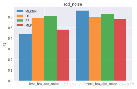
# data to plot
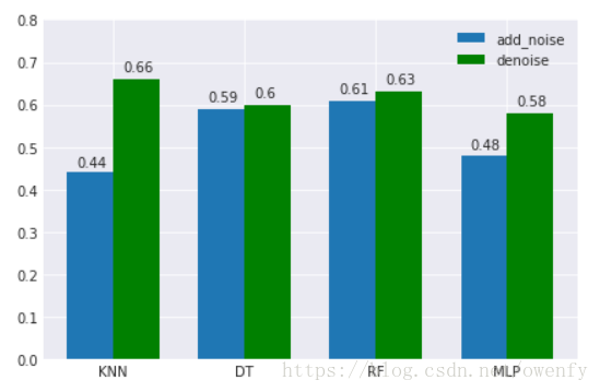
fig, ax = plt.subplots()
names = ('add_noise','denoise')
models = ('KNN', 'DT', 'RF','MLP')
F1 = ((0.44,0.59,0.61,0.48),(0.66,0.60,0.63,0.58))
# 设置柱形图宽度
bar_width = 0.35
index = np.arange(len(F1[0]))
rects1 = plt.bar(index, F1[0], bar_width, label=names[0])
rects2 = plt.bar(index + bar_width, F1[1], bar_width, color='g', label=names[1])
plt.xticks(index + 0.5*bar_width, models)
plt.ylim(ymax = 0.8,ymin = 0)
def add_labels(rects):
for rect in rects:
height = rect.get_height()
plt.text(rect.get_x()+rect.get_width()/2.-0.1, 1.03*height, '%s' % float(height))
add_labels(rects1)
add_labels(rects2)
plt.legend()
plt.tight_layout()
plt.show()
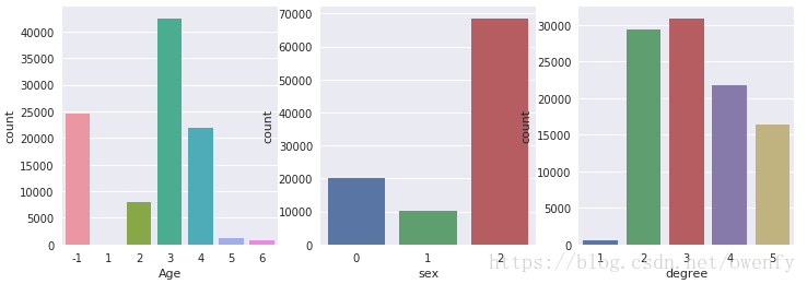
8、统计数量的柱状图
### 统计用户信息:年龄、等级、性别比例
plt.figure(figsize=(12,4))
plt.subplot(131)
ax1 = sns.countplot(x="age", data=user)
plt.xlabel("Age")

plt.subplot(132)
ax2 = sns.countplot(x="sex", data=user)
plt.xlabel("sex")

plt.subplot(133)
ax3 = sns.countplot(x="user_lv_cd", data=user)
plt.xlabel("degree")
plt.show()