Python画图主要用到matplotlib这个库。具体来说是pylab和pyplot这两个子库。这两个库可以满足基本的画图需求。
pylab神器:pylab.rcParams.update(params)。这个函数几乎可以调节图的一切属性,包括但不限于:坐标范围,axes标签字号大小,xtick,ytick标签字号,图线宽,legend字号等。
具体参数参看官方文档:http://matplotlib.org/users/customizing.html
scatter和 plot 函数的不同之处
scatter才是离散点的绘制程序,plot准确来说是绘制线图的,当然也可以画离散点。
scatter/scatter3做散点的能力更强,因为他可以对散点进行单独设置
所以消耗也比plot/plot3大
所以如果每个散点都是一致的时候,还是用plot/plot3好以下
如果要做一些plot没法完成的事情那就只能用scatter了
scatter强大,但是较慢。所以如果你只是做实例中的图,plot足够了。
plt.ion()用于连续显示。

# plot the real data
fig = plt.figure() ax = fig.add_subplot(1,1,1) ax.scatter(x_data, y_data) plt.ion()#本次运行请注释,全局运行不要注释 plt.show()
首先在python中使用任何第三方库时,都必须先将其引入。即:
import matplotlib.pyplot as plt- 1
或者:
from matplotlib.pyplot import *1.建立空白图
fig = plt.figure()
也可以指定所建立图的大小
fig = plt.figure(figsize=(4,2))也可以建立一个包含多个子图的图,使用语句:
plt.figure(figsize=(12,6))
plt.subplot(231) plt.subplot(232) plt.subplot(233) plt.subplot(234) plt.subplot(235) plt.subplot(236) plt.show()
其中subplot()函数中的三个数字,第一个表示Y轴方向的子图个数,第二个表示X轴方向的子图个数,第三个则表示当前要画图的焦点。
当然上述写法并不是唯一的,比如我们也可以这样写:
fig = plt.figure(figsize=(6, 6))
ax1 = fig.add_subplot(221) ax2 = fig.add_subplot(222) ax3 = fig.add_subplot(223) ax4 = fig.add_subplot(224) plt.show()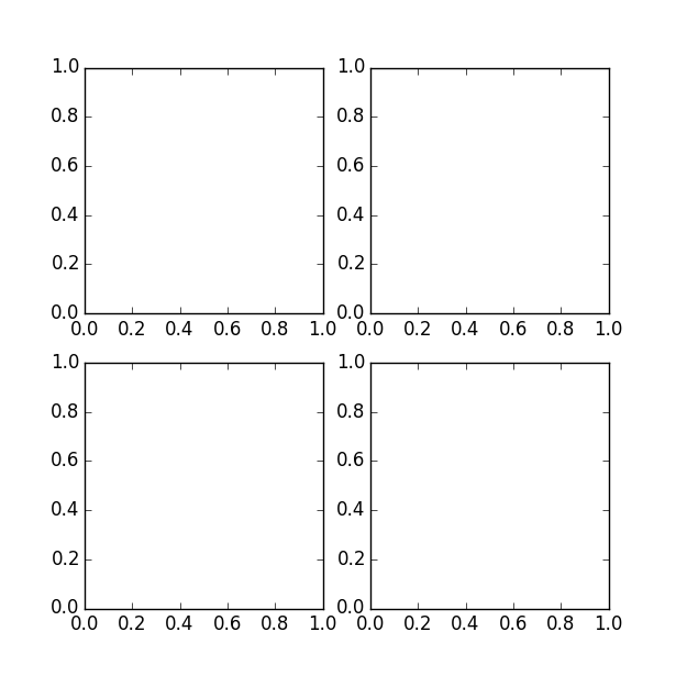
plt.subplot(111)和plt.subplot(1,1,1)是等价的。意思是将区域分成1行1列,当前画的是第一个图(排序由行至列)。
plt.subplot(211)意思就是将区域分成2行1列,当前画的是第一个图(第一行,第一列)。以此类推,只要不超过10,逗号就可省去。
可以看到图中的x,y轴坐标都是从0到1,当然有时候我们需要其他的坐标起始值。
此时可以使用语句指定:
ax1.axis([-1, 1, -1, 1])或者:
plt.axis([-1, 1, -1, 1])效果如下:

2.向空白图中添加内容,想你所想,画你所想
首先给出一组数据:
x = [1, 2, 3, 4, 5] y = [2.3, 3.4, 1.2, 6.6, 7.0]A.画散点图*
plt.scatter(x, y, color='r', marker='+') plt.show()效果如下:
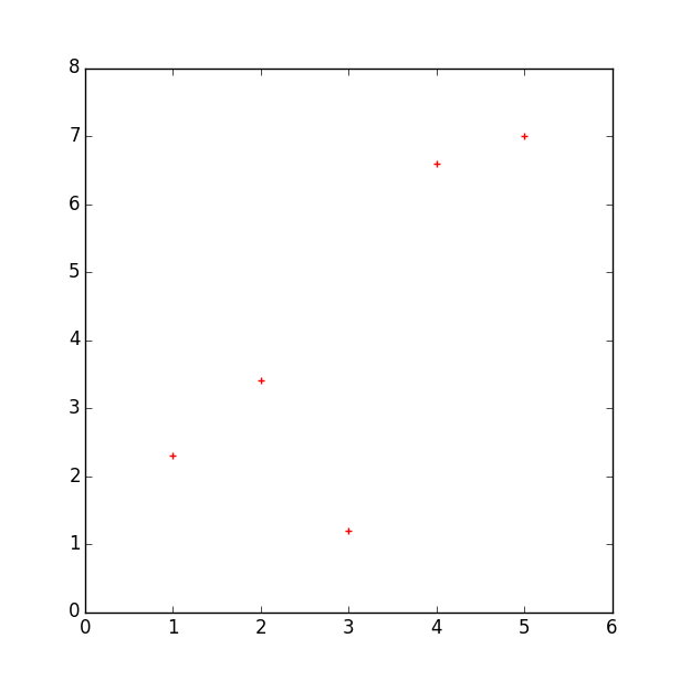
这里的参数意义:
- x为横坐标向量,y为纵坐标向量,x,y的长度必须一致。
-
控制颜色:color为散点的颜色标志,常用color的表示如下:
b---blue c---cyan g---green k----black m---magenta r---red w---white y----yellow有四种表示颜色的方式:
- 用全名
- 16进制,如:#FF00FF
- 灰度强度,如:‘0.7’
-
控制标记风格:marker为散点的标记,标记风格有多种:
.  Point marker
,  Pixel marker
o  Circle marker
v  Triangle down marker
^  Triangle up marker < Triangle left marker > Triangle right marker 1 Tripod down marker 2 Tripod up marker 3 Tripod left marker 4 Tripod right marker s Square marker p Pentagon marker * Star marker h Hexagon marker H Rotated hexagon D Diamond marker d Thin diamond marker | Vertical line (vlinesymbol) marker _ Horizontal line (hline symbol) marker + Plus marker x Cross (x) marker
B.函数图(折线图)
数据还是上面的。
fig = plt.figure(figsize=(12, 6))
plt.subplot(121)
plt.plot(x, y, color='r', linestyle='-') plt.subplot(122) plt.plot(x, y, color='r', linestyle='--') plt.show()
效果如下:

这里有一个新的参数linestyle,控制的是线型的格式:符号和线型之间的对应关系
-      实线
--     短线
-.     短点相间线
: 虚点线另外除了给出数据画图之外,我们也可以利用函数表达式进行画图,例如:y=sin(x)
from math import *
from numpy import *
x = arange(-math.pi, math.pi, 0.01) y = [sin(xx) for xx in x] plt.figure() plt.plot(x, y, color='r', linestyle='-.') plt.show()

效果如下: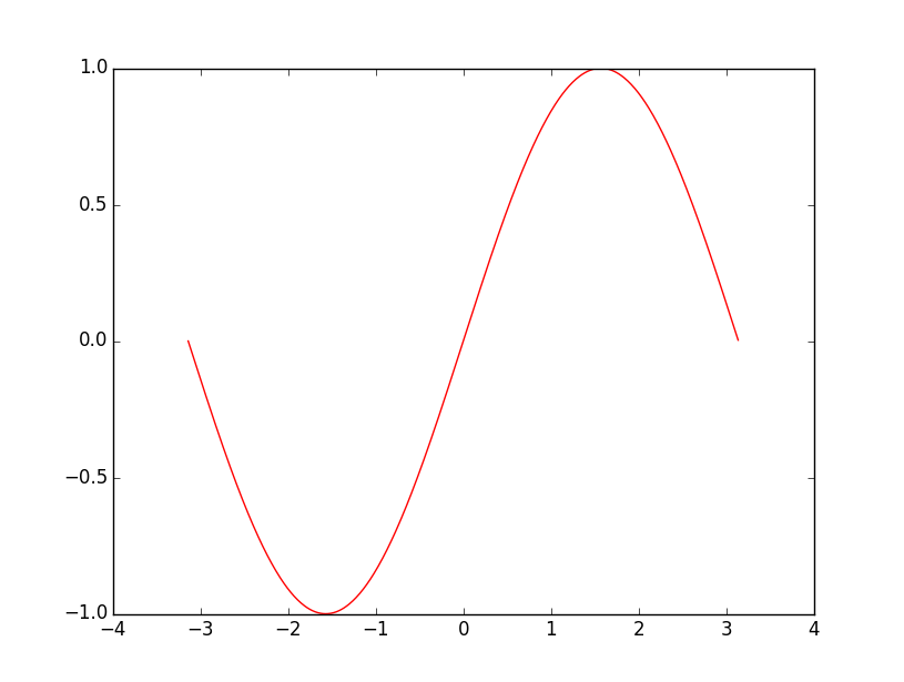
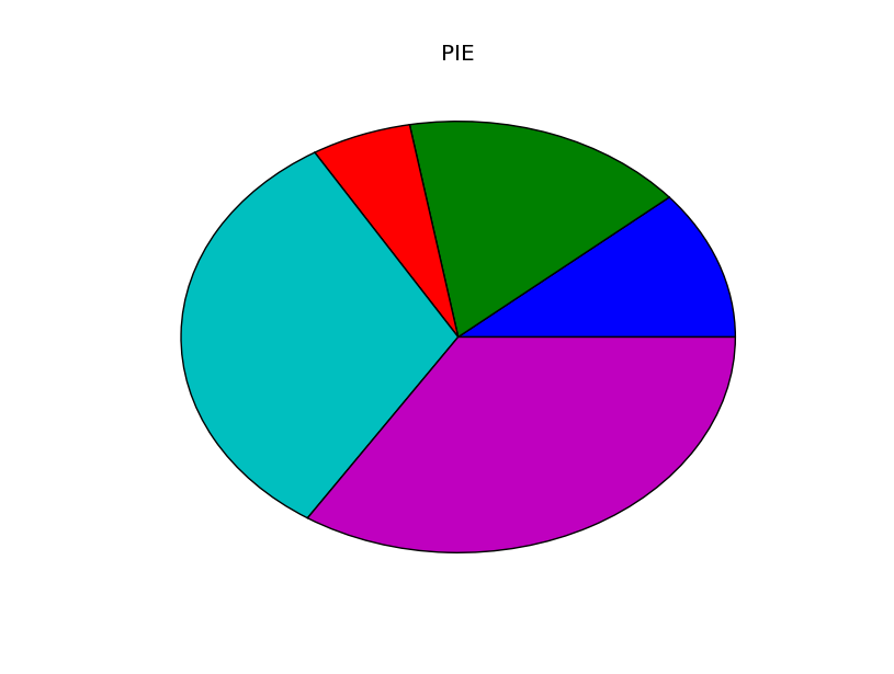
C.扇形图
示例:
import matplotlib.pyplot as plt
y = [2.3, 3.4, 1.2, 6.6, 7.0] plt.figure() plt.pie(y) plt.title('PIE') plt.show()
效果如下:
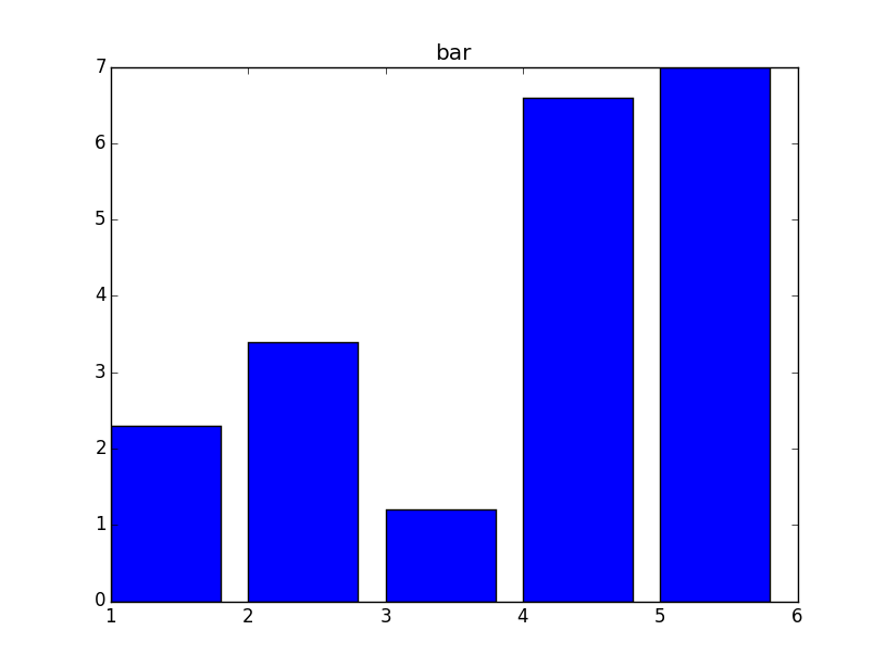
D.柱状图bar
示例:
import matplotlib.pyplot as plt
x = [1, 2, 3, 4, 5] y = [2.3, 3.4, 1.2, 6.6, 7.0] plt.figure() plt.bar(x, y) plt.title("bar") plt.show()
效果如下:
E.二维图形(等高线,本地图片等)
import matplotlib.pyplot as plt
import numpy as np
import matplotlib.image as mpimg # 2D data delta = 0.025 x = y = np.arange(-3.0, 3.0, delta) X, Y = np.meshgrid(x, y) Z = Y**2 + X**2 plt.figure(figsize=(12, 6)) plt.subplot(121) plt.contour(X, Y, Z) plt.colorbar() plt.title("contour") # read image img=mpimg.imread('marvin.jpg') plt.subplot(122) plt.imshow(img) plt.title("imshow") plt.show() #plt.savefig("matplot_sample.jpg")
效果图:

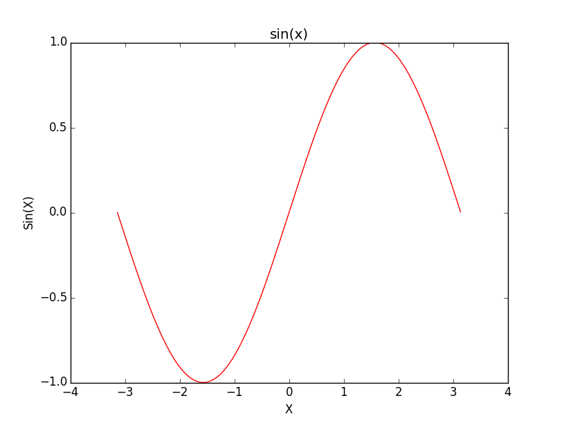
F.对所画图进行补充
__author__ = 'wenbaoli'


import matplotlib.pyplot as plt
from math import * from numpy import * x = arange(-math.pi, math.pi, 0.01) y = [sin(xx) for xx in x] plt.figure() plt.plot(x, y, color='r', linestyle='-') plt.xlabel(u'X')#fill the meaning of X axis plt.ylabel(u'Sin(X)')#fill the meaning of Y axis plt.title(u'sin(x)')#add the title of the figure plt.show()
效果图:
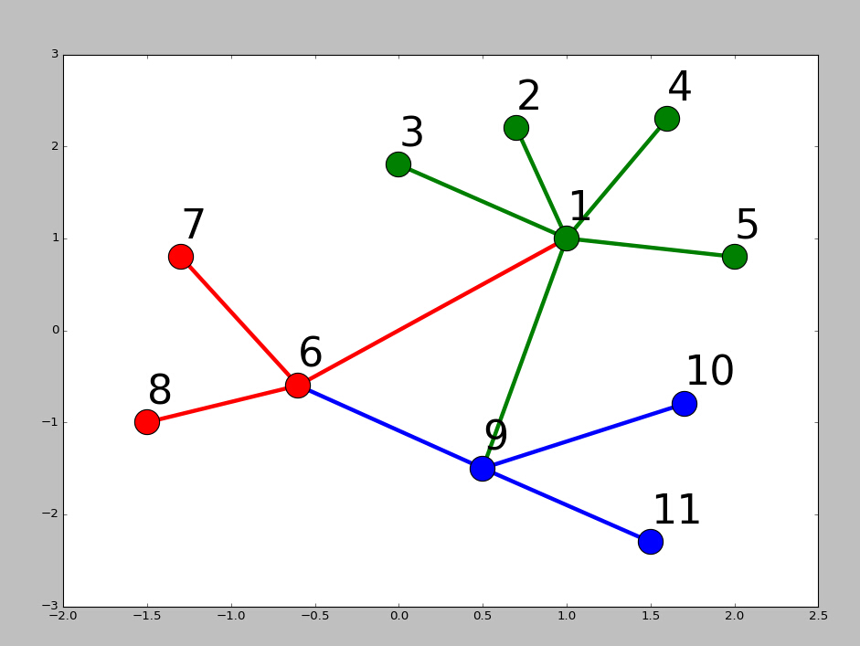
画网络图,要用到networkx这个库,下面给出一个实例:
|
|
import
networkx as nx
import
pylab as plt
g
=
nx.Graph()
g.add_edge(
1
,
2
,weight
=
4
)
g.add_edge(
1
,
3
,weight
=
7
)
g.add_edge(
1
,
4
,weight
=
8
)
g.add_edge(
1
,
5
,weight
=
3
)
g.add_edge(
1
,
9
,weight
=
3
)
g.add_edge(
1
,
6
,weight
=
6
)
g.add_edge(
6
,
7
,weight
=
7
)
g.add_edge(
6
,
8
,weight
=
7
)
g.add_edge(
6
,
9
,weight
=
6
)
g.add_edge(
9
,
10
,weight
=
7
)
g.add_edge(
9
,
11
,weight
=
6
)
fixed_pos
=
{
1
:(
1
,
1
),
2
:(
0.7
,
2.2
),
3
:(
0
,
1.8
),
4
:(
1.6
,
2.3
),
5
:(
2
,
0.8
),
6
:(
-
0.6
,
-
0.6
),
7
:(
-
1.3
,
0.8
),
8
:(
-
1.5
,
-
1
),
9
:(
0.5
,
-
1.5
),
10
:(
1.7
,
-
0.8
),
11
:(
1.5
,
-
2.3
)}
#set fixed layout location
#pos=nx.spring_layout(g) # or you can use other layout set in the module
nx.draw_networkx_nodes(g,pos
=
fixed_pos,nodelist
=
[
1
,
2
,
3
,
4
,
5
],
node_color
=
'g'
,node_size
=
600
)
nx.draw_networkx_edges(g,pos
=
fixed_pos,edgelist
=
[(
1
,
2
),(
1
,
3
),(
1
,
4
),(
1
,
5
),(
1
,
9
)],edge_color
=
'g'
,width
=
[
4.0
,
4.0
,
4.0
,
4.0
,
4.0
],label
=
[
1
,
2
,
3
,
4
,
5
],node_size
=
600
)
nx.draw_networkx_nodes(g,pos
=
fixed_pos,nodelist
=
[
6
,
7
,
8
],
node_color
=
'r'
,node_size
=
600
)
nx.draw_networkx_edges(g,pos
=
fixed_pos,edgelist
=
[(
6
,
7
),(
6
,
8
),(
1
,
6
)],width
=
[
4.0
,
4.0
,
4.0
],edge_color
=
'r'
,node_size
=
600
)
nx.draw_networkx_nodes(g,pos
=
fixed_pos,nodelist
=
[
9
,
10
,
11
],
node_color
=
'b'
,node_size
=
600
)
nx.draw_networkx_edges(g,pos
=
fixed_pos,edgelist
=
[(
6
,
9
),(
9
,
10
),(
9
,
11
)],width
=
[
4.0
,
4.0
,
4.0
],edge_color
=
'b'
,node_size
=
600
)
plt.text(fixed_pos[
1
][
0
],fixed_pos[
1
][
1
]
+
0.2
, s
=
'1'
,fontsize
=
40
)
plt.text(fixed_pos[
2
][
0
],fixed_pos[
2
][
1
]
+
0.2
, s
=
'2'
,fontsize
=
40
)
plt.text(fixed_pos[
3
][
0
],fixed_pos[
3
][
1
]
+
0.2
, s
=
'3'
,fontsize
=
40
)
plt.text(fixed_pos[
4
][
0
],fixed_pos[
4
][
1
]
+
0.2
, s
=
'4'
,fontsize
=
40
)
plt.text(fixed_pos[
5
][
0
],fixed_pos[
5
][
1
]
+
0.2
, s
=
'5'
,fontsize
=
40
)
plt.text(fixed_pos[
6
][
0
],fixed_pos[
6
][
1
]
+
0.2
, s
=
'6'
,fontsize
=
40
)
plt.text(fixed_pos[
7
][
0
],fixed_pos[
7
][
1
]
+
0.2
, s
=
'7'
,fontsize
=
40
)
plt.text(fixed_pos[
8
][
0
],fixed_pos[
8
][
1
]
+
0.2
, s
=
'8'
,fontsize
=
40
)
plt.text(fixed_pos[
9
][
0
],fixed_pos[
9
][
1
]
+
0.2
, s
=
'9'
,fontsize
=
40
)
plt.text(fixed_pos[
10
][
0
],fixed_pos[
10
][
1
]
+
0.2
, s
=
'10'
,fontsize
=
40
)
plt.text(fixed_pos[
11
][
0
],fixed_pos[
11
][
1
]
+
0.2
, s
=
'11'
,fontsize
=
40
)
plt.show()
|
结果如下: