版权声明:本文为博主原创文章,转载请注明出处! https://blog.csdn.net/PoGeN1/article/details/83313263
plt.figure() 产生图
你可以多次使用figure命令来产生多个图,其中,图片号按顺序增加。这里,要注意一个概念当前图和当前坐标。所有绘图操作仅对当前图和当前坐标有效。通常,你并不需要考虑这些事,下面的这个例子为大家演示这一细节。
import numpy as np
import matplotlib.pyplot as plt
t = np.arange(0., 5., 0.2)
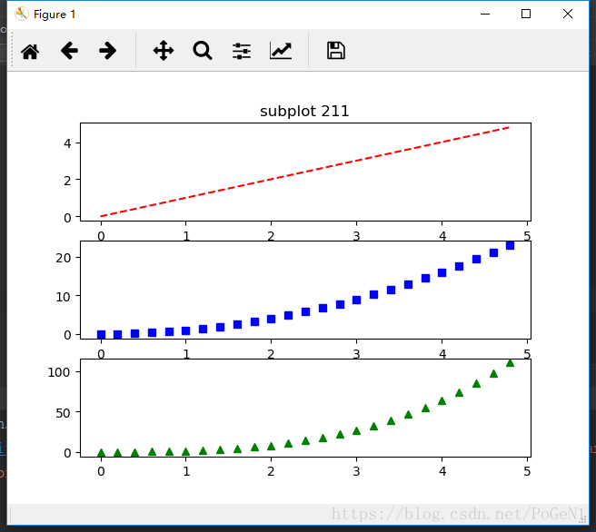
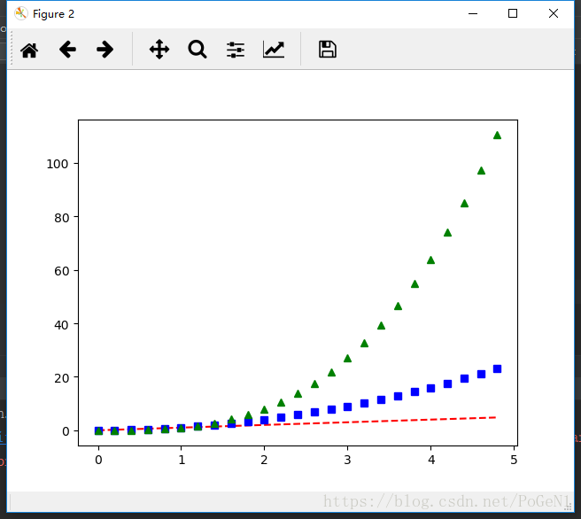
plt.figure(1) # 第一张图
plt.subplot(3, 1, 1) # 第一张图的第1个子图
plt.plot(t, t, 'r--')
plt.subplot(3, 1, 2) # 第一张图的第2个子图
plt.plot(t, t ** 2, 'bs')
plt.subplot(3, 1, 3) # 第一张图的第3个子图
plt.plot(t, t ** 3, 'g^')
plt.figure(2) # 第二张图
# 默认创建子图subplot(1,1,1)
plt.plot(t, t, 'r--', t, t ** 2, 'bs', t, t ** 3, 'g^')
plt.figure(1) # 切换到figure 1 ; 子图subplot(313)仍旧是当前图
plt.subplot(311) # 令子图subplot(311)成为figure1的当前图
plt.title('subplot 211') # 添加subplot 211 的标题
plt.show() #注:最后要有这一句话才能将图绘制出来
【注:figure()里面的数字就是相当于图像ID,可以索引定位到它】
plt.text() 添加文字说明
text()可以在图中的任意位置添加文字,并支持LaTex语法
xlable(), ylable()用于添加x轴和y轴标签
title()用于添加图的题目
例如:
import numpy as np
import matplotlib.pyplot as plt
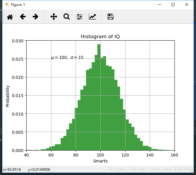
mu, sigma = 100, 15
x = mu + sigma * np.random.randn(10000)
# 数据的直方图
n, bins, patches = plt.hist(x, 50, normed=1, facecolor='g', alpha=0.75)
plt.xlabel('Smarts') # 添加x轴标签
plt.ylabel('Probability') # 添加y轴标签
plt.title('Histogram of IQ') # 添加图的标题
plt.text(60, .025, r'$\mu=100,\ \sigma=15$') # 添加文字
plt.axis([40, 160, 0, 0.03]) # 设定坐标轴的范围
plt.grid(True) # 添加网格线
plt.show()
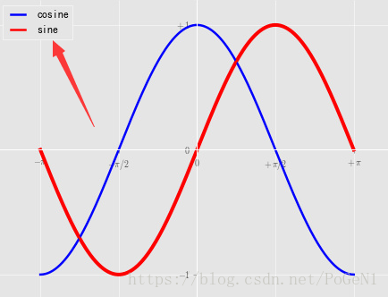
plt.lenged() 添加图例
plot(X, C, color="blue", linewidth=2.5, linestyle="-", label="cosine")
plot(X, S, color="red",  linewidth=2.5, linestyle="-", label="sine")

legend(loc='upper left')
今天先写这么多吧,以后逐渐补充。