CSS实现围绕按钮边框转圈的光线效果,可以自由改变按钮的光线渐变颜色和按钮边框颜色,背景色等。
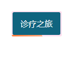
效果图:
实现完整代码:
<template>
	<view class="btnBlock">
		<view class="btnBian">

		</view>
		<view class="btn">诊疗之旅</view>
	</view>
</template>

<script>
	export default {
		data() {
			return {
			};
		},
		methods: {
		}
	};
</script>

<style scoped>
	.btnBlock {
		position: relative;
		overflow: hidden;
		height: 100rpx;
		width: 200rpx;
		margin: 50rpx;
		background-color: rgba(255, 105, 180, 0.2);
		border-radius: 3px;
	}

	.btnBian {
		height: 200rpx;
		width: 200rpx;
		border-radius: 3px;
		animation: border-line 3s infinite linear;
		z-index: 3;
		transform-origin: 0 0;
		top: 50%;
		left: 50%;
		content: '';
		background: linear-gradient(to bottom, #ffaa7f, #ff5500);
		position: absolute;

	}
	@keyframes border-line {
		to {
			transform: rotate(1turn);
		}
	}

	.btn {
		z-index: 4;
		height: 90rpx;
		width: 190rpx;
		margin: 2px;
		border-radius: 3px;
		display: flex;
		justify-content: center;
		align-items: center;
		position: relative;
		overflow: hidden;
		background-color: #10647F;
		color:#fff;
	}

</style>