版权声明:我的新浪博客http://blog.sina.com.cn/f6056 https://blog.csdn.net/weimob258616/article/details/80015035
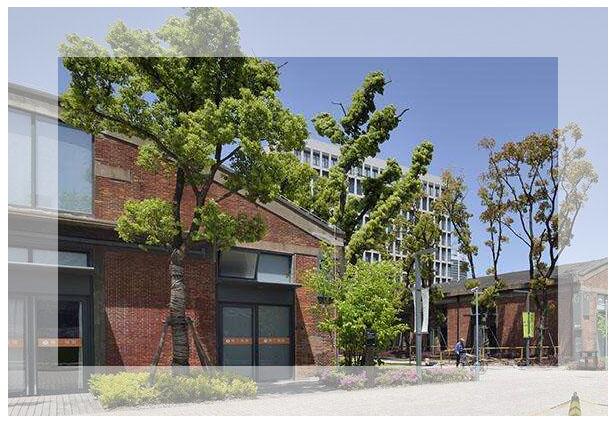
源代码:
<!doctype html>
<html>
<head>
<meta charset="utf-8">
<style>
div{
	width:500px;
	height:309px;
	border:50px solid  hsla(0,0%,100%,0.5);
	background:url(file:///C:/Users/Administrator/Desktop/timg11111.jpg) -50px  -50px no-repeat;

	}

</style>
</head>
<body>
<div></div>
</body>
</html>
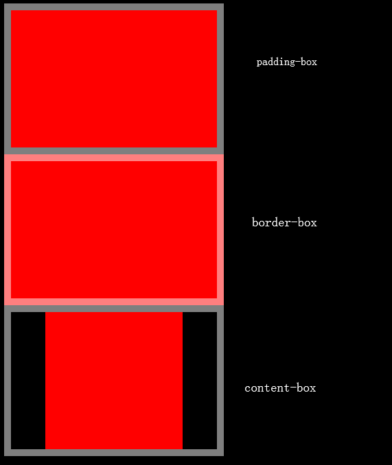
1、HSL颜色模式不太理解。
2、background-clip属性。
background-clip:border-box;
以border外边缘为边界剪除背景,背景范围为border、padding、content。
background-clip:padding-box;
以padding外边缘为边界剪除背景,背景范围为padding、content。
background-clip:content-box;
以content外边缘为边界剪除背景,背景范围为content。
background-clip属性实例代码:
<!doctype html>
<html>
<head>
<meta charset="utf-8">
<style>
body{
	background:black;
	}

div{
	width:200px;
	height:200px;
	padding:0 50px;
	border:10px solid hsla(0,0%,100%,.5);
	background:red;
	}
.class-padding-box{
	background-clip:padding-box;
	}

.class-border-box{
	background-clip:border-box;
	}
.class-content-box{
	background-clip:content-box;
}
</style>

</head>
<body>
<div class='class-padding-box'></div>
<div class='class-border-box'></div>
<div class='class-content-box'></div>
</body>
</html>