<template>
<view class="content">
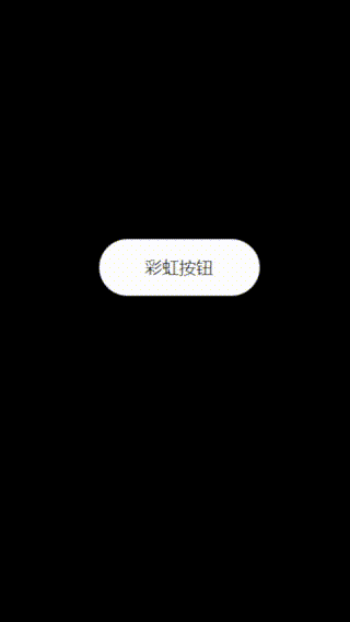
<button class="btn">彩虹按钮</button>
</view>
</template>
<script>
</script>
<style>
body{
background-color: #000;
}
.content {
margin-top: 300px;
}
.btn {
width: 170px;
height: 60px;
font-size: 18px;
background: #fff;
border: none;
border-radius: 50px;
color: #000;
outline: none;
cursor: pointer;
transition: all 0.4s;
align-items: center;
display: flex;
justify-content: center;
}
.btn:hover {
box-shadow: inset 0 0 0 4px #ef476f,
inset 0 0 0 8px #ffd166,
inset 0 0 0 12px #06d6a0,
inset 0 0 0 16px #118ab2;
background: #073b4c;
color: #fff;
}
</style>