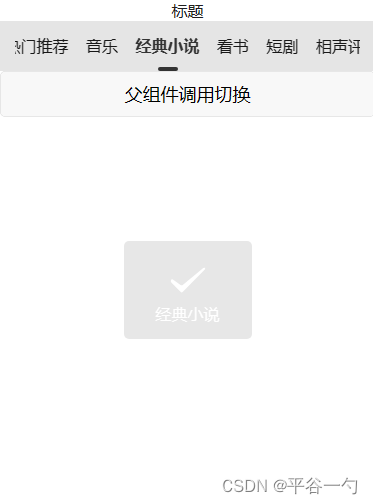
效果截图:
前言:
最近开发小程序,需要用到tabs组件,在标签多的时候,可以左右滑动。在插件库找到uView UI,但是这个库插件体积不算太小,小程序尽可能需要减少包体积,于是就打算自己封装一下。
主要能力:选中的tab会自动移动到组件的中间位置,支持默认选中第几个tab,可联动获取数据,支持和swiper联动使用。
主要方法:scroll-view
scroll-x:true //允许横向滚动

scroll-left //设置横向滚动条位置

scroll-with-animation  //在设置滚动条位置时使用动画过渡
tabs接受的参数props,tablist是父组件传递过来的tab数组,defaultsSelectIndex默认选中的第几个tab。
<tabs :tablist='list' :defaultSelectIndex='defaultSelectIndex' @select='change'></tabs>计算每个tab的宽度
onMounted(() => {
		const query = uni.createSelectorQuery().in(getCurrentInstance());

		query.selectAll('.tabs-scroll_item').boundingClientRect((data:Array<UniApp.NodeInfo>) => {
			let dataLen = data.length;
			for (let i = 0; i < dataLen; i++) {
				//  scroll-view 子元素组件距离左边栏的距离
				itemList.value[i].left = data[i].left;
				//  scroll-view 子元素组件宽度
				itemList.value[i].width = data[i].width
			}
		}).exec()


	})
select选中的tab暴露给父组件的方法。
const emits=defineEmits<{
		(e : 'select',value : ItabItem) : void
	}>()
隐藏滑动条
/* 隐藏滚动条*/
	::v-deep.uni-scroll-view::-webkit-scrollbar {
		display: none
	}
组件实现代码tabs.vue
<template>
	<view class="nav">
		<scroll-view class="tabs" scroll-x="true" scroll-with-animation :scroll-left="scrollLeft">
			<view class="tabs-scroll">
				<view class="tabs-scroll_item" v-for=" (item,index) in itemList" :key="index"
					:class="{'active':selectIndex==index}" @click="chenked(index)">
					{

   {item.title}}
				</view>
			</view>
		</scroll-view>
	</view>
</template>

<script setup lang="ts">
	import { getCurrentInstance, onMounted, ref, watch } from "vue";
	const scrollLeft = ref<number>(0)
	const selectIndex = ref<number>(0)
 	const itemList = ref<Array<ItabItem>>()
	interface ItabItem {
		title : string
		width ?: number
		left ?: number
		id : number
	}
	interface Iprops {
		tablist : Array<ItabItem>
		defaultSelectIndex ?: number
	}

	const props = withDefaults(defineProps<Iprops>(), {
		tablist: () => [],
		defaultSelectIndex: 6
	})
	const emits=defineEmits<{
		(e : 'select',value : ItabItem) : void
	}>()
	const chenked = (index:number) => {
		selectIndex.value = index
		scrollLeft.value = 0
		for (let i = 0; i < index - 2; i++) {
			scrollLeft.value = scrollLeft.value + itemList.value[i]?.width
		}
		emits('select',props.tablist[index])
	}
	onMounted(() => {
		const query = uni.createSelectorQuery().in(getCurrentInstance());

		query.selectAll('.tabs-scroll_item').boundingClientRect((data:Array<UniApp.NodeInfo>) => {
			let dataLen = data.length;
			for (let i = 0; i < dataLen; i++) {
				//  scroll-view 子元素组件距离左边栏的距离
				itemList.value[i].left = data[i].left;
				//  scroll-view 子元素组件宽度
				itemList.value[i].width = data[i].width
			}
		}).exec()


	})
	watch(() => [props.tablist, props.defaultSelectIndex], () => {
		itemList.value = props.tablist
		selectIndex.value = props.defaultSelectIndex
		if(props.defaultSelectIndex!==0){
			setTimeout(()=>{
				chenked(props.defaultSelectIndex)
			},50)
		}
	}, {
		immediate: true
	})
</script>
<style lang="scss" scoped>
	.nav {

		background-color: rgba(0, 0, 0, .1);
		position: fixed;
		z-index: 99;
		width: 100%;
		align-items: center;
		height: 100rpx;

		.tabs {
			flex: 1;
			overflow: hidden;
			box-sizing: border-box;
			padding-left: 30rpx;
			padding-right: 30rpx;

			.tabs-scroll {
				display: flex;
				align-items: center;
				flex-wrap: nowrap;
				box-sizing: border-box;

				.tabs-scroll_item {
					line-height: 60rpx;
					margin-right: 35rpx;
					flex-shrink: 0;
					padding-bottom: 10px;
					display: flex;
					justify-content: center;
					font-size: 16px;
					padding-top: 10px;
				}
			}
		}
	}


	.active {
		position: relative;
		color: #333;
		font-weight: 800;
	}

	.active::after {
		content: "";
		position: absolute;
		width: 40rpx;
		height: 8rpx;
		border-radius: 8rpx;
		background-color: #333;
		left: 0px;
		right: 0px;
		bottom: 0px;
		margin: auto;
	}

	/* 隐藏滚动条,但依旧具备可以滚动的功能 */
	::v-deep.uni-scroll-view::-webkit-scrollbar {
		display: none
	}
</style>
使用方法index.vue
<template>
	<view>
		<text style="text-align: center;width: 100%;display: block;"> 标题</text>
		<tabs :tablist='list' :defaultSelectIndex='defaultSelectIndex' @select='change'></tabs>
	</view>
	<button @click="add" style="margin-top: 100rpx;">父组件调用切换</button>

</template>

<script lang="ts" setup>
	import { ref } from "vue";
	const defaultSelectIndex=ref(0)
	const list = ref([

		{
			id: 1,
			title: '直播直播',
		},
		{
			id: 2,
			title: '热门推荐',
		},
		{
			id: 3,
			title: '音乐',
		},
		{
			id: 4,
			title: '经典小说',
		},
		{
			id: 5,
			title: '看书',
		},
		{
			id: 6,
			title: '短剧',
		},
		{
			id: 7,
			title: '相声评述',
		},
		{
			id: 8,
			title: '找书广场',
		},
	])
    const change=(value)=>{
		uni.showToast({
			title: value.title,
			duration: 2000
		});

	}
	const add=( )=>{
		defaultSelectIndex.value++
	}
</script>

<style>

</style>
希望本篇文章对你有所帮助,我也是根据自己的需求封装的,你也可以根据自己的需求在该代码上进行优化。