我们先来看看实现的效果
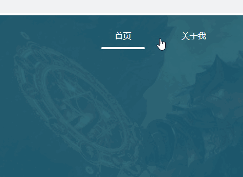
效果是鼠标放上去的时候,会出现一个下边框,并且这个下边框会从中间往两边撑开的动画,鼠标划出来后下边框又会从两边往中间慢慢缩短并消失的效果。
好呐我们来看看代码
首先我们写好一个循环的li标签,v-for,指定的:key值, @mouseover鼠标放上去的事件,@mouseout鼠标划出来的事件。
<li
v-for="(item,index) in listIndex"
:key="index"
@mouseover="navShow(index)"
@mouseout="dboShow(index)">
  <a class="nav-link" href="#">{{item}}
    <div class="spanClass"
    :class="{borderTwoClass:spanTwoClass==index,borderThreeClass:spanThreeClass==index}">
    </div>
  </a>
</li>
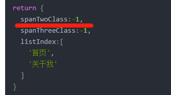
list数组的值
 return {
   spanTwoClass:-1,
   spanThreeClass:-1,
   listIndex:[
     '首页',
     '关于我'
   ]
 }
请留意li标签里有个div,div里有个:class,为什么有class和:class呢,:class是v-bind:class的简写,具体啥意思呢相信了解vue的人都能经常用到,如果你不知道那建议先去学学vue基础,要是你用不到vue又想实现这个效果,当然也可以实现,加我V吧hua658818。
接着来看代码
:class="{borderTwoClass:spanTwoClassindex,borderThreeClass:spanThreeClassindex}"
解释一下
borderTwoClass是一个css样式,实际上是对li标签里的div做出的样式,样式是啥意思呢,这个样式是中间往两边撑开的效果,我们来看看代码。不太熟悉css3的,可以浏览这个网址过一遍 https://www.runoob.com/css3/css3-animations.html
.borderTwoClass{
    background: #fff;
    width: 80%;
    animation:myfirst 0.3s;				/* 定义动画名*/
    -webkit-animation:myfirst 0.3s;		/* webkit内核的浏览器*/
}
@keyframes myfirst						/*执行动画(一定要仔细看,懂css的人就能看得懂)*/
{
    0%   {background: #fff;width:0%;}
    25%   {background: #fff;width:20%;}
    50%   {background: #fff;width:40%;}
    75%   {background: #fff;width:60%;}
    100%   {background: #fff;width:80%;}
}
@-webkit-keyframes myfirst 				/* webkit内核的浏览器执行*/
{
    0%   {background: #fff;width:0%;}
    25%   {background: #fff;width:20%;}
    50%   {background: #fff;width:40%;}
    75%   {background: #fff;width:60%;}
    100%   {background: #fff;width:80%;}
}
看我上面的代码我相信你也发现了,出现的那个线条并不是一个边框,而是li标签里的div,对这个div添加背景颜色以及宽度,在添加的这个过程使用了动画的效果,到了这里,熟悉vue的大佬估计看不下去了,急匆匆写代码去了吧,好吧,为了考虑新手的感受,我还是坚持把它写完。
继续解释
borderTwoClass:spanTwoClass==index什么意思呢?
意思就是想要让borderTwoClass:spanTwoClass生效,spanTwoClass必须等于index
那我们来看看上面的代码
我们是不是已经定义好了呢,但是它等于-1,怎么办?
我们刚刚上面的li标签里不是有个 @mouseover="navShow(index)"方法么,我们把它拿出来用。
 navShow(index){
  this.spanTwoClass = index;
},
这不就实现了吗,你自己测一测呢,实现不了你就得查看你自己的代码了。
接下来鼠标划出去的时候还得有一个消失的效果呀,有些哥们儿说,啊!这不是直接反过来就可以了吗。
对的,没错。。就是酱紫。。我们来看完整代码
 <template>
  <div class="body">
    <div class="oneBody">
        <ul class="Navigation">
          <li
          v-for="(item,index) in listIndex"
          :key="index"
          @mouseover="navShow(index)"
          @mouseout="dboShow(index)">
            <a class="nav-link" href="#">{{item}}
              <div class="spanClass"
              :class="{borderTwoClass:spanTwoClass==index,borderThreeClass:spanThreeClass==index}">
              </div>
            </a>
          </li>
        </ul>
    </div>
    <div class="twoDiv">
        sdfsdf
    </div>
  </div>
</template>

<script>
export default {
  name: 'index',
  data () {
    return {
      spanTwoClass:-1,
      spanThreeClass:-1,
      darkshow:true,
      listIndex:[
        '首页',
        '关于我'
      ]
    }
  },
  methods:{
    navShow(index){
      this.spanTwoClass = index;
    },
    dboShow(index){
      this.spanThreeClass = index;
      this.spanTwoClass = -1;
    }
  },
}
</script>
<style>

</style>
/*划入样式*/
.borderTwoClass{
    background: #fff;
    width: 80%;
    animation:myfirst 0.3s;
    -webkit-animation:myfirst 0.3s;
}
@keyframes myfirst
{
    0%   {background: #fff;width:0%;}
    25%   {background: #fff;width:20%;}
    50%   {background: #fff;width:40%;}
    75%   {background: #fff;width:60%;}
    100%   {background: #fff;width:80%;}
}
@-webkit-keyframes myfirst /* Safari and Chrome */
{
    0%   {background: #fff;width:0%;}
    25%   {background: #fff;width:20%;}
    50%   {background: #fff;width:40%;}
    75%   {background: #fff;width:60%;}
    100%   {background: #fff;width:80%;}
}
/*划出样式*/
.borderThreeClass{
    background: #fff;
    width: 0%;
    animation:myfirstwo 0.3s;
    animation-direction:0.3s;
	-webkit-animation:myfirstwo 0.3s;
    -webkit-animation-direction:0.3s;
}
@keyframes myfirstwo
{
    0%   {background: #fff;width:80%;}
    25%   {background: #fff;width:60%;}
    50%   {background: #fff;width:40%;}
    75%   {background: #fff;width:20%;}
    100%   {background: #fff;width:0%;}
}
@-webkit-keyframes myfirstwo /* Safari and Chrome */
{
    0%   {background: #fff;width:80%;}
    25%   {background: #fff;width:60%;}
    50%   {background: #fff;width:40%;}
    75%   {background: #fff;width:20%;}
    100%   {background: #fff;width:0%;}
}
完整代码仅作为参考,具体页面样式还需你自己去跳转,还有想实现这样的效果其实用字体图标更为方便,我这方法可能麻烦了些,具体字体图标来实现的方式有机会我也会了解,了解后当然也会分享出来。
