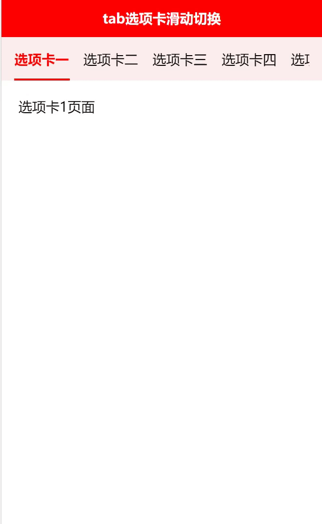
效果如下:
代码如下:
<template>
	<view class="content">
		<view class="nav">
			<!-- 选项卡水平方向滑动,scroll-with-animation是滑动到下一个选项时,有一个延时效果 -->
			<scroll-view class="tab-scroll" scroll-x="true" scroll-with-animation :scroll-left="scrollLeft">
				<view class="tab-scroll_box">
					<!-- 选项卡类别列表 -->
					<view class="tab-scroll_item" v-for=" (item,index) in category" :key="index"  :class="{'active':isActive==index}" @click="chenked(index)">
							{

   {item.name}}
					</view>
				</view>
			</scroll-view>
		</view>
		<!-- 选项卡内容轮播滑动显示,current为当前第几个swiper子项 -->
		<swiper @change="change" :current="isActive" class="swiper-content" :style="fullHeight">
			<swiper-item class="swiperitem-content">
				<scroll-view scroll-y style="height: 100%;">
					<view class="nav_item" >
						选项卡1页面
					</view>
				</scroll-view>
			</swiper-item>
			<swiper-item class="swiperitem-content">
				<scroll-view scroll-y style="height: 100%;">
					<view class="nav_item" >
						选项卡2页面
					</view>
				</scroll-view>
			</swiper-item>
			<swiper-item class="swiperitem-content">
				<scroll-view scroll-y style="height: 100%;">
					<view class="nav_item" >
						选项卡3页面
					</view>
				</scroll-view>
			</swiper-item>
			<swiper-item class="swiperitem-content">
				<scroll-view scroll-y style="height: 100%;">
					<view class="nav_item" >
						选项卡4页面
					</view>
				</scroll-view>
			</swiper-item>
			<swiper-item class="swiperitem-content">
				<scroll-view scroll-y style="height: 100%;">
					<view class="nav_item" >
						选项卡5页面
				    </view>
				</scroll-view>
			</swiper-item>
			<swiper-item class="swiperitem-content">
				<scroll-view scroll-y style="height: 100%;">
					<view class="nav_item" >
						选项卡6页面
				    </view>
				</scroll-view>
			</swiper-item>
		</swiper>
	</view>
</template>
<script>
	export default {
		watch:{
			// swiper与上面选项卡联动
			currentindex(newval){
				this.isActive = newval;
				this.scrollLeft = 0;
				// 滑动swiper后,每个选项距离其父元素最左侧的距离
				for (let i = 0; i < newval - 1; i++) {
					this.scrollLeft += this.category[i].width
				};
			},
		},
		data() {
			return {
				isActive: 0,
				index: 0,
				currentindex:0,
				category:[
					{
						id:1,
						name:'选项卡一',
					},
					{
						id:2,
						name:'选项卡二',
					},
					{
						id:3,
						name:'选项卡三',
					},
					{
						id:4,
						name:'选项卡四',
					},
					{
						id:5,
						name:'选项卡五',
					},
					{
						id:6,
						name:'选项卡六',
					},
				],
				contentScrollW: 0, // 导航区宽度
				scrollLeft: 0, // 横向滚动条位置
				fullHeight:"",
			}
		},
		mounted() {
			var that = this;
			 //获取手机屏幕的高度,让其等于swiper的高度,从而使屏幕充满
			uni.getSystemInfo({
			      success: function (res) {
				         that.fullHeight ="height:" + res.windowHeight + "px";
				  }
				});
			// 获取标题区域宽度,和每个子元素节点的宽度
			this.getScrollW()
		},
		methods: {
			// 获取标题区域宽度,和每个子元素节点的宽度以及元素距离左边栏的距离
			getScrollW() {
				const query = uni.createSelectorQuery().in(this);
				query.select('.tab-scroll').boundingClientRect(data => {
					  // 拿到 scroll-view 组件宽度
					  this.contentScrollW = data.width
				 }).exec();
				 query.selectAll('.tab-scroll_item').boundingClientRect(data => {
					 let dataLen = data.length;
					  for (let i = 0; i < dataLen; i++) {
						  //  scroll-view 子元素组件距离左边栏的距离
						  this.category[i].left = data[i].left;
						 //  scroll-view 子元素组件宽度
						 this.category[i].width = data[i].width
					}
				 }).exec()
			},
			// 当前点击子元素靠左留一个选项展示,子元素宽度不相同也可实现
			chenked(index) {
				this.isActive = index;
				this.scrollLeft = 0;
				for (let i = 0; i < index - 1; i++) {
					this.scrollLeft += this.category[i].width
				};
			},
			// swiper滑动时,获取其索引,也就是第几个
			change(e){
				const {current} = e.detail;
				this.currentindex = current;
			},
		}
	}
</script>
<style lang="scss">
	page{
		height: 100%;
		display: flex;
		background-color: #FFFFFF;
	}
	.content{
		display: flex;
		flex-direction: column;
		width: 100%;
		flex: 1;
		.nav{
			border-top: 1rpx solid #f2f2f2;
			background-color: #fceeee;
			position: fixed;
			z-index: 99;
			width: 100%;
			align-items: center;
			height: 100rpx;
			.tab-scroll{
				flex: 1;
				overflow: hidden;
				box-sizing: border-box;
				padding-left: 30rpx;
				padding-right: 30rpx;
				.tab-scroll_box{
					display: flex;
					align-items: center;
					flex-wrap: nowrap;
					box-sizing: border-box;
					.tab-scroll_item{
						line-height: 60rpx;
						margin-right: 35rpx;
						flex-shrink: 0;
						padding-bottom:10px;
						display: flex;
						justify-content: center;
						font-size: 16px;
						padding-top: 10px;
					}
				}
			}
		}
		.swiper-content{
			   padding-top: 120rpx;
			   flex: 1;
			.swiperitem-content{
			    background-color: #ffffff;
				.nav_item{
					background-color: #FFFFFF;
					padding:20rpx 40rpx 0rpx 40rpx ;
				}
			}
		}
	}
	.active {
		position: relative;
		color: #ff0000;
		font-weight: 600;
	}
	.active::after {
		content: "";
		position: absolute;
		width: 130rpx;
		height: 4rpx;
		background-color: #ff0000;
		left: 0px;
		right: 0px;
		bottom: 0px;
		margin: auto;
	}
	/* 隐藏滚动条,但依旧具备可以滚动的功能 */
	/deep/.uni-scroll-view::-webkit-scrollbar {
		display: none
	}
</style>
注意:css当中需要加上以下,为了隐藏滚动条,否则会出现下图效果
/* 隐藏滚动条,但依旧具备可以滚动的功能 */

/deep/.uni-scroll-view::-webkit-scrollbar {

display: none

}