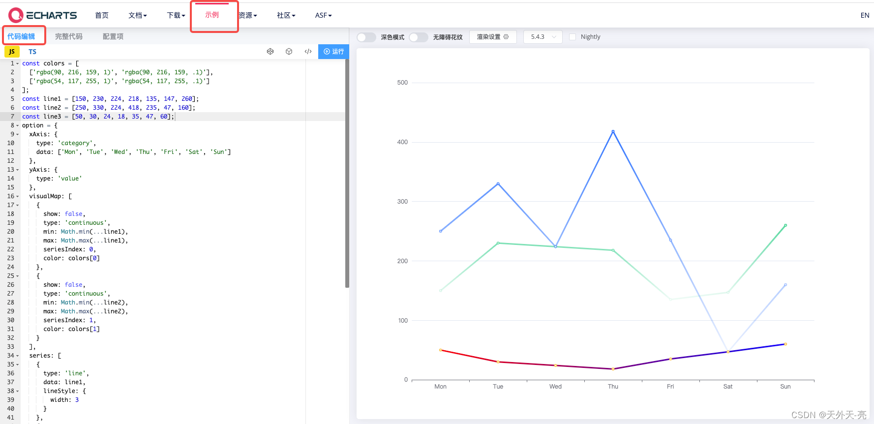
先看示例图:
这几年一直在做大数据可视化前端开发,接下来把近几年用到的比较经典案例给大家分享下,主要用到的可视化库为Echarts、Threejs、Element、D3、fabricjs等。
这个案例是Echarts,Echarts算是学习成本比较低的一个很好的开放库了,大家多看看配置项、案例就可以很好的运用在项目中,各个配置项的组合往往能产生很多出其不意的效果。
这个案例主要是要求根据数据的大小,折线显示不同的颜色,以更好的让用户看出数据效果,主要通过visualMap实现,最下面那根线是夹带了另一个功能,折线实现渐变色,不过这个不受数据影响:
const colors = [
  ['rgba(90, 216, 159, 1)', 'rgba(90, 216, 159, .1)'],
  ['rgba(54, 117, 255, 1)', 'rgba(54, 117, 255, .1)']
];
const line1 = [150, 230, 224, 218, 135, 147, 260];
const line2 = [250, 330, 224, 418, 235, 47, 160];
const line3 = [50, 30, 24, 18, 35, 47, 60];
option = {
  xAxis: {
    type: 'category',
    data: ['Mon', 'Tue', 'Wed', 'Thu', 'Fri', 'Sat', 'Sun']
  },
  yAxis: {
    type: 'value'
  },
  visualMap: [
    {
      show: false,
      type: 'continuous',
      min: Math.min(...line1),
      max: Math.max(...line1),
      seriesIndex: 0,
      color: colors[0]
    },
    {
      show: false,
      type: 'continuous',
      min: Math.min(...line2),
      max: Math.max(...line2),
      seriesIndex: 1,
      color: colors[1]
    }
  ],
  series: [
    {
      type: 'line',
      data: line1,
      lineStyle: {
        width: 3
      }
    },
    {
      type: 'line',
      data: line2,
      lineStyle: {
        width: 3
      }
    },
    {
      type: 'line',
      data: line3,
      lineStyle: {
        width: 3,
        color: {
          type: 'linear',
          x: 0,
          y: 0,
          x2: 1,
          y2: 0,
          colorStops: [
            {
              offset: 0, color: 'red' // 0% 处的颜色
            },
            {
              offset: 1, color: 'blue' // 100% 处的颜色
            }
          ],
          global: false // 缺省为 false
        }
      }
    }
  ]
};
本配置项可以直接复制粘贴到Echarts代码编辑器中展示,然后根据你的项目要求再次配置你需要的样式,就是这么周到。