版权声明:Polarisone https://blog.csdn.net/Polarisone/article/details/89642407
在vue中实现echarts线型背景渐变色
一:安装
1. 首先需要安装echarts依赖包
npm install echarts -S
2. 或者使用国内的淘宝镜像:
npm install -g cnpm --registry=https://registry.npm.taobao.org
二: 创建图表
全局引入
main.js
// 引入echarts
import echarts from 'echarts'

Vue.prototype.$echarts = echarts
Hello.vue
<div id="myChart" :style="{width: '300px', height: '300px'}"></div>
export default {
data(){
return {}
},
mounted(){
this.myChart() //函数调用
},
methods:{
// 左上角柱状图
myChart(){
let myChart= this.$echarts.init(document.getElementById('myChart'));
myChart.setOption({
// backgroundColor:'#050d19',
title:{
textStyle:{
color:"#2BFDA3",在这里插入图片描述
},
text:'消费趋势分析',
left:"left",
},
tooltip: {//鼠标悬浮弹出提示框
trigger:'axis', //提示框弹出的触发时间,折线图和柱状图为axis
formatter:"{a} <br/>{b} : {c} "//提示框提示的信息,{a}series内的名字,{b}为块状的名字,{c}为数值
},
grid: {//统计图距离边缘的距离
top: '14%',
left: '10%',
right: '10%',
bottom: '14%'
},
xAxis: [{//x轴
type: 'category',//数据类型为不连续数据
boundaryGap: false,//坐标轴两边是否留白
axisLine: { //坐标轴轴线相关设置。数学上的x轴
show: true,
lineStyle: {
color: '#233e64' //x轴颜色
},
},
axisLabel: { //坐标轴刻度标签的相关设置
textStyle: {
color: '#FFFFFF',
},
},
axisTick: { show: true,},//刻度点数轴
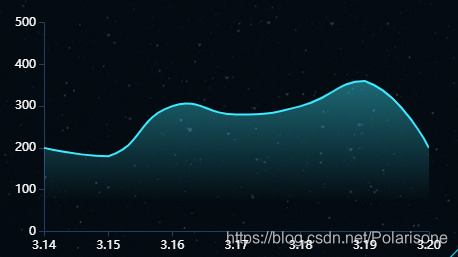
data: ['3.14', '3.15', '3.16', '3.17', '3.18', '3.19', '3.20'],
}],
yAxis: [{//y轴的相关设置
type: 'value',//y轴数据类型为连续的数据
min: 0,//y轴上的刻度最小值
max:500,//y轴上的刻度最大值
splitNumber: 6,//y轴上的刻度段数
splitLine: {//y轴上的y轴线条相关设置
show: false,
lineStyle: {
color: '#233e64'
}
},
axisLine: {//y轴的相关设置
show: true,
lineStyle: {
color: '#233e64' //y轴颜色
},
},
axisLabel: {//y轴的标签相关设置
textStyle: {
color: '#FFFFFF',
},
},
axisTick: { show: true,}, //刻度点数轴
}],
series: [{
name: '消费趋势分析',
type: 'line',//统计图类型为折线图
smooth: true, //是否平滑曲线显示
symbolSize:0,//数据点的大小,[0,0]//b表示宽度和高度
lineStyle: {//线条的相关设置
normal: {
color: "#3deaff" // 线条颜色
},
},
// 背景色渐变色
areaStyle: {
// color: '3deaff',
color: new this.$echarts.graphic.LinearGradient(0, 0, 0, 1, [
{offset: 0, color: 'rgba(61,234,255,0.6)'},
{offset: 0.8, color: 'rgba(61,234,255,0)'}
]),
// opacity: 0.1,
// origin: "start"
},
data: [200, 180, 300, 280, 300, 360, 200]
}]
})
},
}
}
最终结果