前言:在 Echarts 可视化中,我们常见的属性之一就包括 调色板 color 的更换,以达到不同颜色的显示要求,在 Echarts 中的调色板支持 普通颜色填充和渐变填充线性渐变、径向渐变),具体的介绍在它的官网配置属性链接如下:https://echarts.apache.org/zh/option.html#color
接下来就简单的介绍如何具体的使用线性渐变的案例:
其它的颜色填充都类似,所以只举例一个,大家即可按照调色板来调解。
在柱状图中的 渐变色 使用。
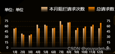
预想的目标如下
1.封装 React 类组件,准备存储 Echarts数据。
该步骤不重要,重点是如何在将数据的颜色渲染成 渐变或者条纹。
import React, { Component } from "react";
import * as echarts from "echarts";
import "echarts-gl";  //该依赖可不要
//以上依赖的前提是你需要下载 Echarts 在 React 中
class Bar extends Component{
     componentDidMount() {   //初始化组件,只执行一次
        this.initEcharts();
      }
     componentDidUpdate(){   // 组件更新时也会调用。
        this.initEcharts();
     }
      initEcharts() {
        const myChart = echarts.init(
          document.getElementById("bar") as HTMLElement
        );
        myChart.setOption({  //下列数据可以直接按照可视化图里面的东西进行替换

        });
    }
    render(): React.ReactNode{   //挂载
        return <div id="bar" style={

   {width:'100px',height:'100px'}}></div>
    }
}
export default Bar;
扫描二维码关注公众号,回复:
16915197 查看本文章

2.在 Echarts 中将自己需要的数据引入: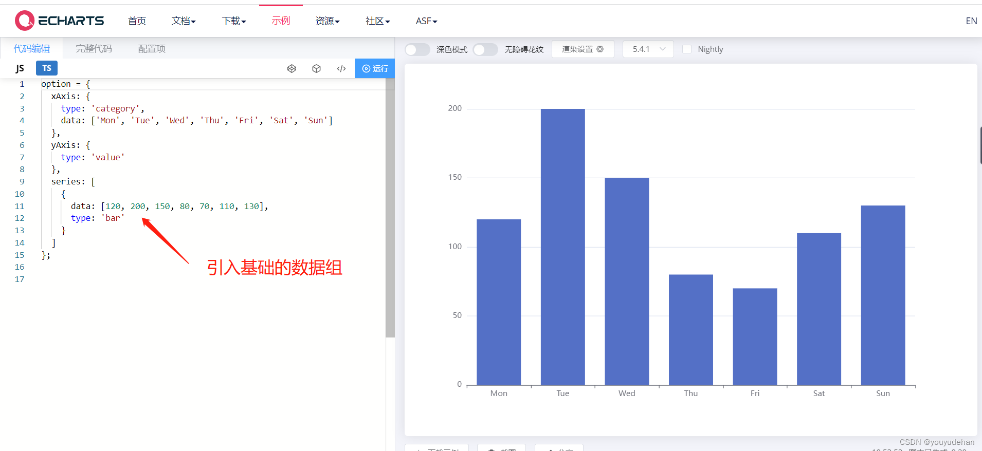
将数据复制在类组件的中即可
myChart.setOption({  //下列数据可以直接按照可视化图里面的东西进行替换

           });
为了将该图形更改成我们需要的成品,借鉴文档配置项

3.节省文章内容,直接按照最后 option 的完整代码进行讲解,请多注意看代码的注释行
myChart.setOption({
xAxis: { //x轴
type: 'category',
data: ['1月', '2月', '3月', '4月', '5月', '6月', '7月','8月','9月', '10月', '11月','12月'],
show: true, //是否显示 X 轴
axisTick: {
show: false, //是否显示刻度
interval: 0,
},
axisLabel: { //刻度标签样式
show: true,
interval: 0,
fontSize: 8,
color: "rgba(255, 255, 255, 1)",
fontFamily: "苹方-简 常规体"
}
},
yAxis: [ //y轴
{
min: 0,
max: 75,
type: 'value',
interval: 15,
axisLabel: { //刻度标签样式
show: true,
interval: 0,
fontSize: 8,
color: "rgba(255, 255, 255, 1)",
fontFamily: "苹方-简 常规体"
},
splitLine: { //分隔线样式
show: true,
lineStyle: {
color: 'rgba(102, 60, 0, 1)',
type:'dashed',
opacity: 0.4
}
}
},
{
min: 0,
max: 75,
interval: 15,
axisLabel: { //刻度标签样式
show: true,
interval: 0,
fontSize: 8,
color: "rgba(255, 255, 255, 1)",
fontFamily: "苹方-简 常规体"
},
splitLine: { //分隔线样式
show: false,
}
},
],
grid: { //极坐标
left: "5%",
right: "5%",
bottom: "0%",
containLabel: true
},
legend: { //图例
icon: "rect", //图例样式
show: true,
right: "0%",
top: '11%',
itemWidth: 17,
itemHeight: 14,
itemStyle: {
// color: "rgba(255, 178, 0, 0.15)",
// borderColor: "inherit"
// borderColor: "rgba(255, 178, 0, 1)", //描边颜色
// borderWidth: 1
},
textStyle: {
color: "#fff"
},
},
title: { //标题
subtext: '单位:单位', //副标题
subtextStyle: { //副标题样式
color: "#ffffff",
fontSize: 10,
},
padding: [0, 0, 0, 0], //标题边距
left: "5%",
top: '10%'
},
series: [
{
//每一组的数据写在 { } 中
name: '本月阻拦请求次数',
data: [ 54, 40, 35, 65, 65,55,75,71,50,55,60,55],
type: 'bar',
showBackground: false, //是否显示柱状图背景
symbolSize:['30%', '50%'],
//我们直接在数据中写入颜色属性,用来标记某一类数据。
itemStyle: { //本月阻拦请求次数的数据渐变色设置,本章重点部分
color: new echarts.graphic.LinearGradient(0, 0, 0, 1, [
{ offset: 0, color: 'rgba(253, 201, 141, 1)'}, //开始的颜色
{ offset: 1, color: 'rgba(253, 201, 141, 0)' } //结束的颜色
]),//中间可以设置多个数值,0 为百分之0 所以可以按照自己的想法,百分之10一个颜色变化都可。
},
barCategoryGap: "60%", //柱状图间距
},
{
name: '总请求数',
data: [ 56, 37, 38, 55, 62,56,65,72,56,60,65,70],
type: 'bar',
showBackground: false, //是否显示柱状图背景
itemStyle: { //总请求数的数据渐变色设置,本章重点部分
color: new echarts.graphic.LinearGradient(0, 0, 0, 1, [
{ offset: 0, color: 'rgba(255, 136, 0, 1)'}, //开始的颜色
{ offset: 1, color: 'rgba(255, 137, 0, 0)' } //结束的颜色
])
},
barCategoryGap: "60%" //柱状图间距
}
],
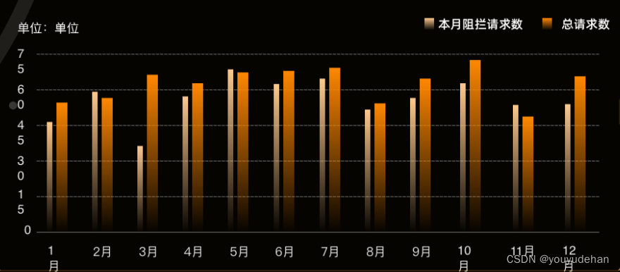
});总结 :如果想实现 数据颜色的渐变,我们可以直接在数据组或者数据列中配置相应的调色板即可,也可以写在全局中,让所有的数据都调用这个调色板。(全局及在 series 外部 )
最终的实现效果: