前言:
用过echarts的朋友们应该都知道,里边的一般都是单色的,但是如果UI把它设计成了渐变色,前端该怎么处理呢?
法一:echarts.graphic.LinearGradient
echarts内置的渐变色生成器 echarts.graphic.LinearGradient可以用来设置渐变色,那该怎么写吗?下面是一个线性渐变的柱状图的例子(此处只附上series中的代码,重点是itemStyle中的部分):
series: [
{
    name: this.legend[0],
    type: 'bar',
    barGap: 0,
    barMaxWidth: 10,
    data:  this.yicheDatas,
    itemStyle: {
        barBorderRadius:  [5, 5, 0, 0],
        color: new echarts.graphic.LinearGradient(
            0, 1, 0, 0,       //4个参数用于配置渐变色的起止位置, 这4个参数依次对应右/下/左/上四个方位. 而0 0 0 1则代表渐变色从正上方开始
            [
                {offset: 1, color: '#2B99FF'},
                {offset: 0, color: '#0084FF'}
            ]
        )
    }
},
{
    name:this.legend[1],
    type: 'bar',
    barMaxWidth: 10,
    data: this.homeOfCarDatas,
    itemStyle: {
        barBorderRadius:  [5, 5, 0, 0],
        color: new echarts.graphic.LinearGradient(
            0, 1, 0, 0,       //4个参数用于配置渐变色的起止位置, 这4个参数依次对应右/下/左/上四个方位. 而0 0 0 1则代表渐变色从正上方开始
            [
                {offset: 1, color: '#39E489'},
                {offset: 0, color: '#35C97A'}
            ]
        )
    }
},
{
    name: this.legend[2],
    type: 'bar',
    barMaxWidth: 10,
    data: this.understandCarDatas,
    barGap:"20%",          //不同系列的柱间距离
    barCategoryGap:"30%",   //同一系列的柱间距离
    itemStyle: {
        barBorderRadius:  [5, 5, 0, 0],
        color: new echarts.graphic.LinearGradient(
            0, 1, 0, 0,       //4个参数用于配置渐变色的起止位置, 这4个参数依次对应右/下/左/上四个方位. 而0 0 0 1则代表渐变色从正上方开始
            [
                {offset: 1, color: '#FFD473'},
                {offset: 0, color: '#FDC955'}
            ]                //数组, 用于配置颜色的渐变过程. 每一项为一个对象, 包含offset和color两个参数. offset的范围是0 ~ 1, 用于表示位置
        )
    }
}]
其中barBorderRadius是用来设置圆角的,颜色部分使用的是echarts内置的渐变色生器 echarts.graphic.LinearGradient,第一个参数是4个0,1参数,用于配置渐变色的起止位置,这4个参数依次对应右/下/左/上四个方位,而0 1 0 0则代表渐变色从正下方开始。第二个参数是个数组,用于配置颜色的渐变过程,每一项为一个对象, 包含offset和color两个参数,offset的范围是0 ~ 1, 用于表示位置。
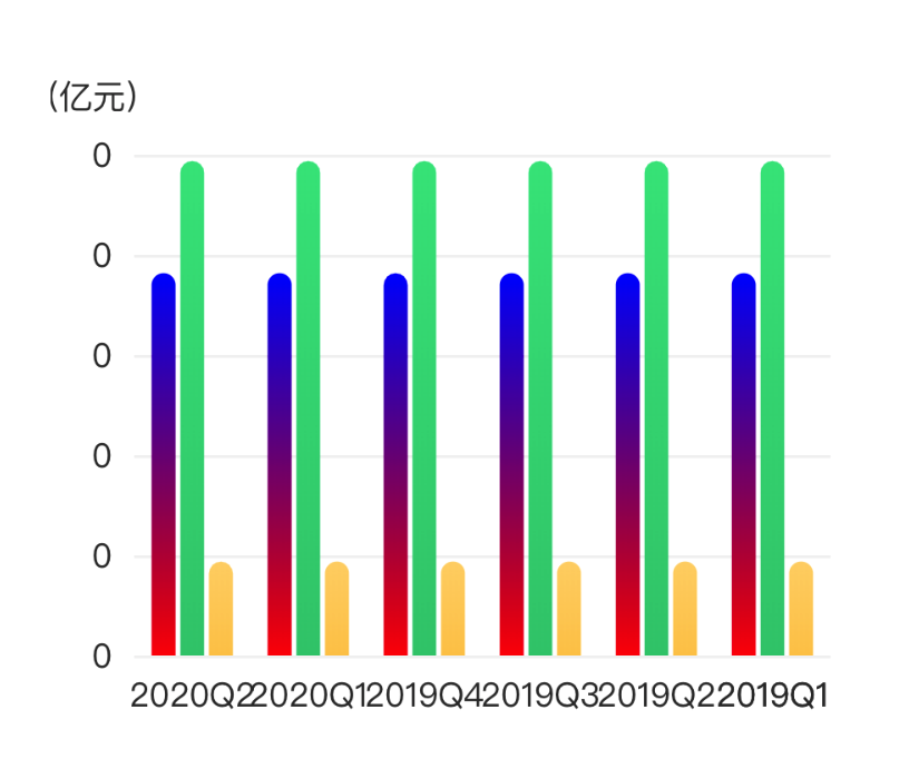
效果图来啦:

这个图中的y轴都是0是因为数据太长,到图外边去了,就被遮住了,但是这不重要。图中的渐变色可能不太明显,不过仔细看是看的出来渐变的。
法二:color属性中就能直接设置渐变色
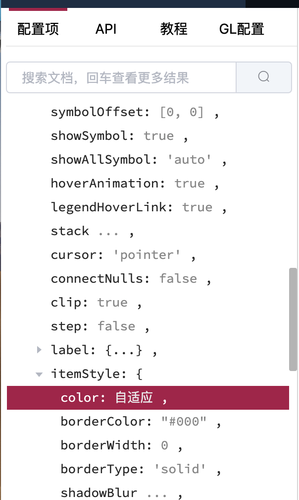
在echarts中series属性中,有一个itemStyle的属性是用来设置每一项的样式的,在itemStyle中的color属性用于设置颜色,支持单色、线性渐变、径向渐变和纹理填充等,好像是每个样式(line、bar等)的都有这个属性,大家可以在官网查看。
还是原来那个图,改变series中的第一个对象中的color,其中x,x2,y,y2分别表示四个不同的方向( 此处指1 ——> 0的方向 ):
- x : 从左向右 1 ——> 0
- x2:从右向左 1 ——> 0
- y:从上向下 1 ——> 0
- y2:从下向上 1 ——> 0
series: [
{
    name: this.legend[0],
    type: 'bar',
    barGap: 0,
    barMaxWidth: 10,
    data:  this.yicheDatas,
    itemStyle: {
        barBorderRadius:  [5, 5, 0, 0],
        color: {
            x: 0,
            y: 1,
            x2: 0,
            y2: 0,
            colorStops: [{
                offset: 0, color: 'red' // 0% 处的颜色
            }, {
                offset: 1, color: 'blue' // 100% 处的颜色
            }],
            global: false // 缺省为 false
        }
    }
},
{
    name:this.legend[1],
    type: 'bar',
    barMaxWidth: 10,
    data: this.homeOfCarDatas,
    itemStyle: {
        barBorderRadius:  [5, 5, 0, 0],
        color: new echarts.graphic.LinearGradient(
            0, 1, 0, 0,
            [
                {offset: 1, color: '#39E489'},
                {offset: 0, color: '#35C97A'}
            ]
        )
    }
},
{
    name: this.legend[2],
    type: 'bar',
    barMaxWidth: 10,
    data: this.understandCarDatas,
    barGap:"20%",          //不同系列的柱间距离
    barCategoryGap:"30%",   //同一系列的柱间距离
    itemStyle: {
        barBorderRadius:  [5, 5, 0, 0],
        color: new echarts.graphic.LinearGradient(
            0, 1, 0, 0,
            [
                {offset: 1, color: '#FFD473'},
                {offset: 0, color: '#FDC955'}
            ]
        )
    }
}]
效果图如下:
这只是柱状图渐变色的例子,其他的几种样式配置都类似,感兴趣的朋友可以自己尝试哦!