提到了两种方式实现了三角形:
- border边框
- linear-gradient渐变
本文将通过第三种方式:使用伪元素的来实现气泡三角形。
1、实心气泡
其实,严格来说,是通过 border+伪元素 实现的,具体的可以参考以下代码:
/* 气泡三角 */
.triangle {
	width: 100px;
    height: 50px;
    background: #abc88b;
    border-radius: 5px;
    position: relative;
}
/* 上 */
.triangle1:before {
	content: "";
    width: 0px;
    height: 0px;
	border-bottom: 8px solid #abc88b;
	border-left: 10px solid transparent;
	border-right: 10px solid transparent;
	position: absolute;
	top: -8px;
	left: 40px;
}
/* 下 */
.triangle2:before {
	content: "";
    width: 0px;
    height: 0px;
	border-top: 10px solid #abc88b;
	border-left: 10px solid transparent;
	border-right: 10px solid transparent;
	position: absolute;
	bottom: -10px;
	left: 40px;
}
/* 左 */
.triangle3:before {
	content: "";
    width: 0px;
    height: 0px;
	border-right: 10px solid #abc88b;
	border-top: 10px solid transparent;
	border-bottom: 10px solid transparent;
	position: absolute;
	top: 15px;
	left: -10px;
}
/* 右 */
.triangle4:before {
	content: "";
    width: 0px;
    height: 0px;
	border-left: 10px solid #abc88b;
	border-top: 10px solid transparent;
	border-bottom: 10px solid transparent;
	position: absolute;
	top: 15px;
	right: -10px;
}
效果图如下:

有没有觉得很眼熟,这不就跟border直接实现差不多吗?不过是换了一种写法而已。
相比于直接使用border,使用伪元素不需要额外再去创建一个div,在一个div上就可以搞定。
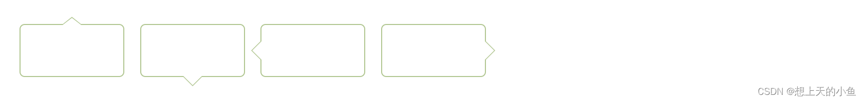
2、空心气泡
实现了实心气泡之后,如果想要空心的要怎么搞呢?
首先,肯定得把背景色去了加一个border;
border: 1px solid #abc88b;其次,我需要一个三角形覆盖住我的实心小三角。
那我前面加了一个伪元素before,我可以再加一个after嘛,after是一个白色小三角,只需要比有颜色的三角形小一个px就可以解决啦。
完整的代码如下:
.triangle {
	width: 100px;
    height: 50px;
    border: 1px solid #abc88b;
    border-radius: 5px;
    position: relative;
}
/* 上 */
.triangle1:before {
	content: "";
    width: 0px;
    height: 0px;
	border-bottom: 8px solid #abc88b;
	border-left: 10px solid transparent;
	border-right: 10px solid transparent;
	position: absolute;
	top: -8px;
	left: 40px;
}
.triangle1:after {
	content: "";
    width: 0px;
    height: 0px;
    border-bottom: 7px solid #ffffff;
    border-left: 9px solid transparent;
    border-right: 9px solid transparent;
    position: absolute;
    top: -7px;
    left: 41px;
}
/* 下 */
.triangle2:before {
	content: "";
    width: 0px;
    height: 0px;
	border-top: 10px solid #abc88b;
	border-left: 10px solid transparent;
	border-right: 10px solid transparent;
	position: absolute;
	bottom: -10px;
	left: 40px;
}
.triangle2:after {
	content: "";
    width: 0px;
    height: 0px;
	border-top: 9px solid #ffffff;
	border-left: 9px solid transparent;
	border-right: 9px solid transparent;
	position: absolute;
	bottom: -9px;
	left: 41px;
}
/* 左 */
.triangle3:before {
	content: "";
    width: 0px;
    height: 0px;
	border-right: 10px solid #abc88b;
	border-top: 10px solid transparent;
	border-bottom: 10px solid transparent;
	position: absolute;
	top: 15px;
	left: -10px;
}
.triangle3:after {
	content: "";
    width: 0px;
    height: 0px;
	border-right: 9px solid #ffffff;
	border-top: 9px solid transparent;
	border-bottom: 9px solid transparent;
	position: absolute;
	top: 16px;
	left: -9px;
}
/* 右 */
.triangle4:before {
	content: "";
    width: 0px;
    height: 0px;
	border-left: 10px solid #abc88b;
	border-top: 10px solid transparent;
	border-bottom: 10px solid transparent;
	position: absolute;
	top: 15px;
	right: -10px;
}
.triangle4:after {
	content: "";
    width: 0px;
    height: 0px;
	border-left: 9px solid #ffffff;
	border-top: 9px solid transparent;
	border-bottom: 9px solid transparent;
	position: absolute;
	top: 16px;
	right: -9px;
}
效果图如下:
OK,掌握了这几种方法之后,实现三角形应该是问题不大了,后续会补充其他方式哦!