目录
2.3.3 切分数据集(Train,Val)进行模型训练,评价和预测
承接上一章:数据挖掘:汽车车交易价格预测(测评指标;EDA)_牛大了2023的博客-CSDN博客来一次实战演练。
一、前期准备
数据集是我以前发在资源里的心脏病数据集,大家可以手动划分一下训练集和测试集。
https://download.csdn.net/download/m0_62237233/87694444?spm=1001.2014.3001.5503
二、实战演练
2.1分类指标评价计算示例
import pandas as pd
import numpy as np
import os, PIL, random, pathlib
data_dir = './data/'
data_dir = pathlib.Path(data_dir)
import torch
import torch.nn as nn
import torchvision.transforms as transforms
import torchvision
import torch.nn.functional as F
device = torch.device("cuda" if torch.cuda.is_available() else "cpu")

print(device)
data_paths = list(data_dir.glob('*'))
classeNames = [str(path).split("\\")[1] for path in data_paths]
print(classeNames)

Train_data = pd.read_csv('data/trainC.csv', sep=',')
Test_data = pd.read_csv('data/testC.csv', sep=',')
print('Train data shape:',Train_data.shape) #包含了标签所以多一列
print('TestA data shape:',Test_data.shape)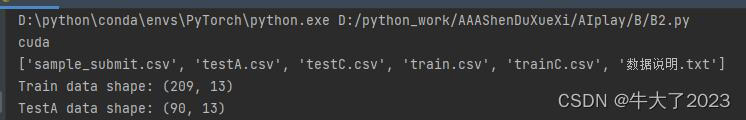
打印相关指标
from sklearn.metrics import accuracy_score
y_pred = [0, 1, 0, 1]
y_true = [0, 1, 1, 1]
print('ACC:',accuracy_score(y_true, y_pred))
## Precision,Recall,F1-score
from sklearn import metrics
y_pred = [0, 1, 0, 0]
y_true = [0, 1, 0, 1]
print('Precision',metrics.precision_score(y_true, y_pred))
print('Recall',metrics.recall_score(y_true, y_pred))
print('F1-score:',metrics.f1_score(y_true, y_pred))import numpy as np
from sklearn.metrics import roc_auc_score
y_true = np.array([0, 0, 1, 1])
y_scores = np.array([0.1, 0.4, 0.35, 0.8])
print('AUC socre:',roc_auc_score(y_true, y_scores))回归指标评价计算也搞里头
# coding=utf-8
import numpy as np
from sklearn import metrics

# MAPE需要自己实现
def mape(y_true, y_pred):
    return np.mean(np.abs((y_pred - y_true) / y_true))

y_true = np.array([1.0, 5.0, 4.0, 3.0, 2.0, 5.0, -3.0])
y_pred = np.array([1.0, 4.5, 3.8, 3.2, 3.0, 4.8, -2.2])

# MSE
print('MSE:',metrics.mean_squared_error(y_true, y_pred))
# RMSE
print('RMSE:',np.sqrt(metrics.mean_squared_error(y_true, y_pred)))
# MAE
print('MAE:',metrics.mean_absolute_error(y_true, y_pred))
# MAPE
print('MAPE:',mape(y_true, y_pred))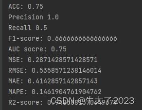
2.2数据探索性分析(EDA)
2.2.1 导入函数工具箱
## 基础工具
import numpy as np
import pandas as pd
import warnings
import matplotlib
import matplotlib.pyplot as plt
import seaborn as sns
from scipy.special import jn
from IPython.display import display, clear_output
import time

warnings.filterwarnings('ignore')


## 模型预测的
from sklearn import linear_model
from sklearn import preprocessing
from sklearn.svm import SVR
from sklearn.ensemble import RandomForestRegressor, GradientBoostingRegressor

## 数据降维处理的
from sklearn.decomposition import PCA, FastICA, FactorAnalysis, SparsePCA

import lightgbm as lgb
import xgboost as xgb

## 参数搜索和评价的
from sklearn.model_selection import GridSearchCV, cross_val_score, StratifiedKFold, train_test_split
from sklearn.metrics import mean_squared_error, mean_absolute_error
# coding:utf-8
# 导入warnings包,利用过滤器来实现忽略警告语句。
import warnings

warnings.filterwarnings('ignore')

import pandas as pd
import numpy as np
import matplotlib.pyplot as plt
import seaborn as sns
import missingno as msno
2.2.2 查看数据信息等相关数据
## 2) 简略观察数据(head()+shape)
print(Train_data.head().append(Train_data.tail()))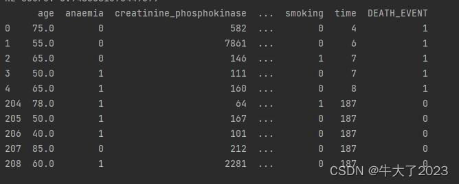
通过describe()来熟悉数据的相关统计量
describe种有每列的统计量,个数count、平均值mean、方差std、最小值min、中位数25% 50% 75% 、以及最大值 看这个信息主要是瞬间掌握数据的大概的范围以及每个值的异常值的判断
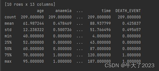
这个数据集没啥问题,但还是要做这些前置工作,要养成这个习惯。
判断数据缺失和异常
print(Train_data.isnull().sum())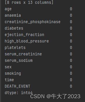
没缺少的
了解预测值分布情况
对预测值分析+对预测值进行统计+对分布情况进行验证,以time变量为例
## 1) 总体分布概况(无界约翰逊分布等)
import scipy.stats as st

y = Train_data['time']
plt.figure(1);
plt.title('Johnson SU')
sns.distplot(y, kde=False, fit=st.johnsonsu)
plt.figure(2);
plt.title('Normal')
sns.distplot(y, kde=False, fit=st.norm)
plt.figure(3);
plt.title('Log Normal')
sns.distplot(y, kde=False, fit=st.lognorm)
plt.show()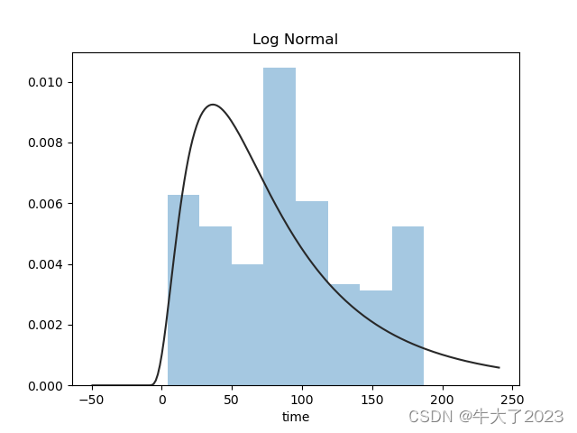
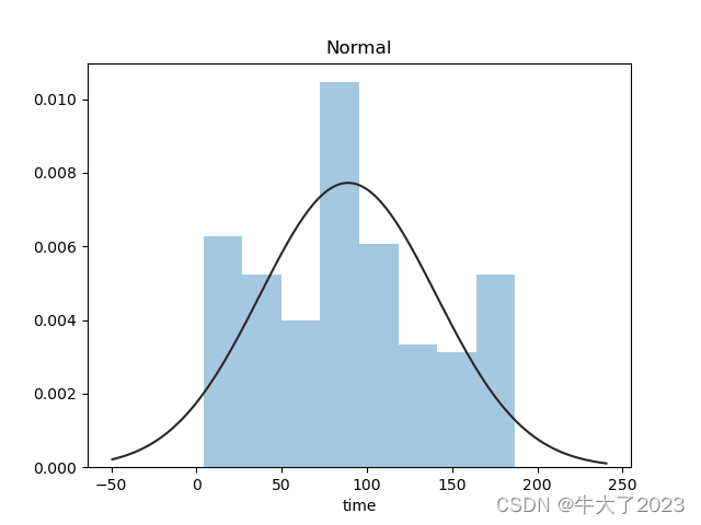
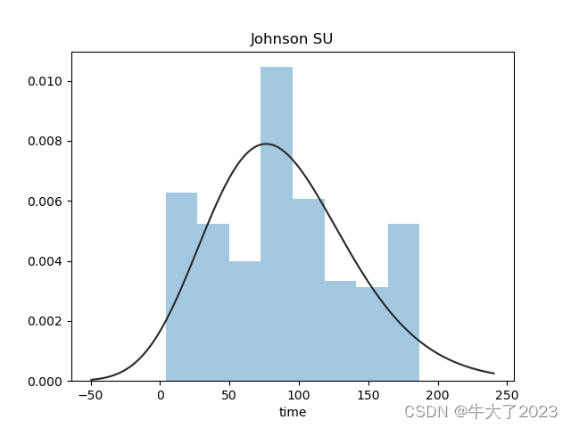
还挺符合正态分布的。在进行回归之前,可以进行转换。虽然对数变换做得很好,但最佳拟合是无界约翰逊分布。
查看频数
plt.hist(Train_data['time'], orientation = 'vertical',histtype = 'bar', color ='red')
plt.show()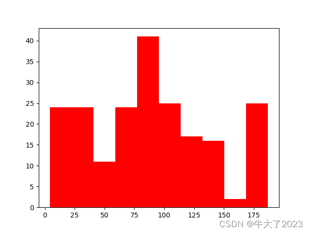
# log变换 z之后的分布较均匀,可以进行log变换进行预测,这也是预测问题常用的trick
plt.hist(np.log(Train_data['price']), orientation = 'vertical',histtype = 'bar', color ='red')
plt.show()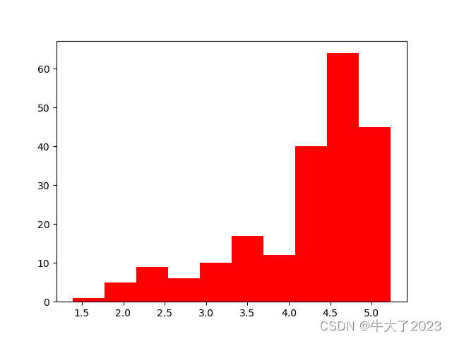
将time进行log变换后趋近于正态分布,可以用来预测。
特征分为类别特征和数字特征,并对类别特征查看unique分布
# 分离label即预测值
Y_train = Train_data['time']

# 这个区别方式适用于没有直接label coding的数据
# 这里不适用,需要人为根据实际含义来区分
# 数字特征
# numeric_features = Train_data.select_dtypes(include=[np.number])
# numeric_features.columns
# # 类型特征
# categorical_features = Train_data.select_dtypes(include=[np.object])
# categorical_features.columns

#数字特征
numeric_features = ['age', 'creatinine_phosphokinase', 'ejection_fraction', 'platelets', 'serum_creatinine', 'serum_sodium', 'time']
#类型特征
categorical_features = ['anaemia', 'diabetes', 'high_blood_pressure', 'sex', 'smoking',  'DEATH_EVENT']

# 特征nunique分布
for cat_fea in categorical_features:
    print(cat_fea + "的特征分布如下:")
    print("{}特征有个{}不同的值".format(cat_fea, Train_data[cat_fea].nunique()))
    print(Train_data[cat_fea].value_counts())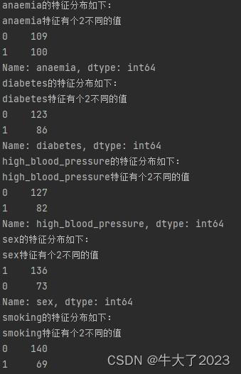
相关性分析:
## 1) 相关性分析

numeric_features.append('DEATH_EVENT')
price_numeric = Train_data[numeric_features]
correlation = price_numeric.corr()
print(correlation['DEATH_EVENT'].sort_values(ascending = False),'\n') 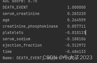
数字特征相互之间的关系可视化
## 4) 数字特征相互之间的关系可视化
sns.set()
columns = ['age', 'creatinine_phosphokinase', 'ejection_fraction', 'platelets', 'serum_creatinine', 'serum_sodium', 'time']
sns.pairplot(Train_data[columns],size = 2 ,kind ='scatter',diag_kind='kde')
plt.show()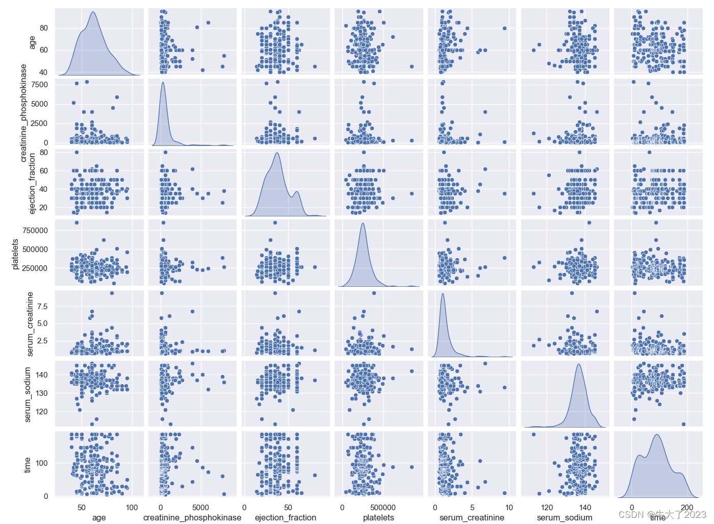
弄time和其他的看看
## 5) 多变量互相回归关系可视化
fig, ((ax1, ax2), (ax3, ax4), (ax5, ax6), (ax7, ax8), (ax9, ax10)) = plt.subplots(nrows=5, ncols=2, figsize=(24, 20))
# ['age', 'creatinine_phosphokinase' , 'ejection_fraction', 'platelets', 'serum_creatinine',  'time']
age_scatter_plot = pd.concat([Y_train, Train_data['age']], axis=1)
sns.regplot(x='age', y='time', data=age_scatter_plot, scatter=True, fit_reg=True, ax=ax1)

creatinine_phosphokinase_scatter_plot = pd.concat([Y_train, Train_data['creatinine_phosphokinase']], axis=1)
sns.regplot(x='creatinine_phosphokinase', y='time', data=creatinine_phosphokinase_scatter_plot, scatter=True,
            fit_reg=True, ax=ax2)

ejection_fraction_scatter_plot = pd.concat([Y_train, Train_data['ejection_fraction']], axis=1)
sns.regplot(x='ejection_fraction', y='time', data=ejection_fraction_scatter_plot, scatter=True, fit_reg=True, ax=ax3)

platelets_scatter_plot = pd.concat([Y_train, Train_data['platelets']], axis=1)
sns.regplot(x='platelets', y='time', data=platelets_scatter_plot, scatter=True, fit_reg=True, ax=ax4)

serum_creatinine_scatter_plot = pd.concat([Y_train, Train_data['serum_creatinine']], axis=1)
sns.regplot(x='serum_creatinine', y='time', data=serum_creatinine_scatter_plot, scatter=True, fit_reg=True, ax=ax5)

# time_scatter_plot = pd.concat([Y_train, Train_data['time']], axis=1)
# sns.regplot(x='time', y='time', data=time_scatter_plot, scatter=True, fit_reg=True, ax=ax6)

plt.show()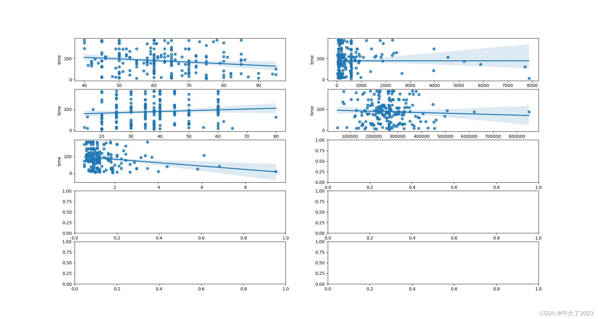
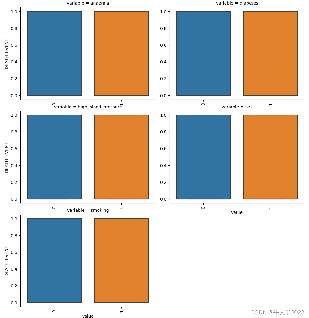
类别特征分析(箱图,小提琴图,柱形图)
# 因为 name和 regionCode的类别太稀疏了,这里我们把不稀疏的几类画一下
categorical_features = ['anaemia',
                        'diabetes',
                        'high_blood_pressure',
                        'sex',
                        'smoking']
for c in categorical_features:
    Train_data[c] = Train_data[c].astype('category')
    if Train_data[c].isnull().any():
        Train_data[c] = Train_data[c].cat.add_categories(['MISSING'])
        Train_data[c] = Train_data[c].fillna('MISSING')


def boxplot(x, y, **kwargs):
    sns.boxplot(x=x, y=y)
    x = plt.xticks(rotation=90)


f = pd.melt(Train_data, id_vars=['DEATH_EVENT'], value_vars=categorical_features)  # 预测值
g = sns.FacetGrid(f, col="variable", col_wrap=2, sharex=False, sharey=False, height=5)
g = g.map(boxplot, "value", "DEATH_EVENT")
plt.show()
因为都是0-1数据,所以好像没法直观看…不再演示其他类型图了
类别特征的每个类别频数可视化(count_plot)
##  5) 类别特征的每个类别频数可视化(count_plot)
def count_plot(x,  **kwargs):
    sns.countplot(x=x)
    x=plt.xticks(rotation=90)

f = pd.melt(Train_data,  value_vars=categorical_features)
g = sns.FacetGrid(f, col="variable",  col_wrap=2, sharex=False, sharey=False, height=5)
g = g.map(count_plot, "value")
plt.show()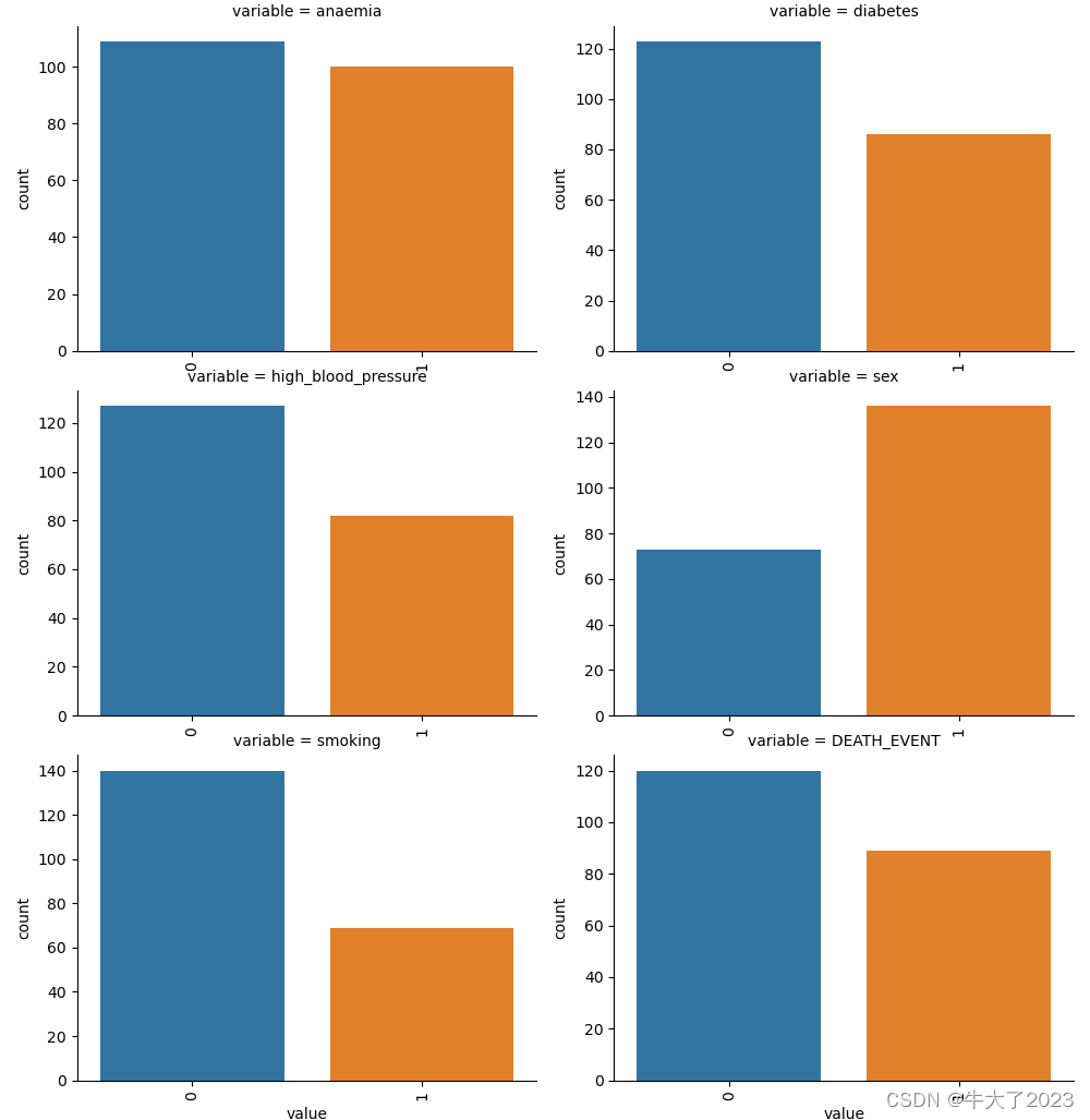
2.2.3特征与标签构建
- 提取数值类型特征列名
numerical_cols = Train_data.select_dtypes(exclude='object').columns
print(numerical_cols)


categorical_cols = Train_data.select_dtypes(include='object').columns
print(categorical_cols)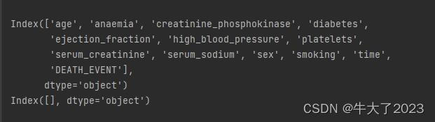
- 构建训练和测试样本
## 提前特征列,标签列构造训练样本和测试样本
X_data = Train_data[feature_cols]
Y_data = Train_data['time']

X_test = Test_data[feature_cols]

print('X train shape:', X_data.shape)
print('X test shape:', X_test.shape)
X train shape: (209, 13)
X test shape: (90, 13)
- 统计标签的基本分布信息
## 定义了一个统计函数,方便后续信息统计
def Sta_inf(data):
print('_min', np.min(data))
print('_max:', np.max(data))
print('_mean', np.mean(data))
print('_ptp', np.ptp(data))
print('_std', np.std(data))
print('_var', np.var(data))
print('Sta of label:')
Sta_inf(Y_data)
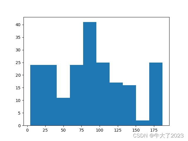
## 绘制标签的统计图,查看标签分布
plt.hist(Y_data)
plt.show()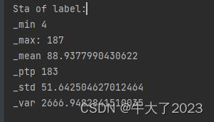
2.3模型训练与预测
2.3.1 利用xgb进行五折交叉验证查看模型的参数效果
## xgb-Model
xgr = xgb.XGBRegressor(n_estimators=120, learning_rate=0.1, gamma=0, subsample=0.8,\
        colsample_bytree=0.9, max_depth=7) #,objective ='reg:squarederror'
#簇120,学习率0.1 ,深度为7
scores_train = []
scores = []

## 5折交叉验证方式,防止过拟合
sk=StratifiedKFold(n_splits=5,shuffle=True,random_state=0)
for train_ind,val_ind in sk.split(X_data,Y_data):

    train_x=X_data.iloc[train_ind].values
    train_y=Y_data.iloc[train_ind]
    val_x=X_data.iloc[val_ind].values
    val_y=Y_data.iloc[val_ind]

    xgr.fit(train_x,train_y)
    pred_train_xgb=xgr.predict(train_x)
    pred_xgb=xgr.predict(val_x)

    score_train = mean_absolute_error(train_y,pred_train_xgb)
    scores_train.append(score_train)
    score = mean_absolute_error(val_y,pred_xgb)
    scores.append(score)

print('Train mae:',np.mean(score_train))
print('Val mae',np.mean(scores))
Train mae: 0.04781590756915864
Val mae 1.206481080991189
2.3.2 定义xgb和lgb模型函数
def build_model_xgb(x_train,y_train):
    model = xgb.XGBRegressor(n_estimators=150, learning_rate=0.1, gamma=0, subsample=0.8,\
        colsample_bytree=0.9, max_depth=7) #, objective ='reg:squarederror'
    model.fit(x_train, y_train)
    return model

def build_model_lgb(x_train,y_train):
    estimator = lgb.LGBMRegressor(num_leaves=127,n_estimators = 150)
    param_grid = {
        'learning_rate': [0.01, 0.05, 0.1, 0.2],
    }
    gbm = GridSearchCV(estimator, param_grid)  #网格搜索
    gbm.fit(x_train, y_train)
    return gbm
网格搜索自动调参方式,对param_grid中参数进行改正,可以添加学习率等等参数
 param_grid = {
        'learning_rate': [0.01, 0.05, 0.1, 0.2],
        'n_estimators': [100, 140, 120, 130],

    }
2.3.3 切分数据集(Train,Val)进行模型训练,评价和预测
## Split data with val
x_train,x_val,y_train,y_val = train_test_split(X_data,Y_data,test_size=0.3)
按比例切分,也可以4:1 即test_size=0.2
 print('Train lgb...')
model_lgb = build_model_lgb(x_train,y_train)
val_lgb = model_lgb.predict(x_val)
MAE_lgb = mean_absolute_error(y_val,val_lgb)
print('MAE of val with lgb:',MAE_lgb)

print('Predict lgb...')
model_lgb_pre = build_model_lgb(X_data,Y_data)
subA_lgb = model_lgb_pre.predict(X_test)
print('Sta of Predict lgb:')
Sta_inf(subA_lgb)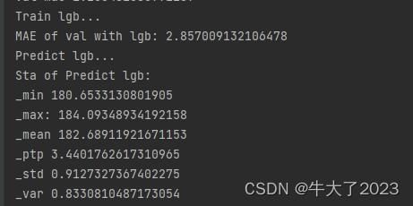
print('Train xgb...')
model_xgb = build_model_xgb(x_train,y_train)
val_xgb = model_xgb.predict(x_val)
MAE_xgb = mean_absolute_error(y_val,val_xgb)
print('MAE of val with xgb:',MAE_xgb)

print('Predict xgb...')
model_xgb_pre = build_model_xgb(X_data,Y_data)
subA_xgb = model_xgb_pre.predict(X_test)
print('Sta of Predict xgb:')
Sta_inf(subA_xgb)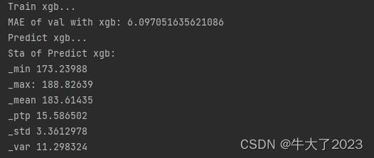
2.3.4 进行两模型的结果加权融合
## 这里我们采取了简单的加权融合的方式
val_Weighted = (1-MAE_lgb/(MAE_xgb+MAE_lgb))*val_lgb+(1-MAE_xgb/(MAE_xgb+MAE_lgb))*val_xgb
val_Weighted[val_Weighted<0]=10 # 由于我们发现预测的最小值有负数,而真实情况下,price为负是不存在的,由此我们进行对应的后修正
print('MAE of val with Weighted ensemble:',mean_absolute_error(y_val,val_Weighted))
MAE of val with Weighted ensemble: 3.1147994422143657