前言
本系列主要整理前端面试中需要掌握的知识点。本节介绍CSS3动画知识。
一、动画是什么
- 过渡动画:transition。
- 转换动画:transform。
- 自定义动画:animation。
二、过渡动画:transition
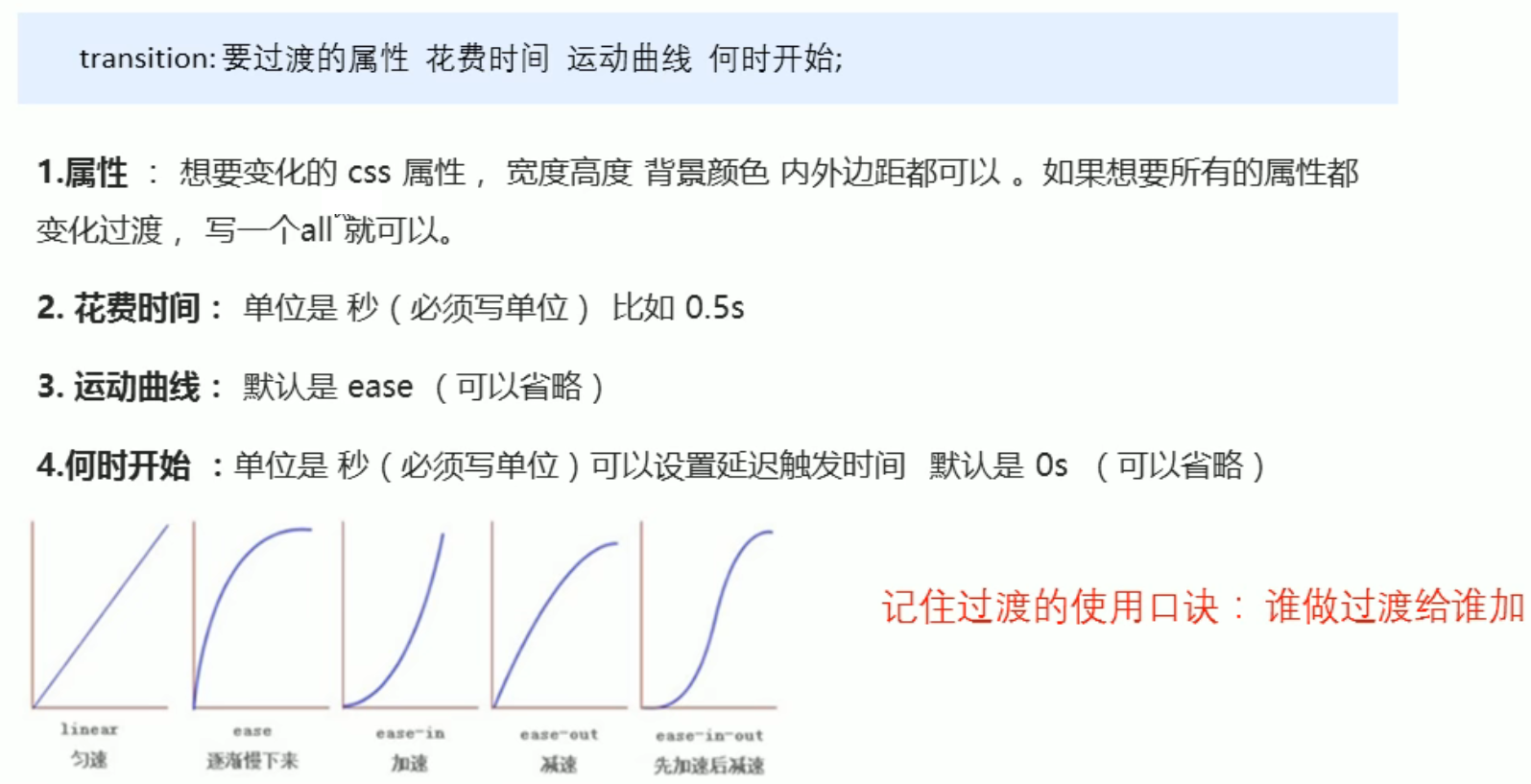
<head>
	<style>
        .box {


            width: 200px;
            height: 100px;
            background-color: pink;
            /* transition: width 1s, height 2s; */
            transition: all 1s;
        }
        .box:hover {


            width: 400px;
            height: 500px;
            background-color: skyblue;
        }
    </style>
</head>
<body>
    <div class="box"></div>
</body>
三、转换动画:transform
- translate移动
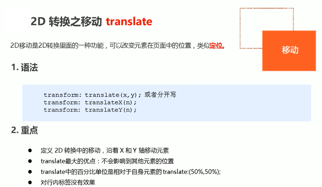
.box {


    width: 200px;
    height: 100px;
    background-color: pink;
    transform: translate(100px,200px);
}
定位+transform: translate(-50%,-50%)可以实现元素居中
- rotate旋转
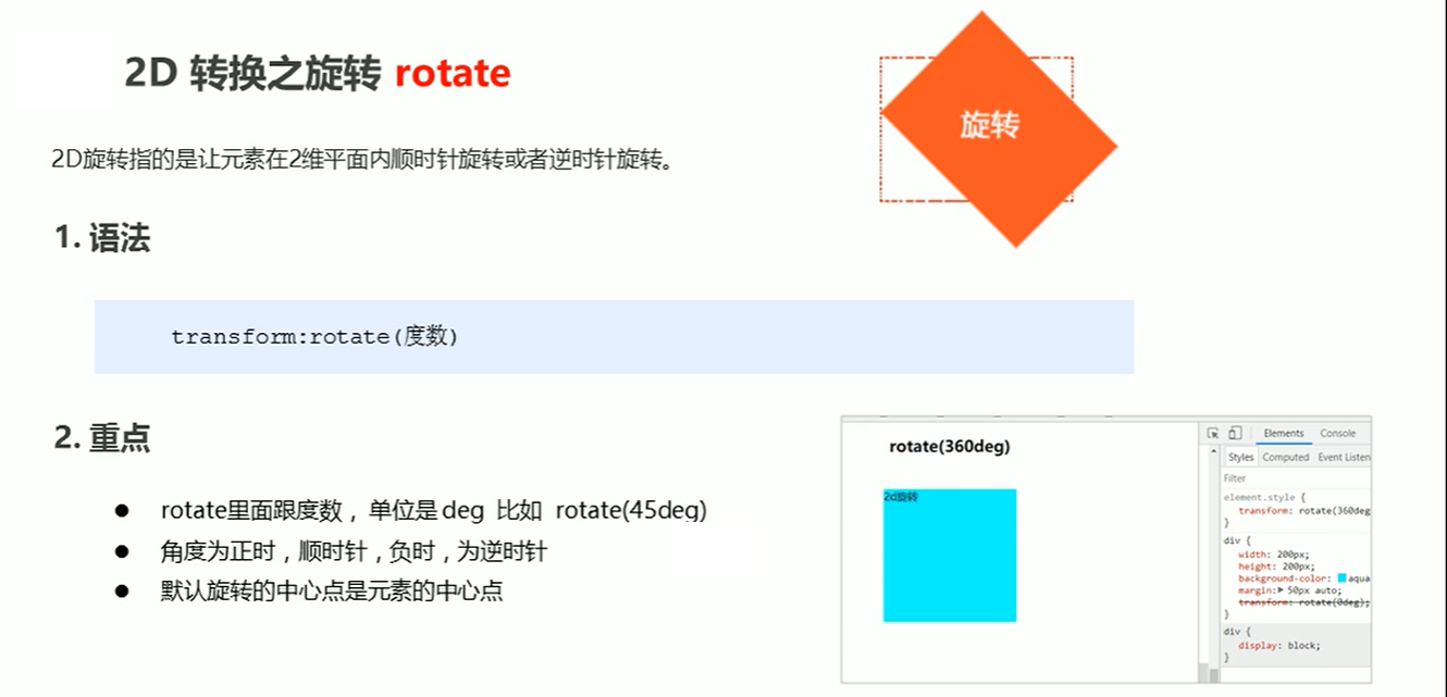
img {


    width: 200px;
    transform: rotate(45deg);
}
设置转换中心点 transform-origin
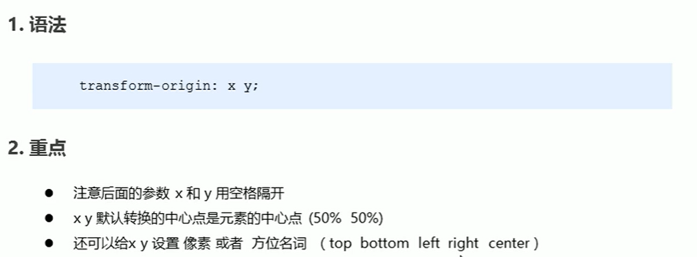
img {


    width: 200px;
    transform-origin: top right;
    transform: rotate(45deg);
}
- scale缩放
.box2 {


    width: 200px;
    height: 100px;
    background-color: pink;
    transform: scale(2,1.5)
}
- skew倾斜
.box2 {


    width: 200px;
    height: 100px;
    background-color: black;
    transform: skew(30deg,20deg)
}
四、自定义动画:animation
-
先定义动画;
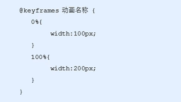
-
再使用动画
/* 使用动画 */
animation-name: move;
animation-duration: 2s;
- 动画序列
@keyframes move {


    0% {


        transform: translate(0,0);
    }
    25% {


        transform: translate(500px,0);
    }
    50% {


        transform: translate(500px,500px);
    }
    75% {


        transform: translate(0,500px);
    }
    100% {


        transform: translate(0,0);
    }
}
- 常用属性
| 属性 | 描述 |
|---|---|
| animation-name | 动画名称 |
| animation-duration | 动画持续时间 |
| animation-timing-function | 动画时间函数,默认ease |
| animation-delay | 动画延迟时间 |
| animation-iteration-count | 动画执行次数,可以设置为一个整数,也可以设置为infinite,意思是无限循环 |
| animation-direction | 动画执行方向,是否反方向播放 |
| animation-paly-state | 动画播放状态 |
| animation-fill-mode | 动画填充模式 |