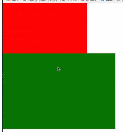
1、margin塌陷
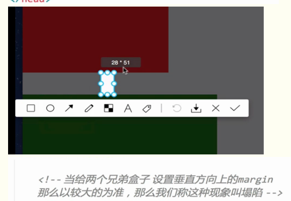
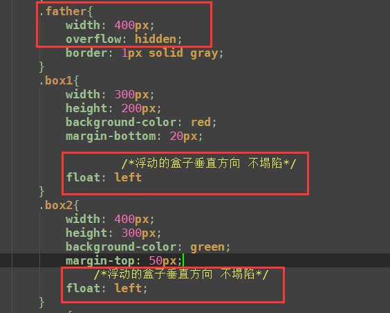
<!DOCTYPE html>
<html lang="en">
<head>
    <meta charset="UTF-8">
    <title>margin的塌陷</title>

    <style type="text/css">
        *{
            padding: 0;
            margin: 0;
        }
        .box1{
            width: 300px;
            height: 200px;
            background-color: red;
            margin-bottom: 20px;

        }
        .box2{
            width: 400px;
            height: 300px;
            background-color: green;
            margin-top: 50px;

        }
        span{
            background-color: red;
        }
        span.a{
            margin-right: 20px;
        }
        span.b{
            margin-left: 20px;
        }
    </style>
</head>
<body>
    <div class="father">

        <!-- 当给两个兄弟盒子 设置垂直方向上的margin 那么以较大的为准,
        那么我们称这种现象叫塌陷
        -->
        <div class="box1"></div>

        <div class="box2"></div>


    </div>
    <span class="a">内容</span>
    <span class="b">内容</span>

</body>
</html>
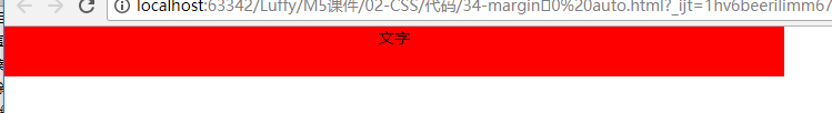
2、margin:0 auto; 标准流盒子
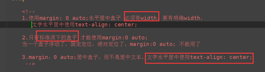
<!DOCTYPE html>
<html lang="en">
<head>
    <meta charset="UTF-8">
    <title>margin:0 auto</title>
    <style type="text/css">

        *{
            padding: 0;
            margin: 0;
        }

        div{
            width: 780px;
            height: 50px;
            background-color: red;
            /*水平居中盒子*/
            margin: 0 auto;

            /*margin-left: auto;
            margin-right: auto;*/
            text-align: center;
            float: left;

        }

    </style>
</head>
<body>


    <div>
        文字
    </div>

</body>
</html>
3
4
5