1、margin塌陷
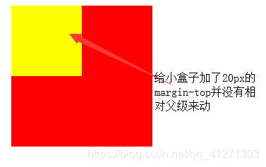
问题:垂直方向的父子关系的盒子使用不当会产生margin塌陷。给子级设置margin-top时,他不会相对父级一起动,只有他的margin超过父级的margin时,才会生效,但会带着父级一起动(作者总结,官方定义自己查看)。
如:
<!DOCTYPE html>
<html lang="en">
<head>
    <meta charset="UTF-8">
    <meta name="viewport" content="width=device-width, initial-scale=1.0">
    <meta http-equiv="X-UA-Compatible" content="ie=edge">
    <title>Document</title>
</head>
<body>
    <div class="parent" style="width:200px;height:200px; background-color:red;margin-top:20px;margin-left:20px">
        <div class="son" style="width:100px;height:100px; background-color:yellow; margin-top:20px ">//20pxmargin-top
        </div>
    </div>
</body>
</html>
解决方法:
(1)给父级盒子加上边框border:1px silod black;(改变结构了,不推荐使用)
<!DOCTYPE html>
<html lang="en">
<head>
    <meta charset="UTF-8">
    <meta name="viewport" content="width=device-width, initial-scale=1.0">
    <meta http-equiv="X-UA-Compatible" content="ie=edge">
    <title>Document</title>
</head>
<body>
    <div class="parent" style="width:200px;height:200px;
    background-color:red;margin-top:20px;margin-left:20px;border:1px solid black">
        <div class="son" style="width:100px;height:100px; background-color:yellow; margin-top:20px ">
        </div>
    </div>
</body>
</html>
效果: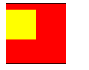
(2)触发盒子的BFC模型(不懂就去百度吧)
如何触发盒子的BFC呢?
1.Position:absolute;
2.display:inline-block;
3.float:left/right;
4.overflow:hiddle;
1.Position:absolute;给父级加上绝对定位,让子级相对父级动。
<!DOCTYPE html>
<html lang="en">
<head>
    <meta charset="UTF-8">
    <meta name="viewport" content="width=device-width, initial-scale=1.0">
    <meta http-equiv="X-UA-Compatible" content="ie=edge">
    <title>Document</title>
</head>
<body>
    <div class="parent" style="width:200px;height:200px;
    background-color:red;margin-top:20px;margin-left:20px;position: absolute;">
        <div class="son" style="width:100px;height:100px; background-color:yellow; margin-top:20px ">
        </div>
    </div>
</body>
</html>
效果:

2.display:inline-block;让父级同时具有行级属性和块级属性。
<!DOCTYPE html>
<html lang="en">
<head>
    <meta charset="UTF-8">
    <meta name="viewport" content="width=device-width, initial-scale=1.0">
    <meta http-equiv="X-UA-Compatible" content="ie=edge">
    <title>Document</title>
</head>
<body>
    <div class="parent" style="width:200px;height:200px;
 background-color:red;margin-top:20px;margin-left:20px;display: inline-block;">
        <div class="son" style="width:100px;height:100px; background-color:yellow; margin-top:20px ">
        </div>
    </div>
</body>
</html>
效果:

3.float:left/right;让父级产生浮动流
<!DOCTYPE html>
<html lang="en">
<head>
    <meta charset="UTF-8">
    <meta name="viewport" content="width=device-width, initial-scale=1.0">
    <meta http-equiv="X-UA-Compatible" content="ie=edge">
    <title>Document</title>
</head>
<body>
    <div class="parent" style="width:200px;height:200px;
 background-color:red;margin-top:20px;margin-left:20px; float:left;">
        <div class="son" style="width:100px;height:100px; background-color:yellow; margin-top:20px ">
        </div>
    </div>
</body>
</html>
效果:

4.overflow:hiddle;溢出部分隐藏
<!DOCTYPE html>
<html lang="en">
<head>
    <meta charset="UTF-8">
    <meta name="viewport" content="width=device-width, initial-scale=1.0">
    <meta http-equiv="X-UA-Compatible" content="ie=edge">
    <title>Document</title>
</head>
<body>
    <div class="parent" style="width:200px;height:200px;
 background-color:red;margin-top:20px;margin-left:20px; overflow: hidden;">
        <div class="son" style="width:100px;height:100px; background-color:yellow; margin-top:20px ">
        </div>
    </div>
</body>
</html>
效果:

2、margin合并
问题:
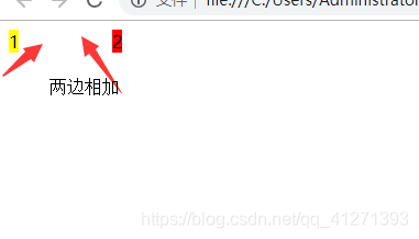
margin-left和margin-right区域不能共用。只会叠加。
<!DOCTYPE html>
<html lang="en">
<head>
    <meta charset="UTF-8">
    <meta name="viewport" content="width=device-width, initial-scale=1.0">
    <meta http-equiv="X-UA-Compatible" content="ie=edge">
    <title>Document</title>
</head>
<body>
    <span class="box1" style="background-color:yellow; margin-right:30px;">1</span>
    <span class="box2" style="background-color:red; margin-left:50px;">2</span>
</body>
</html>
效果:
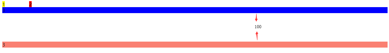
两个兄弟结构垂直方向的margin共用。
<!DOCTYPE html>
<html lang="en">
<head>
    <meta charset="UTF-8">
    <meta name="viewport" content="width=device-width, initial-scale=1.0">
    <meta http-equiv="X-UA-Compatible" content="ie=edge">
    <title>Document</title>
</head>
<body>
    <span class="box1" style="background-color:yellow; margin-right:30px;">1</span>
    <span class="box2" style="background-color:red; margin-left:50px;">2</span>
    <div class="demo1" style="background-color:blue; margin-bottom:100px ;">3</div>
    <div class="demo2" style="background-color:salmon; margin-top: 100px;">3</div>
</body>
</html>
效果:
解决垂直方向的margin合并问题也是触动盒子的BFC。
解决方法如下:(嵌套盒子:然后:overflower:hidden;)
<!DOCTYPE html>
<html lang="en">
<head>
    <meta charset="UTF-8">
    <meta name="viewport" content="width=device-width, initial-scale=1.0">
    <meta http-equiv="X-UA-Compatible" content="ie=edge">
    <title>Document</title>
</head>
<body>
    <span class="box1" style="background-color:yellow; margin-right:30px;">1</span>
    <span class="box2" style="background-color:red; margin-left:50px;">2</span>
    <div style="overflow:hidden;">
    <div class="demo1" style="background-color:blue; margin-bottom:100px ;">3</div>
</div>
    <div class="demo2" style="background-color:salmon; margin-top: 100px;">3</div>

</body>
</html>
效果:

总结:
在实际开发时不解决这个问题,比如说要解决垂直方面200px,为什么不直接top200px呢,不用top100px,然后bottom100px。
顺带说一下清除浮动的两种两种方法:
(1)在有浮动的元素的后面加入一个标签。
下面我就简单举例了:
想看更详细的解答,请继续关注作者的更新。