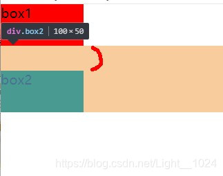
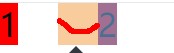
1、垂直方向塌陷
1、只有标准流下垂直方向产生的问题,如果给两个盒子在垂直方向设置margin间隔,以较大的为准,会产生塌陷。
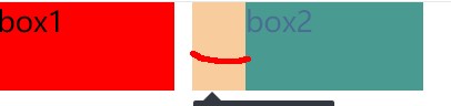
2、盒子标准流左右不会产生,浮动流上下显示或浮动并排左右也不会产生。
如下:盒子1和2之间间距并不是40,而是30;

<style type="text/css">
		*{
			padding: 0;
			margin: 0;
		}
		.box1{
			width: 100px;
			height: 50px;
			margin-bottom: 10px;
			background-color: red;
		}
		.box2{
			width: 100px;
			height: 50px;
			margin-top: 30px;
			background-color: green;
		}
	</style>
</head>
<body>
	<div class="father">
		<div class="box1">box1</div>
		<div class="box2">box2</div>
	</div>
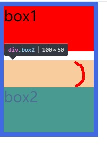
如下:则没有发生塌陷
<style type="text/css">
		*{
			padding: 0;
			margin: 0;
		}
		.father{
			width: 100px;
			border: 5px solid royalblue;
			/*overflow: hidden;*/
		}
		.box1{
			width: 100px;
			height: 50px;
			margin-bottom: 10px;
			background-color: red;
			float: left;
		}
		.box2{
			width: 100px;
			height: 50px;
			margin-top: 30px;
			background-color: green;
			float: left;
		}
	</style>
</head>
<body>
	<div class="father">
		<div class="box1">box1</div>
		<div class="box2">box2</div>
	</div>
浮动并排,水平方向没有发生:
标准流下左右也没有浮动:
居中:0 auto
margin: 0 auto
auto 意思是尽可能显示。
margin:0代表上下 auto代表左右
margin: 10px auto 则水平居中,上下10px


margin: 0 auto =
    margin-left:auto
    margin-right: auto
1、标准流下盒子水平居中,设置宽度后用margin: 0 auto
2、浮动,相对定位和绝对定位不能用。
3、文本没有居中。
	<style type="text/css">
		* {
			padding: 0;
			margin: 0;
		}

		div{
			width:800px;
			background-color: red;
			margin: 0 auto;

			/*设置文本居中*/
			/*text-align: center;*/
		}
	</style>
</head>
<body>
	<div>
		内容
	</div>

再次理解盒子模型,两种方式做出如下效果:
1、用margin
<style type="text/css">
		* {
			padding: 0;
			margin: 0;
		}
		.box1{
			width: 300px;
			height:300px;
			background-color: red;

			/*把盒子1顶部用border固定,不然box1和box2一起往下*/
			border-top: 3px solid red;
		}
		.box2{
			width: 150px;
			height: 150px;
			background-color: royalblue;
			margin-left: 20px;
			margin-top: 20px;
		}

	</style>
</head>
<body>
	<div class="box1">
		<div class="box2"></div>
	</div>
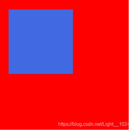
2、用padding
	<style type="text/css">
		* {
			padding: 0;
			margin: 0;
		}
		.box1{
			width: 280px;
			height:280px;
			background-color: red;

			/*用内边距*/
			padding-left: 20px;
			padding-top: 20px;

			border-top: 3px solid red;


		}
		.box2{
			width: 150px;
			height: 150px;
			background-color: royalblue;
		}

	</style>
</head>
<body>
	<div class="box1">
		<div class="box2"></div>
	</div>
</body>
</html>
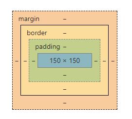
再看盒子模型:
box1:
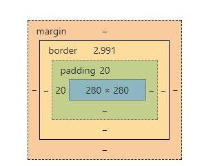
box2: