五一假期,来点轻松点的知识!
整个新系列。目前的几个系列, #R实战 以生信分析为主, #跟着CNS学作图 以复现顶刊Figure为主,而本系列 #R绘图 则是学习不在文章中但同样很好看的图,致力于给同学们在数据可视化中提供新的思路和方法。
本期图片

示例数据和代码领取
点赞、在看 本文,分享至朋友圈集赞20个并保留30分钟,截图发至微信mzbj0002领取。
木舟笔记2022年度VIP可免费领取。
木舟笔记2022年度VIP企划
权益:
2022年度木舟笔记**所有推文示例数据及代码(在VIP群里实时更新)**。
木舟笔记科研交流群。
半价购买
跟着Cell学作图系列合集(免费教程+代码领取)|跟着Cell学作图系列合集。
收费:
99¥/人。可添加微信:mzbj0002 转账,或直接在文末打赏。

绘制
# 加载包
library(tidyverse)
library(ggplot2)

# 示例数据准备
niwot_plant_exp <- read.csv("niwot_plant_exp.csv")
# Calculate species richness per plot per year
niwot_richness <- niwot_plant_exp %>%
  group_by(plot_num, year) %>%
  mutate(richness = length(unique(USDA_Scientific_Name))) %>%
  ungroup()
distributions1 <- ggplot(niwot_richness, aes(x = fert, y = richness)) +
geom_violin()
distributions1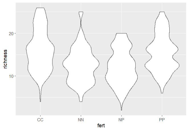
图很丑,但这是对数据分布的有效观察。我们可以添加一些颜色,也可以添加我们的自定义主题。
theme_niwot <- function(){
  theme_bw() +
    theme(text = element_text(family = "Helvetica Light"),
          axis.text = element_text(size = 16),
          axis.title = element_text(size = 18),
          axis.line.x = element_line(color="black"),
          axis.line.y = element_line(color="black"),
          panel.border = element_blank(),
          panel.grid.major.x = element_blank(),
          panel.grid.minor.x = element_blank(),
          panel.grid.minor.y = element_blank(),
          panel.grid.major.y = element_blank(),
          plot.margin = unit(c(1, 1, 1, 1), units = , "cm"),
          plot.title = element_text(size = 18, vjust = 1, hjust = 0),
          legend.text = element_text(size = 12),
          legend.title = element_blank(),
          legend.position = c(0.95, 0.15),
          legend.key = element_blank(),
          legend.background = element_rect(color = "black",
                                           fill = "transparent",
                                           size = 2, linetype = "blank"))
}

distributions2 <- ggplot(niwot_richness, aes(x = fert, y = richness)) +
  geom_violin(aes(fill = fert, colour = fert), alpha = 0.5) +
  # alpha控制不透明度
  theme_niwot()

distributions2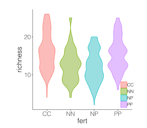
看起来好多了,但对于读者来说,要找出每个类别的平均值仍然很难。这样我们就可以用箱形图把小提琴覆盖起来。
distributions3 <- ggplot(niwot_richness, aes(x = fert, y = richness)) +
  geom_violin(aes(fill = fert, colour = fert), alpha = 0.5) +
  geom_boxplot(aes(colour = fert), width = 0.2) + # 添加箱线图图层
  theme_niwot()
distributions3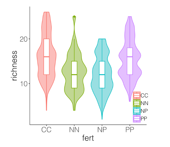
虽然箱线图在图上添加了更多的信息,但我们仍然不知道数据点的确切位置,小提琴的平滑函数有时会隐藏给定变量的真实值。不用箱线图,我们可以加上实际数据点。
distributions4 <- ggplot(niwot_richness, aes(x = fert, y = richness)) +
  geom_violin(aes(fill = fert, colour = fert), alpha = 0.5) +
  geom_jitter(aes(colour = fert), position = position_jitter(0.1), # 添加散点
              alpha = 0.3) +
  theme_niwot()
distributions4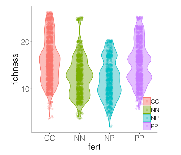
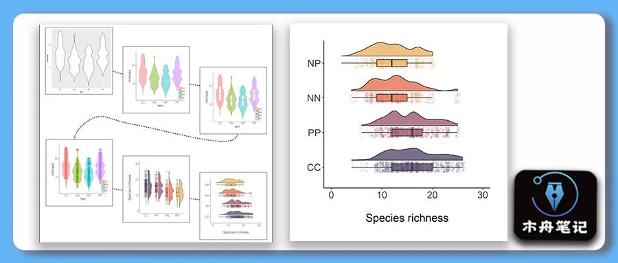
可以看到,虽然能看到真实的数据,但当这些点放在小提琴上时,很难区分。这就到了雨云图发挥作用的时候,它结合了真实数据点和箱线图的分布。
# This code loads the function in the working environment
source("geom_flat_violin.R")
distributions5 <-
  ggplot(data = niwot_richness,
         aes(x = reorder(fert, desc(richness)), y = richness, fill = fert)) +
  # 半小提琴
  geom_flat_violin(position = position_nudge(x = 0.2, y = 0), alpha = 0.8) +
  # 散点
  geom_point(aes(y = richness, color = fert),
             position = position_jitter(width = 0.15), size = 1, alpha = 0.1) +
  # 箱线
  geom_boxplot(width = 0.2, outlier.shape = NA, alpha = 0.8) +
  # \n 添加一个新行,在轴和轴标题之间创建一些空间

  labs(y = "Species richness\n", x = NULL) +
  # 删除图例
  guides(fill = FALSE, color = FALSE) +
  # 设置 y 轴范围
  scale_y_continuous(limits = c(0, 30)) +
  # 颜色
  scale_fill_manual(values = c("#5A4A6F", "#E47250",  "#EBB261", "#9D5A6C")) +
  scale_colour_manual(values = c("#5A4A6F", "#E47250",  "#EBB261", "#9D5A6C")) +
  theme_niwot()
distributions5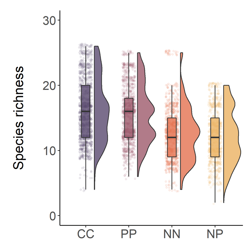
可以翻转x轴和y轴。
distributions6 <-
    ggplot(data = niwot_richness,
           aes(x = reorder(fert, desc(richness)), y = richness, fill = fert)) +
    geom_flat_violin(position = position_nudge(x = 0.2, y = 0), alpha = 0.8) +
    geom_point(aes(y = richness, color = fert),
               position = position_jitter(width = 0.15), size = 1, alpha = 0.1) +
    geom_boxplot(width = 0.2, outlier.shape = NA, alpha = 0.8) +
    labs(y = "\nSpecies richness", x = NULL) +
    guides(fill = FALSE, color = FALSE) +
    scale_y_continuous(limits = c(0, 30)) +
    scale_fill_manual(values = c("#5A4A6F", "#E47250",  "#EBB261", "#9D5A6C")) +
    scale_colour_manual(values = c("#5A4A6F", "#E47250",  "#EBB261", "#9D5A6C")) +
    coord_flip() +
    theme_niwot()

ggsave(distributions6, filename = "distributions6.png",
       height = 5, width = 5)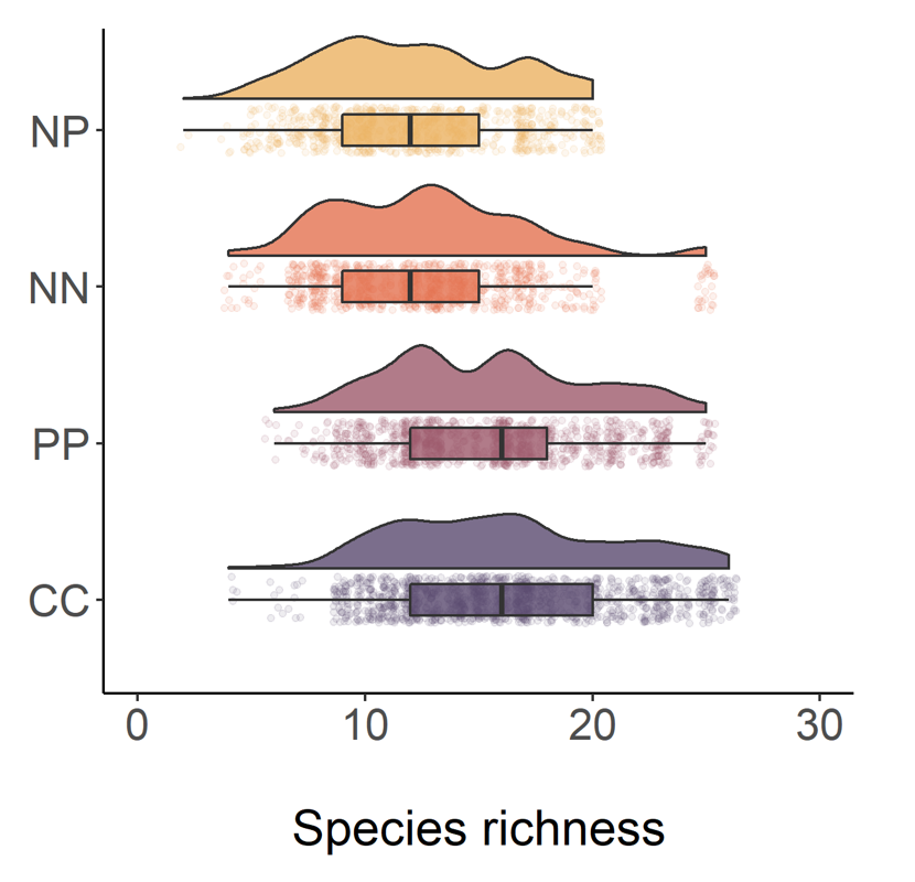
美化之旅到此结束啦!
参考
Efficient and beautiful data visualisation (ourcodingclub.github.io)(https://ourcodingclub.github.io/tutorials/dataviz-beautification/#distributions)
往期内容