微生信-在线绘图网站
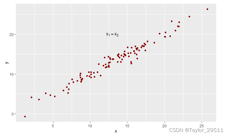
线性图
library(ggplot2)
x <- rnorm(100, 14, 5)
y <- x + rnorm(100, 0, 1)
ggplot(data = NULL, aes(x = x, y = y)) +
geom_point(color = "darkred") +
annotate(
"text",
x = 13,
y = 20,
parse = T,
label = "x[1] == x[2]"
)
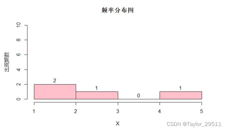
频率分布直方图
yx = c(1, 2, 3, 5)
hist(
  yx,
  col = "PINK",
  labels = TRUE,
  ylim = c(0, 10),
  main = "频率分布图",
  xlab = "X",
  ylab = "出现频数"
)
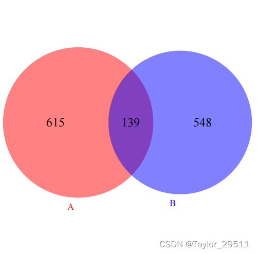
Venn图
library(VennDiagram)
library(grid)
venn.plot <- draw.pairwise.venn(
area1 = 754,
area2 = 687,
cross.area = 139,
category = c("A", "B"),
fill = c("red", "blue"),
lty = "blank",
cex = 2,
cat.cex = 1.5,
cat.col = c("red", "blue"),
cat.pos = c(185, 185),
)
pdf("venn.pdf")
grid.draw(venn.plot)
dev.off()
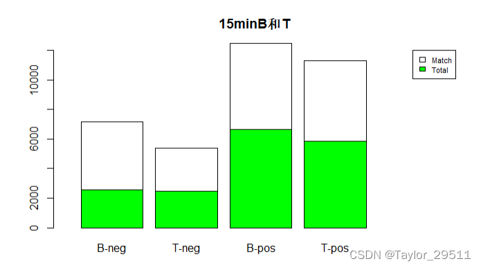
柱状累计分布图
data <- matrix(c(2587, 4576, 2457, 2946, 6670, 5790, 5862, 5421), ncol = 4, nrow = 2)
colnames(data) <- c('B-neg', 'T-neg', 'B-pos', 'T-pos')
barplot(
height = data,
main = "15minB和T",
col = c('green', 'white'),
legend.text = c('Total','Match'),
args.legend = list(x = "topright", cex=0.7),
xlim = c(0, 9),
ylim = c(0, 12000),
width = 1.5,
)
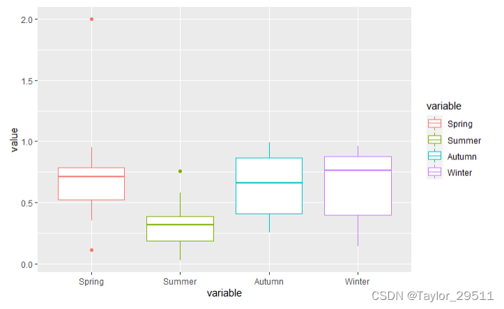
箱体图
library(data.table)
library(ggplot2)

dat <- data.table(
  Spring = c(runif(9, 0, 1), 2),
  Summer = runif(10, 0, 1),
  Autumn = runif(10, 0, 1),
  Winter = runif(10, 0, 1)
)

dat1 <- melt(dat, measure.vars = c("Spring", "Summer", "Autumn", "Winter"))
ggplot(data = dat1, aes(x = variable, y = value, colour = variable)) + geom_boxplot()
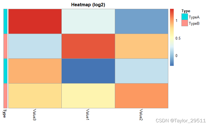
热图
library(data.table)
library(pheatmap)
b_data <- data.frame(
Gene = c("Gene1", "Gene2", "Gene3", "Gene4"),
Annotation = c("TypeA", "TypeB", "TypeA", "TypeB"),
Value1 = c(1.2, 2.3, 0.8, 1.5),
Value2 = c(0.9, 1.8, 1.1, 2.0),
Value3 = c(2.5, 1.1, 1.9, 1.7)
)
rownames(b_data) <- b_data$Gene
annotation_row <- data.frame(Type = b_data$Annotation)
rownames(annotation_row) <- b_data$Gene
colnames(annotation_row) <- "Type "
data <- as.matrix(b_data[, -(1:2)])
pheatmap(
log2(data + 0.01),
cluster_rows = FALSE,
cluster_cols = TRUE,
treeheight_col = 0,
show_rownames = FALSE,
show_colnames = TRUE,
annotation_row = annotation_row,
main = "Heatmap (log2)"
)