1、箱形图
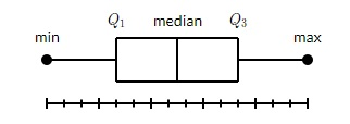
摘要:箱形图也被称为胡须图,它显示了一组数据的摘要,包括最小值、第一四分位数、中位数、第三四分位数和最大值。在箱形图中,我们从第一个四分位数到第三个四分位数画一个箱形。在中位数处有一条垂直线穿过方框。晶须从每个四分位数到最小值或最大值,如下图实例所示:
让我们为boxplots创建数据。我们使用numpy.random.normal()函数来创建假数据。它需要三个参数,正态分布的平均数和标准差,以及所需值的数量。
np.random.seed(10)
collectn_1 = np.random.normal(100, 10, 200)
collectn_2 = np.random.normal(80, 30, 200)
collectn_3 = np.random.normal(90, 20, 200)
collectn_4 = np.random.normal(70, 25, 200)
我们在上面创建的数组列表是创建boxplot的唯一必要输入。使用data_to_plot这行代码,我们可以用下面的代码创建boxplo图:
fig = plt.figure()
# Create an axes instance
ax = fig.add_axes([0,0,1,1])
# Create the boxplot
data_to_plot = [collectn_1,collectn_2,collectn_3,collectn_4]
bp = ax.boxplot(data_to_plot)
plt.show()
显示结果为:

2、小提琴图
小提琴图与箱形图类似,但它们也显示不同数值下数据的概率密度。这些图包括一个数据中位数的标记和一个表示四分位数范围的方框,就像标准方框图一样。叠加在这个方框图上的是一个核密度估计。和箱形图一样,小提琴图也是用来表示一个变量分布(或样本分布)在不同 "类别 "之间的比较。
小提琴图比普通的箱形图信息量更大。事实上,箱形图只显示摘要统计,如平均数/中位数和四分位数范围,而小提琴图则显示数据的完整分布。
import matplotlib.pyplot as plt

np.random.seed(10)
collectn_1 = np.random.normal(100, 10, 200)
collectn_2 = np.random.normal(80, 30, 200)
collectn_3 = np.random.normal(90, 20, 200)
collectn_4 = np.random.normal(70, 25, 200)

## combine these different collections into a list
data_to_plot = [collectn_1, collectn_2, collectn_3, collectn_4]

# Create a figure instance
fig = plt.figure()

# Create an axes instance
ax = fig.add_axes([0.2,0.2,0.6,0.6])

# Create the boxplot
bp = ax.violinplot(data_to_plot)
plt.show()
显示结果如下:
