整个新系列。目前的几个系列, #R实战 以生信分析为主, #跟着CNS学作图 以复现顶刊Figure为主,而本系列 #R绘图 则是学习不在文章中但同样很好看的图,致力于给同学们在数据可视化中提供新的思路和方法。
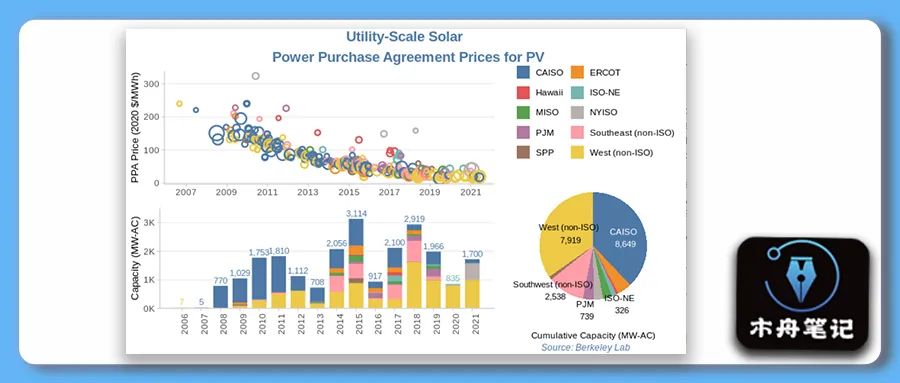
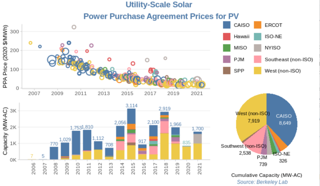
本期图片
示例数据和代码领取
点赞、在看 本文,分享至朋友圈集赞20个并保留30分钟,截图发至微信mzbj0002领取。
木舟笔记2022年度VIP可免费领取。
木舟笔记2022年度VIP企划
权益:
2022年度木舟笔记所有推文示例数据及代码(在VIP群里实时更新)。
木舟笔记科研交流群。
半价购买
跟着Cell学作图系列合集(免费教程+代码领取)|跟着Cell学作图系列合集。
收费:
99¥/人。可添加微信:mzbj0002 转账,或直接在文末打赏。

绘制
数据处理
library('tidyverse')
# install.packages('janitor')
library('janitor')
library('readxl')
library('lubridate')
ppa_price <- read_excel(
  "2021_utility-scale_solar_data_update_0.xlsm",
  sheet = "PPA Price by Project (PV only)",
  range = "A24:L357"
)
str(ppa_price)
# 长宽转换
ppa_price_long <- ppa_price %>%
  pivot_longer(cols = c(CAISO:Hawaii),
               names_to = "region",
               values_to = "price",
               values_drop_na = TRUE)
# 列名清洗
ppa_price_long <- ppa_price_long %>%
  clean_names()
# Convert Region to Factor
ppa_price_long <- ppa_price_long %>%
  mutate(region_cat = factor(region, ordered = TRUE))

# 提取年份
str(ppa_price_long)
ppa_price_long <- ppa_price_long %>%
  mutate_if(is.POSIXct, as_date) %>%  # 日期格式为POSIXct
  mutate(ppa_year = year(ppa_execution_date))
散点图
# 颜色设置
color.pal <- c(
  "#4E79A7", #dark blue
  "#F28E2B", #orange
  "#E15759", #red
  "#76B7B2", #teal
  "#59A14F", #green
  "#BAB0AC", #gray
  "#B07AA1", #purple
  "#FF9DA7", #pink
  "#9C755F", #brown
  "#EDC948" #yellow
)

## 散点图
p1 <- ppa_price_long %>%
  ggplot(aes(x = ppa_execution_date,
             y = price,
             size = capacity_mw,
             color = region))+
  geom_point(shape = 1, stroke = 1.2)+
  scale_size(guide = "none")+
  scale_color_manual(values = color.pal, name = "Region")+
  #ggthemes::scale_color_tableau()+
  scale_x_date(date_breaks = "2 years", date_labels = "%Y")+ # x轴日期间距及格式
  ylab("PPA Price (2020 $/MWh)")+
  theme_light()+
  theme(panel.grid.major.x = element_blank(),
        panel.grid.minor.x = element_blank(),
        panel.grid.minor.y = element_blank(),
        panel.border = element_blank(),
        axis.line.x.bottom = element_line(color = "lightgray"),
        axis.line.y.left = element_line(color = "lightgray"),
        axis.title.y = element_text(size = 10),
        axis.title.x = element_blank())+
  guides(color = guide_legend(
    override.aes=list(shape = 15)))

p1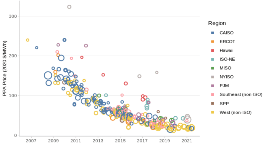
堆叠柱状图
## 堆叠柱状图
year_totals <- ppa_price_long %>%
  group_by(ppa_year) %>%
  arrange(ppa_year, region) %>%
  summarise(year_total = prettyNum(trunc(sum(capacity_mw)),
                                   big.mark = ","),
            region = first(region))

p2_data = ppa_price_long %>%
  group_by(region, ppa_year) %>%
  summarise(capacity_mw = sum(capacity_mw)) %>%
  left_join(year_totals)

p2 <- p2_data %>%
  ggplot(aes(x = ppa_year,
             y = capacity_mw,
             color = region,
             fill = region,
             label = year_total))+
  geom_col(width = 0.7)+
  geom_text(position = position_stack(), vjust = -0.5, size = 3) +
  scale_fill_manual(values = color.pal)+
  scale_color_manual(values = color.pal)+
  scale_x_continuous(breaks = seq(2006, 2021, 1))+
  scale_y_continuous(limits = c(0, 3500),
                     expand = c(0,0),
                     labels = c("0K", "1K", "2K", "3K"),
                     breaks = c(0, 1000, 2000, 3000))+
  ylab("Capacity (MW-AC)")+
  theme_light()+
  theme(legend.position = "top",
        axis.title.y = element_text(size = 10),
        panel.grid.major.x = element_blank(),
        panel.grid.minor.x = element_blank(),
        panel.grid.minor.y = element_blank(),
        panel.border = element_blank(),
        axis.line.x.bottom = element_line(color = "lightgray"),
        axis.line.y.left = element_line(color = "lightgray"),
        axis.title.x = element_blank(),
        axis.text.x = element_text(angle = 90))

p2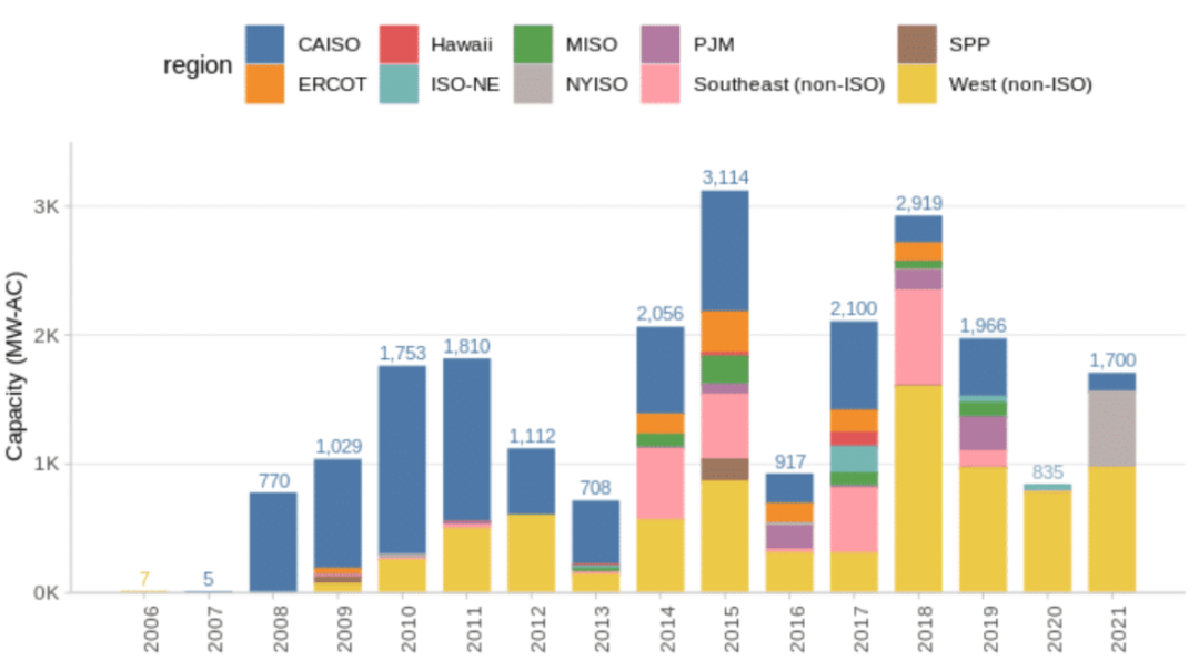
饼图
cumulative_cap <- ppa_price_long %>%
  group_by(region) %>%
  summarise(cumulative_capacity = round(sum(capacity_mw))) %>%
  mutate(capacity_label = prettyNum(cumulative_capacity, big.mark = ","))

p3 <- ggplot(cumulative_cap,
             aes(x="",
                 y=cumulative_capacity,
                 fill=region))+
  geom_bar(stat="identity", width=1)+
  scale_fill_manual(values = color.pal)+
  coord_polar("y", start=0, direction = -1)+
  annotate("text", y = 4000, x = 1,
           label = "West (non-ISO)\n 7,919", size = 3)+
  annotate("text", y = 18000, x = 1.1,
           label = "CAISO \n 8,649", color = "white", size = 3)+
  annotate("text", y = 8800, x = 1.6,
           label = "Southwest (non-ISO) \n 2,538", size = 3)+
  annotate("text", y = 13000, x = 1.7,
           label = "ISO-NE \n 326", size = 3)+
  annotate("text", y = 11000, x = 1.7,
           label = "PJM \n 739", size = 3)+
  theme_void()+
  labs(caption = "Cumulative Capacity (MW-AC)")+
  theme(legend.position="top",
        legend.title = element_blank(),
        legend.key.size = unit(.5, 'cm'),
        plot.caption = element_text(hjust = .5),
        plot.title = element_text(hjust = 0.5, size = 12),
        plot.subtitle = element_text(hjust = 0.5, size = 10))+
  guides(fill = guide_legend(nrow = 5, byrow = TRUE))
p3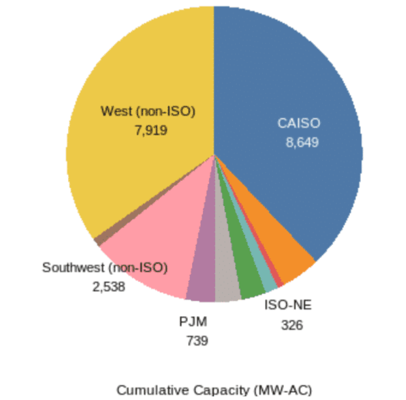
拼图
library('ggpubr')
p_full <- ggarrange(
  ggarrange(p1, p2, nrow=2, legend = "none"),
  p3,
  widths = c(2, 1), heights = c(1,1))

p_full

annotate_figure(p_full,
                top = text_grob(
                  "Utility-Scale Solar \n Power Purchase Agreement Prices for PV",
                  face = "bold",
                  size = 14,
                  color = color.pal[1]),
                bottom = text_grob(
                  "Source: Berkeley Lab",
                  hjust = 1,
                  x = .9,
                  face = "italic",
                  size = 9,
                  color = color.pal[1])
)
参考
Analytics X3: Tidy Tuesday US Solar | KPress R Blog(https://kpress.dev/blog/analytics-x3-tidytuesday-us-solar/)
往期内容