尝试变得正常

1引言
一篇 NC 文章 Neutrophil-induced ferroptosis promotes tumor necrosis in glioblastoma progression 中的 gsea 图:
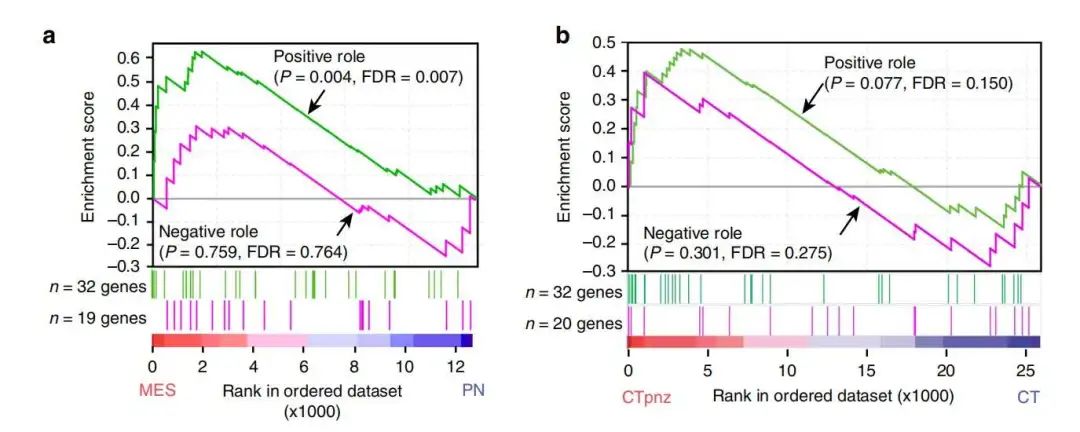
文章:

目前简单的想法就是 拼图 ,不够也会遇到一些问题,下面展示一下结果:

小伙伴们可以在推文末尾
打赏我 5 个大洋, 然后截图私戳我 ,我把文献,测试数据,代码分享给你。
2测试数据
上传一下测试数据,包含两个通路:
# 加载R包
library(ggplot2)
library(ggnewscale)
library(aplot)

# load data
df <- read.delim('c:/Users/admin/Desktop/test_data.txt',header = T)

# 查看内容
head(df,3)
   NAME SYMBOL TITLE RANK.IN.GENE.LIST RANK.METRIC.SCORE RUNNING.ES CORE.ENRICHMENT
1 row_0   LDB3    na               173         0.2474102 0.02058329             Yes
2 row_1  GATA6    na               249         0.2274002 0.04379894             Yes
3 row_2  ABCC6    na               262         0.2252293 0.06997884             Yes
          pathway
1 ANGINA_PECTORIS
2 ANGINA_PECTORIS
3 ANGINA_PECTORIS
3绘制曲线图
先绘制上面的曲线图:
# plot
up <- ggplot(df,aes(x = RANK.IN.GENE.LIST,y = RUNNING.ES,color = pathway)) +
  # 0水平线
  geom_hline(yintercept = 0,color = 'grey',size = 1) +
  # 曲线图层
  geom_line(show.legend = F,size = 1) +
  # 颜色设置
  scale_color_manual(values = c('#4E9F3D','#FF87CA')) +
  theme_bw(base_size = 18) +
  # 主题细节调整
  theme(panel.grid = element_blank(),
        axis.ticks.length = unit(0.25,'cm'),
        panel.border = element_rect(size = 2),
        axis.text.x = element_blank(),
        axis.title.x = element_blank(),
        axis.ticks.x = element_blank()) +
  ylab('Enrichment score') +
  # 添加文本注释
  annotate(geom = 'text',x = 5500,y = 0.05,size = 6,
           label = 'Negative role\n(P = 0.759, FDR = 0.764)') +
  annotate(geom = 'text',x = 11000,y = 0.45,size = 6,
           label = 'Positive role\n(P = 0.004, FDR = 0.007)') +
  # 添加箭头注释
  geom_segment(aes(x = 10000,xend = 11000,y = 0.05,yend = 0.1),show.legend = F,
               arrow = arrow(length=unit(0.4,"cm"),type = 'open'),
               color = 'black',size = 0.5) +
  geom_segment(aes(x = 8000,xend = 7500,y = 0.4,yend = 0.35),show.legend = F,
               arrow = arrow(length=unit(0.4,"cm"),type = 'open'),
               color = 'black',size = 0.5)

up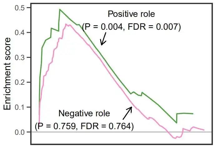
4绘制中间排序图
绘制中间的基因排序图:
# line
mid <- ggplot(df,aes(x = RANK.IN.GENE.LIST,y = pathway)) +
  # 线图层
  geom_vline(aes(xintercept = RANK.IN.GENE.LIST,
                 color = pathway),
             show.legend = F,size = 0.5) +
  # 颜色
  scale_color_manual(values = c('#4E9F3D','#FF87CA')) +
  theme_classic(base_size = 18) +
  # 分面
  facet_wrap(~pathway,ncol = 1) +
  # 主题调整
  theme(strip.background = element_blank(),
        strip.text = element_blank(),
        axis.ticks.length = unit(0.25,'cm'),
        axis.text.x = element_blank(),
        axis.title.x = element_blank(),
        axis.line.x = element_blank(),
        axis.ticks.x = element_blank(),
        axis.line.y = element_line(color = 'white'),
        axis.title.y = element_text(color = 'white'))

mid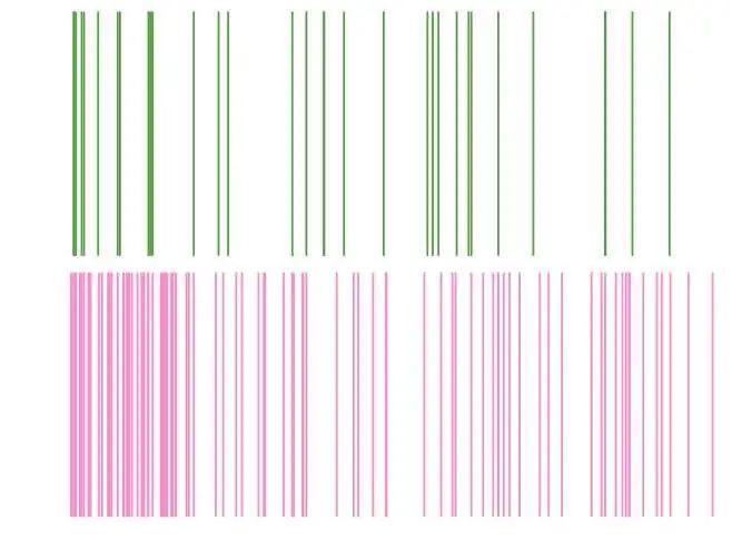
5底层热图
最后绘制底层热图,但是我不知道颜色具体是按什么填充的,我觉得可能就是排序的位置:
# heatmap
bot <- ggplot(te,aes(x = x,y = 1,fill = x)) +
  # 条形图层
  geom_col(width = 1,show.legend = F) +
  # 颜色
  scale_fill_gradient2(low = 'red',mid = 'white',high = 'blue',
                       midpoint = max(df$RANK.IN.GENE.LIST)/2) +
  # 设置刻度标签
  scale_x_continuous(breaks = seq(0,max(df$RANK.IN.GENE.LIST),3500),
                     labels = seq(0,max(df$RANK.IN.GENE.LIST),3500)/1000) +
  theme_classic(base_size = 18) +
  coord_cartesian(expand = 0) +
  # 主题调整
  theme(axis.ticks.y = element_blank(),
        axis.text.y = element_blank(),
        axis.title.y = element_blank(),
        axis.line.y = element_blank(),
        axis.line.x = element_blank(),
        axis.ticks.length = unit(0.25,'cm')) +
  # 轴标签
  xlab('Ranked in ordered dataset\n(x1000)') +
  labs(caption = c("MES", "PN")) +
  # 添加注释
  theme(plot.caption = element_text(hjust=c(0, 1),color = c('red','blue')))

bot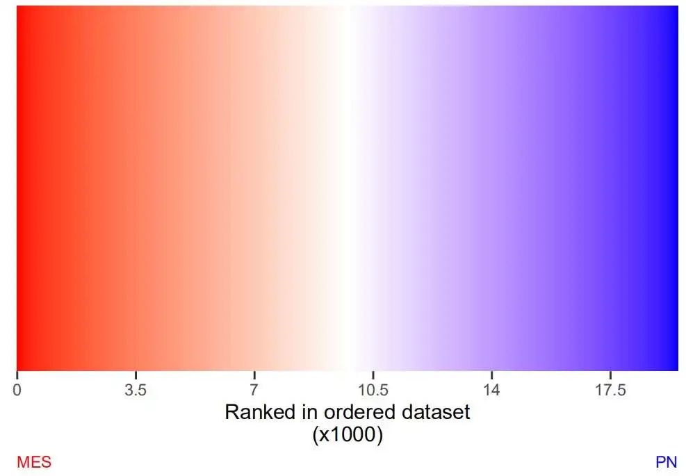
6最最后拼图
最后拼起来看看:
library(patchwork)
up + mid + bot + plot_layout(nrow = 3,heights = c(1,0.2,0.1))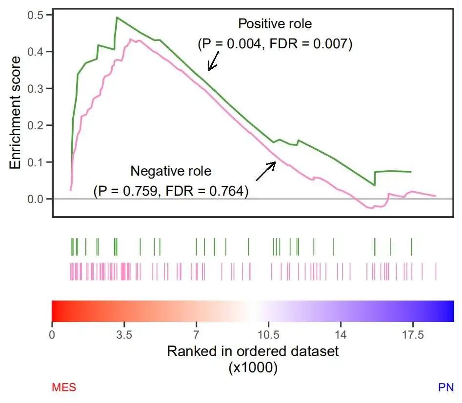
尽力了。

欢迎加入生信交流群。加我微信我也拉你进 微信群聊 老俊俊生信交流群 哦,数据代码已上传至QQ群,欢迎加入下载。
群二维码:

老俊俊微信:

知识星球:

所以今天你学习了吗?
欢迎小伙伴留言评论!
点击我留言!
今天的分享就到这里了,敬请期待下一篇!
最后欢迎大家分享转发,您的点赞是对我的鼓励和肯定!
如果觉得对您帮助很大,赏杯快乐水喝喝吧!
往期回顾
◀跟着 Cell Reports 学画图: Ribo-seq frame 与 reads length 分布
◀...