论文
Large variation in the association between seasonal antibiotic use and resistance across multiple bacterial species and antibiotic classes
数据代码链接
https://github.com/orgs/gradlab/repositories
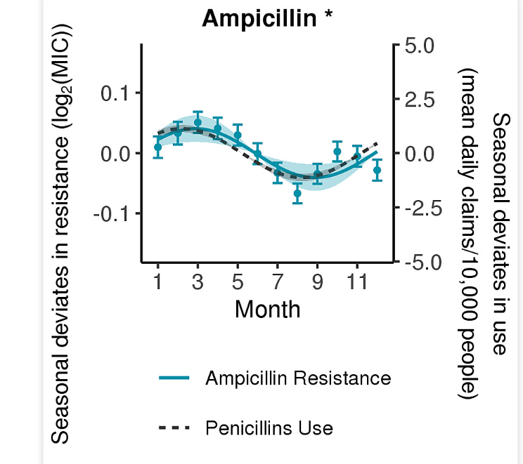
今天的推文重复一下论文中的 Figure S3,双Y轴的折线图
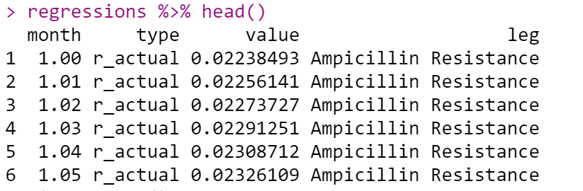
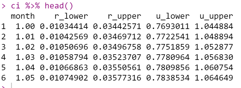
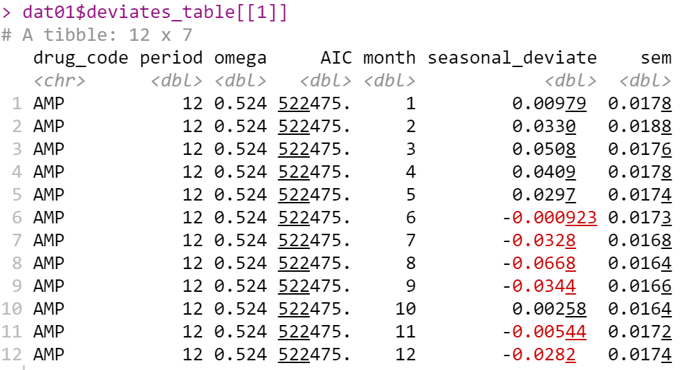
经过论文提供的代码运行,得到作图数据集
regressions
ci
dat01$deviates_table[[1]]
将这三个数据集保存为csv文件
library(tidyverse)
library(readr)

regressions %>%
  write_csv(file = "regressions.csv")
ci %>%
  write_csv(file = "ci.csv")
dat01$deviates_table[[1]] %>%
  write_csv(file = "deviates_table.csv")
作图第一步读取数据集
regressions<-read_csv("regressions.csv")
head(regressions)
ci<-read_csv("ci.csv")
head(ci)
deviates_table<-read_csv("deviates_table.csv")
head(deviates_table)
作图代码
library(ggplot2)
col<-"#359023"
title<-"Ampicillin *"
ratio<-27.79891
ggplot()+
  geom_point(data=deviates_table,
             aes(x=month,y=seasonal_deviate))+
  geom_errorbar(data = deviates_table,
                aes(x = month,
                    ymin = seasonal_deviate - sem,
                    ymax = seasonal_deviate + sem),
                width = 0.5,
                color = col)+
  geom_line(data=regressions,
            aes(x = month, y = value,
                color = leg, linetype = leg),
            size = 0.7) +
  geom_ribbon(data = ci,
              aes(x = month, ymin = r_lower,
                  ymax = r_upper),
              fill = col,
              alpha = 0.3) +
  geom_ribbon(data = ci,
              aes(x = month,
                  ymin = u_upper/ratio,
                  ymax = u_lower/ratio),
              fill = "grey20", alpha = 0.3) +
  scale_color_manual(values = c(col, "grey20")) +
  scale_y_continuous(sec.axis = sec_axis(~. * ratio),
                     limits = c(-.165, .165)) +
  scale_x_continuous(breaks=c(1, 3, 5, 7, 9, 11)) +
  ggtitle(title) +
  xlab("Month") +
  theme_classic() +
  guides(color = guide_legend(nrow = 2, byrow = TRUE)) +
  theme(legend.position = "bottom",
        legend.title = element_blank(),
        legend.text = element_text(size = 9),
        plot.title = element_text(size = 11, hjust = 0.5, face = "bold"),
        axis.text = element_text(size = 10),
        axis.title.y = element_blank()
  ) -> f3splot

print(f3splot)
添加两个坐标轴的标题
library(ggpubr)
f3splot %>%
  annotate_figure(left = text_grob(expression("Seasonal deviates in resistance ("*log["2"]*"(MIC))"), size = 10, rot = 90)) %>%
  annotate_figure(right = text_grob("Seasonal deviates in use\n(mean daily claims/10,000 people)", size = 10, rot = 270))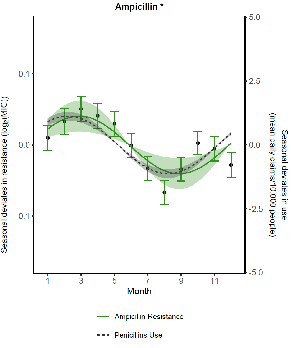
今天推文的示例数据和代码可以在公众号后台留言20220413获取
欢迎大家关注我的公众号
小明的数据分析笔记本
小明的数据分析笔记本 公众号 主要分享:1、R语言和python做数据分析和数据可视化的简单小例子;2、园艺植物相关转录组学、基因组学、群体遗传学文献阅读笔记;3、生物信息学入门学习资料及自己的学习笔记!