机器学习之乳腺癌问题SVM
题目所需的代码及数据
链接:https://pan.baidu.com/s/1bS7Ku_PUfcimiVkmLz9Fzw
提取码:0929
利用SVM建模
import matplotlib.pyplot as plt
import pandas as pd
import numpy as np
from sklearn.preprocessing import StandardScaler
from sklearn.preprocessing import LabelEncoder
from sklearn.model_selection import train_test_split
from sklearn.svm import SVC
from sklearn.model_selection import cross_val_score
from sklearn.pipeline import make_pipeline
from sklearn.feature_selection import SelectKBest, f_regression #特征选择
import seaborn as sns
#更改一下画图的要求
plt.style.use('fivethirtyeight')
sns.set_style("white")
plt.rcParams['figure.figsize'] = (8,4)
data = pd.read_csv('data/data.csv')
print("数据预处理:")
# 划分一下特征和标签
X = data.iloc[:,2:32] # 特征
y = data.iloc[:,1] # 标签
# 将类标签从其原始字符串表示(M和B)转换为整数
le = LabelEncoder()
y = le.fit_transform(y)
print(y)
# 标准化数据(以0为中心并缩放以消除差异)。
scaler =StandardScaler()
Xs = scaler.fit_transform(X)
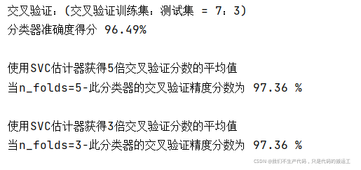
print("交叉验证:(交叉验证训练集:测试集 = 7:3)")
# 5.划分测试集和训练集
#stratify是为了保持split前类的分布
#将stratify=X就是按照X中的比例分配
#将stratify=y就是按照y中的比例分配
X_train, X_test, y_train, y_test = train_test_split(Xs, y, stratify=y,#Xs是特征 y是标签
test_size=0.3,
random_state=33)
# 6. 创建一个SVM分类器,并在70%的数据集上对其进行训练。
clf = SVC(probability=True)
clf.fit(X_train, y_train)
#7. 对30%的持力测试样本的预测精度进行分析。
classifier_score = clf.score(X_test, y_test)*100
print ('分类器准确度得分 {:03.2f}% \n'.format(classifier_score))
print("使用SVC估计器获得5倍交叉验证分数的平均值")
n_folds = 5
cv_error = np.average(cross_val_score(SVC(), Xs, y, cv=n_folds)) * 100
print('当n_folds={}-此分类器的交叉验证精度分数为 {:.2f} % \n'.format(n_folds, cv_error))
#特征选择
#clf2 = make_pipeline(SelectKBest(f_regression, k=3),
# SVC(probability=True))
# 使用SVC估计器获得3倍交叉验证分数的平均值。
print("使用SVC估计器获得3倍交叉验证分数的平均值")
n_folds = 3
cv_error = np.average(cross_val_score(SVC(), Xs, y, cv=n_folds)) * 100
print('当n_folds={}-此分类器的交叉验证精度分数为 {:.2f} %\n'.format(n_folds, cv_error))
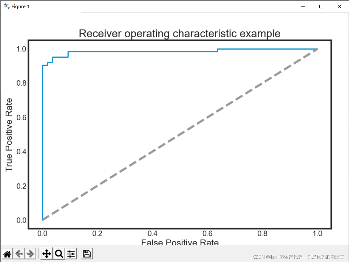
def ROC_plot(y, yproba):
from sklearn.metrics import roc_curve, auc
plt.figure(figsize=(9,6))
fpr, tpr, thresholds = roc_curve(y_test, probas_[:, 1])
roc_auc = auc(fpr, tpr)
plt.plot(fpr, tpr, lw=2, label='ROC fold (area = %0.2f)' % (roc_auc))
plt.plot([0, 1], [0, 1], '--', color=(0.6, 0.6, 0.6), label='Random')
plt.xlim([-0.05, 1.05])
plt.ylim([-0.05, 1.05])
plt.xlabel('False Positive Rate')
plt.ylabel('True Positive Rate')
plt.title('Receiver operating characteristic example')
plt.show()
plt.axes().set_aspect(1)
#进行预测 预测概率
probas_ = clf.predict_proba(X_test)
#画图
ROC_plot(y, probas_[:1])
SVM调参
import pandas as pd
import numpy as np
import matplotlib.pyplot as plt
from matplotlib.colors import ListedColormap
from sklearn.preprocessing import StandardScaler
from sklearn.preprocessing import LabelEncoder
from sklearn.model_selection import train_test_split
from sklearn.svm import SVC
from sklearn import metrics, preprocessing
from sklearn.metrics import classification_report
data = pd.read_csv('data/data.csv')
print("数据预处理:")
# 划分一下特征和标签
X = data.iloc[:,2:32] # 特征
y = data.iloc[:,1] # 标签
# 将类标签从其原始字符串表示(M和B)转换为整数
le = LabelEncoder()
y = le.fit_transform(y)
print(y)
# 标准化数据(以0为中心并缩放以消除差异)。
scaler =StandardScaler()
Xs = scaler.fit_transform(X)
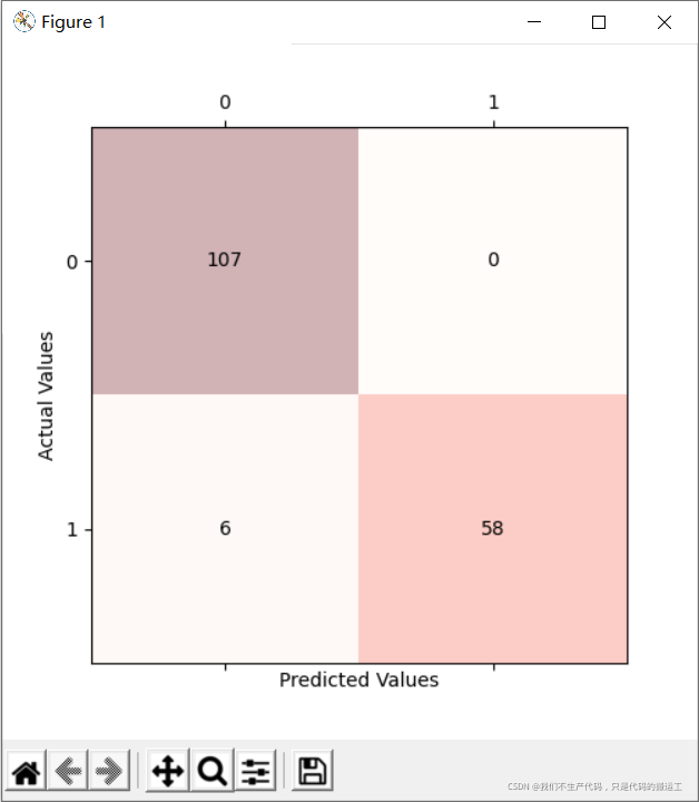
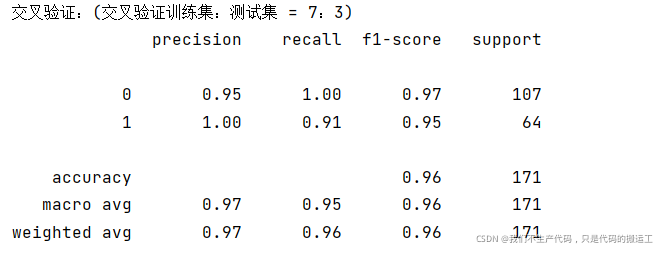
print("交叉验证:(交叉验证训练集:测试集 = 7:3)")
# 5.划分测试集和训练集
#stratify是为了保持split前类的分布
#将stratify=X就是按照X中的比例分配
#将stratify=y就是按照y中的比例分配
X_train, X_test, y_train, y_test = train_test_split(Xs, y, stratify=y,#Xs是特征 y是标签
test_size=0.3,
random_state=33)
# 6. 创建一个SVM分类器,并在70%的数据集上对其进行训练。
clf = SVC(probability=True)
clf.fit(X_train, y_train)
y_pred = clf.fit(X_train, y_train).predict(X_test)
#sklearn中的classification_report函数用于显示主要分类指标的文本报告.在报告中显示每个类的精确度,召回率,F1值等信息。
#主要参数:
# 精度 记得 f1成绩 支持数
#目标值。
#分类器返回的估计值。
#精确
#宏平均值
#加权平均
print(classification_report(y_test, y_pred ))
## 绘图混淆矩阵
cm = metrics.confusion_matrix(y_test, y_pred)
fig, ax = plt.subplots(figsize=(5, 5))
ax.matshow(cm, cmap=plt.cm.Reds, alpha=0.3)
for i in range(cm.shape[0]):
for j in range(cm.shape[1]):
ax.text(x=j, y=i,
s=cm[i, j],
va='center', ha='center')
plt.xlabel('Predicted Values')
plt.ylabel('Actual Values')
plt.show()
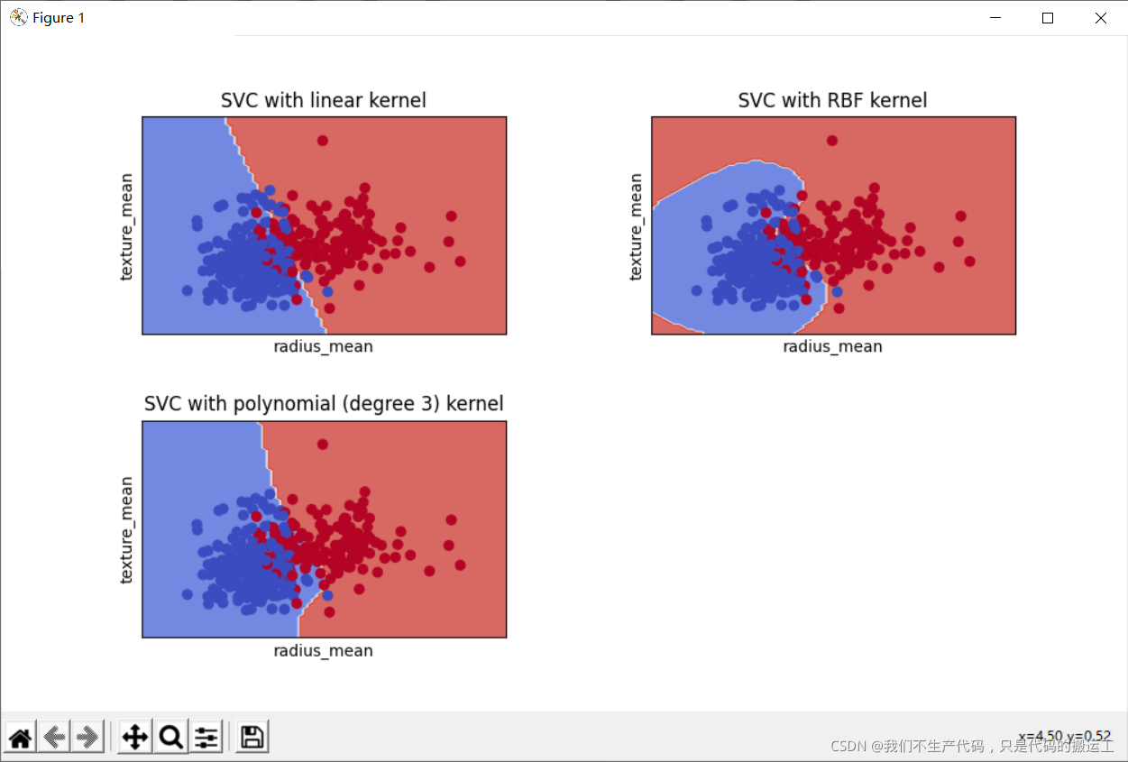
def decision_plot(X_train, y_train, n_neighbors, weights):
h = .02 # step size in the mesh
Xtrain = X_train[:, :2] #我们只采用前两个特性。
#================================================================
#创建颜色贴图
#================================================================
cmap_light = ListedColormap(['#FFAAAA', '#AAFFAA', '#AAAAFF'])
cmap_bold = ListedColormap(['#FF0000', '#00FF00', '#0000FF'])
#================================================================
#我们创建了一个SVM实例并拟合数据。
#我们不缩放数据,因为我们想要绘制支持向量
#================================================================
C = 1.0 # SVM regularization parameter
svm = SVC(kernel='linear', random_state=0, gamma=0.1, C=C).fit(Xtrain, y_train)
rbf_svc = SVC(kernel='rbf', gamma=0.7, C=C).fit(Xtrain, y_train)
poly_svc = SVC(kernel='poly', degree=3, C=C).fit(Xtrain, y_train)
#% matplotlib inline
plt.rcParams['figure.figsize'] = (10, 6)
plt.rcParams['axes.titlesize'] = 'large'
# create a mesh to plot in
x_min, x_max = Xtrain[:, 0].min() - 1, Xtrain[:, 0].max() + 1
y_min, y_max = Xtrain[:, 1].min() - 1, Xtrain[:, 1].max() + 1
xx, yy = np.meshgrid(np.arange(x_min, x_max, 0.1),
np.arange(y_min, y_max, 0.1))
# title for the plots
titles = ['SVC with linear kernel',#线性核函数
'SVC with RBF kernel',#高斯核函数
'SVC with polynomial (degree 3) kernel']#三次多项式核函数
for i, clf in enumerate((svm, rbf_svc, poly_svc)):
# Plot the decision boundary. For that, we will assign a color to each
# point in the mesh [x_min, x_max]x[y_min, y_max].
plt.subplot(2, 2, i + 1)
plt.subplots_adjust(wspace=0.4, hspace=0.4)
Z = clf.predict(np.c_[xx.ravel(), yy.ravel()])
# Put the result into a color plot
Z = Z.reshape(xx.shape)
plt.contourf(xx, yy, Z, cmap=plt.cm.coolwarm, alpha=0.8)
# Plot also the training points
plt.scatter(Xtrain[:, 0], Xtrain[:, 1], c=y_train, cmap=plt.cm.coolwarm)
plt.xlabel('radius_mean')
plt.ylabel('texture_mean')
plt.xlim(xx.min(), xx.max())
plt.ylim(yy.min(), yy.max())
plt.xticks(())
plt.yticks(())
plt.title(titles[i])
plt.show()