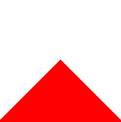
<div class="triangle"></div>
.triangle {


    height: 0;
    width: 0;
    border: 50px solid #fff;
    border-bottom: 50px solid red;
}
效果图:
实际应用:(模仿 apple 购物袋)

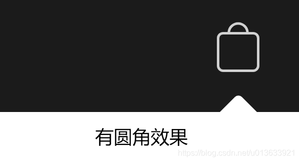
但是有圆角。。。所以放弃上述方案
启动 PLAN B
将 白色 矩形 加一点圆角 旋转45度 就可以了;
.small-b-menu-triangle {


    position: absolute;
    right: 17.5px;
    top: -4.5px;
    border-radius: 1px;
    height: 10px;
    width: 10px;
    background-color: #fff;
    transform: rotate(45deg);
}
