Python之Matplotlib数据可视化(四):多子图问题
有时候需要从多个角度对数据进行对比。Matplotlib 为此提出了子图(subplot)的概念:在较大的图形中同时放置一组较小的坐标轴。这些子图可能是画中画(inset)、网格图(grid of plots),或者是其他更复杂的布局形式。在这里将介绍四种用 Matplotlib 创建子图的方法。
首先,导入画图需要的程序库:
import matplotlib.pyplot as plt
plt.style.use('seaborn-white')
import numpy as np
1 plt.axes :手动创建子图
1.1 图中图的坐标轴
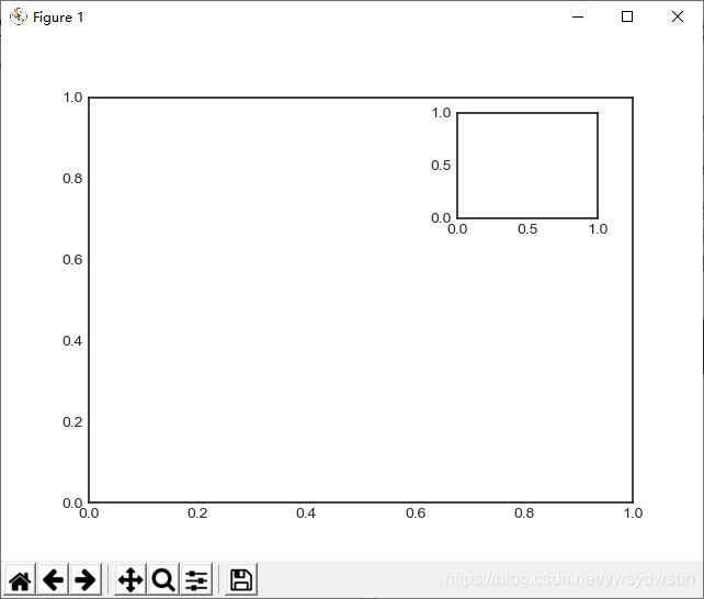
创建坐标轴最基本的方法就是使用 plt.axes 函数。可见我上几篇博客,这个函数的默认配置是创建一个标准的坐标轴,填满整张图。它还有一个可选参数,由图形坐标系统的四个值构成。这四个值分别表示图形坐标系统的 [bottom, left, width, height] (底坐标、左坐标、宽度、高度),数值的取值范围是左下角(原点)为 0,右上角为 1。
如果想要在右上角创建一个画中画,那么可以首先将 x 与 y 设置为0.65(就是坐标轴原点位于图形高度 65% 和宽度 65% 的位置),然后将 x 与 y 扩展到 0.2(也就是将坐标轴的宽度与高度设置为图形的 20%)。 显示了代码的结果:
ax1 = plt.axes() # 默认坐标轴
ax2 = plt.axes([0.65, 0.65, 0.2, 0.2])
import matplotlib.pyplot as plt
plt.style.use('seaborn-white')
import numpy as np
ax1 = plt.axes() # 默认坐标轴
ax2 = plt.axes([0.65, 0.65, 0.2, 0.2])
plt.show()
1.2 竖直排列的坐标轴
面向对象画图接口中类似的命令有 fig.add_axes() 。用这个命令创建两个竖直排列的坐标轴:
fig = plt.figure()
ax1 = fig.add_axes([0.1, 0.5, 0.8, 0.4],
xticklabels=[], ylim=(-1.2, 1.2))
ax2 = fig.add_axes([0.1, 0.1, 0.8, 0.4],
ylim=(-1.2, 1.2))
x = np.linspace(0, 10)
ax1.plot(np.sin(x))
ax2.plot(np.cos(x));
import matplotlib.pyplot as plt
plt.style.use('seaborn-white')
import numpy as np
fig = plt.figure()
ax1 = fig.add_axes([0.1, 0.5, 0.8, 0.4],
xticklabels=[], ylim=(-1.2, 1.2))
ax2 = fig.add_axes([0.1, 0.1, 0.8, 0.4],
ylim=(-1.2, 1.2))
x = np.linspace(0, 10)
ax1.plot(np.sin(x))
ax2.plot(np.cos(x));
plt.show()
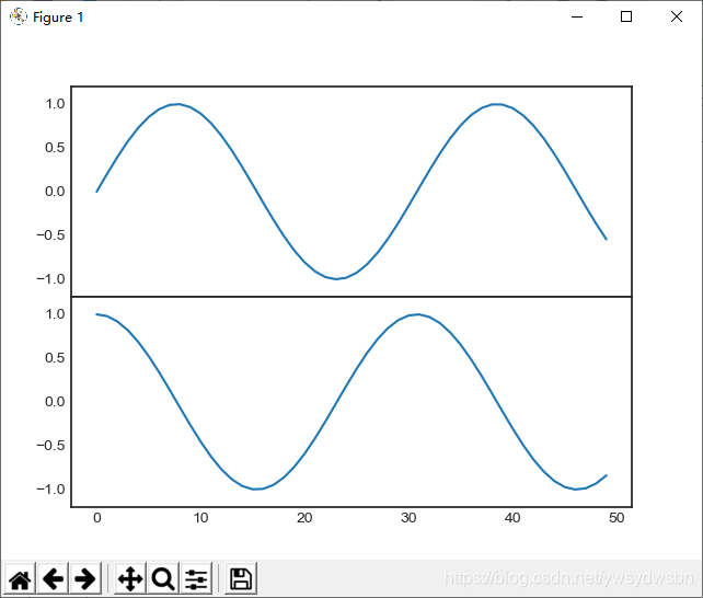
现在就可以看到两个紧挨着的坐标轴(上面的坐标轴没有刻度):上子图(起点 y 坐标为0.5 位置)与下子图的 x 轴刻度是对应的(起点 y 坐标为 0.1,高度为 0.4)。
2 plt.subplot :简易网格子图
2.1 plt.subplot()
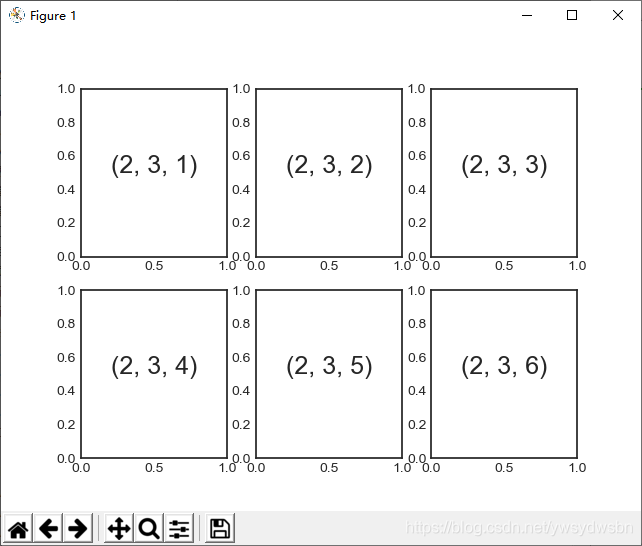
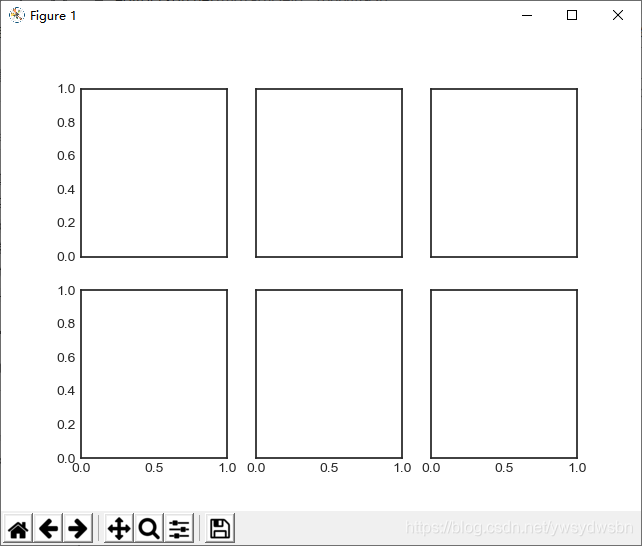
若干彼此对齐的行列子图是常见的可视化任务,Matplotlib 拥有一些可以轻松创建它们的简便方法。最底层的方法是用 plt.subplot() 在一个网格中创建一个子图。这个命令有三个整型参数——将要创建的网格子图行数、列数和索引值,索引值从 1 开始,从左上角到右下角依次增大:
for i in range(1, 7):
	plt.subplot(2, 3, i)
	plt.text(0.5, 0.5, str((2, 3, i)),fontsize=18, ha='center')
import matplotlib.pyplot as plt
plt.style.use('seaborn-white')
import numpy as np
for i in range(1, 7):
	plt.subplot(2, 3, i)
	plt.text(0.5, 0.5, str((2, 3, i)),fontsize=18, ha='center')
plt.show()
2.2 带边距调整功能的 plt.subplot()
plt.subplots_adjust 命令可以调整子图之间的间隔。用面向对象接口的命令 fig.add_subplot() 可以取得同样的效果:
fig = plt.figure()
fig.subplots_adjust(hspace=0.4, wspace=0.4)
for i in range(1, 7):
	ax = fig.add_subplot(2, 3, i)
	ax.text(0.5, 0.5, str((2, 3, i)),fontsize=18, ha='center')
import matplotlib.pyplot as plt
plt.style.use('seaborn-white')
import numpy as np
fig = plt.figure()
fig.subplots_adjust(hspace=0.4, wspace=0.4)
for i in range(1, 7):
	ax = fig.add_subplot(2, 3, i)
	ax.text(0.5, 0.5, str((2, 3, i)),fontsize=18, ha='center')
plt.show()
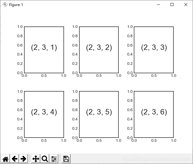
我们通过 plt.subplots_adjust 的 hspace 与 wspace 参数设置与图形高度与宽度一致的子图间距,数值以子图的尺寸为单位(在本例中,间距是子图宽度与高度的 40%)。
3 plt.subplots :用一行代码创建网格
当你打算创建一个大型网格子图时,就没办法使用前面那种亦步亦趋的方法了,尤其是当你想隐藏内部子图的 x 轴与 y 轴标题时。出于这一需求, plt.subplots() 实现了你想要的功能(需要注意此处 subplots 结尾多了个 s )。这个函数不是用来创建单个子图的, 而是用一行代码创建多个子图,并返回一个包含子图的 NumPy 数组。关键参数是行数与列数,以及可选参数 sharex 与 sharey ,通过它们可以设置不同子图之间的关联关系。
3.1 plt.subplots() 方法共享 x 轴与 y 轴坐标
我们将创建一个 2×3 网格子图,每行的 3 个子图使用相同的 y 轴坐标,每列的 2 个子图使用相同的 x 轴坐标:
fig, ax = plt.subplots(2, 3, sharex='col', sharey='row')
import matplotlib.pyplot as plt
plt.style.use('seaborn-white')
import numpy as np
fig, ax = plt.subplots(2, 3, sharex='col', sharey='row')
plt.show()
3.2 确定网格中的子图
设置 sharex 与 sharey 参数之后,我们就可以自动去掉网格内部子图的标签,让图形看起来更整洁。坐标轴实例网格的返回结果是一个 NumPy 数组,这样就可以通过标准的数组取值方式轻松获取想要的坐标轴了:
# 坐标轴存放在一个NumPy数组中,按照[row, col]取值
for i in range(2):
	for j in range(3):
		ax[i, j].text(0.5, 0.5, str((i, j)),fontsize=18, ha='center')
fig
import matplotlib.pyplot as plt
plt.style.use('seaborn-white')
import numpy as np
fig, ax = plt.subplots(2, 3, sharex='col', sharey='row')
# 坐标轴存放在一个NumPy数组中,按照[row, col]取值
for i in range(2):
    for j in range(3):
        ax[i, j].text(0.5, 0.5, str((i, j)),fontsize=18, ha='center')
fig
plt.show()

与 plt.subplot() 1 相比, plt.subplots() 与 Python 索引从 0 开始的习惯保持一致。
4 plt.GridSpec :实现更复杂的排列方式
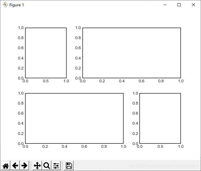
如果想实现不规则的多行多列子图网格, plt.GridSpec() 是最好的工具。 plt.GridSpec()对象本身不能直接创建一个图形,它只是 plt.subplot() 命令可以识别的简易接口。
4.1 用 plt.GridSpec 生成不规则子图
例如,一个带行列间距的 2×3 网格的配置代码如下所示:
grid = plt.GridSpec(2, 3, wspace=0.4, hspace=0.3)
可以通过类似 Python 切片的语法设置子图的位置和扩展尺寸
plt.subplot(grid[0, 0])
plt.subplot(grid[0, 1:])
plt.subplot(grid[1, :2])
plt.subplot(grid[1, 2]);
import matplotlib.pyplot as plt
plt.style.use('seaborn-white')
import numpy as np
grid = plt.GridSpec(2, 3, wspace=0.4, hspace=0.3)
plt.subplot(grid[0, 0])
plt.subplot(grid[0, 1:])
plt.subplot(grid[1, :2])
plt.subplot(grid[1, 2]);
plt.show()
4.2 用 plt.GridSpec 可视化多维分布数据
这种灵活的网格排列方式用途十分广泛,我经常会用它来创建 所示的多轴频次直方图(multi-axes histogram)
# 创建一些正态分布数据
mean = [0, 0]
cov = [[1, 1], [1, 2]]
x, y = np.random.multivariate_normal(mean, cov, 3000).T
# 设置坐标轴和网格配置方式
fig = plt.figure(figsize=(6, 6))
grid = plt.GridSpec(4, 4, hspace=0.2, wspace=0.2)
main_ax = fig.add_subplot(grid[:-1, 1:])
y_hist = fig.add_subplot(grid[:-1, 0], xticklabels=[], sharey=main_ax)
x_hist = fig.add_subplot(grid[-1, 1:], yticklabels=[], sharex=main_ax)
# 主坐标轴画散点图
main_ax.plot(x, y, 'ok', markersize=3, alpha=0.2)
# 次坐标轴画频次直方图
x_hist.hist(x, 40, histtype='stepfilled',orientation='vertical', color='gray')
x_hist.invert_yaxis()
y_hist.hist(y, 40, histtype='stepfilled',orientation='horizontal', color='gray')
y_hist.invert_xaxis()
import matplotlib.pyplot as plt
plt.style.use('seaborn-white')
import numpy as np
# 创建一些正态分布数据
mean = [0, 0]
cov = [[1, 1], [1, 2]]
x, y = np.random.multivariate_normal(mean, cov, 3000).T
# 设置坐标轴和网格配置方式
fig = plt.figure(figsize=(6, 6))
grid = plt.GridSpec(4, 4, hspace=0.2, wspace=0.2)
main_ax = fig.add_subplot(grid[:-1, 1:])
y_hist = fig.add_subplot(grid[:-1, 0], xticklabels=[], sharey=main_ax)
x_hist = fig.add_subplot(grid[-1, 1:], yticklabels=[], sharex=main_ax)
# 主坐标轴画散点图
main_ax.plot(x, y, 'ok', markersize=3, alpha=0.2)
# 次坐标轴画频次直方图
x_hist.hist(x, 40, histtype='stepfilled',orientation='vertical', color='gray')
x_hist.invert_yaxis()
y_hist.hist(y, 40, histtype='stepfilled',orientation='horizontal', color='gray')
y_hist.invert_xaxis()
plt.show()
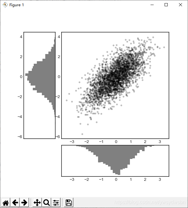
这种类型的分布图十分常见,Seaborn 程序包提供了专门的 API 来实现它们,可以自己查看。
备注
各位老铁来个“关注”、“点赞”、“评论”三连击哦
各位老铁来个“关注”、“点赞”、“评论”三连击哦
各位老铁来个“关注”、“点赞”、“评论”三连击哦
