虽然 Matplotlib 默认的坐标轴定位器(locator)与格式生成器(formatter)可以满足大部分需求,但是并非对每一幅图都合适。此次我将通过一些示例演示如何将坐标轴刻度调整为你需要的位置与格式。
在介绍示例之前,我们最好先对 Matplotlib 图形的对象层级有更深入的理解。Matplotlib 的目标是用 Python 对象表现任意图形元素。例如,想想前面介绍的 figure 对象,它其实就是一个盛放图形元素的包围盒(bounding box)。可以将每个 Matplotlib 对象都看成是子对象(sub-object)的容器,例如每个 figure 都会包含一个或多个 axes 对象,每个 axes 对象又会包含其他表示图形内容的对象。
坐标轴刻度线也不例外。每个 axes 都有 xaxis 和 yaxis 属性,每个属性同样包含构成坐标轴的线条、刻度和标签的全部属性。
Python之Matplotlib数据可视化(六):自定义坐标轴刻度
1 主要刻度与次要刻度
每一个坐标轴都有主要刻度线与次要刻度线。顾名思义,主要刻度往往更大或更显著,而次要刻度往往更小。虽然一般情况下 Matplotlib 不会使用次要刻度,但是你会在对数图中看到它们
import matplotlib.pyplot as plt
plt.style.use('seaborn-whitegrid')
import numpy as np
ax = plt.axes(xscale='log', yscale='log')
plt.show()

我们发现每个主要刻度都显示为一个较大的刻度线和标签,而次要刻度都显示为一个较小的刻度线,且不显示标签。
可以通过设置每个坐标轴的 formatter 与 locator 对象,自定义这些刻度属性(包括刻度线的位置和标签)。来检查一下图形 x 轴的属性:
In[1]: 	print(ax.xaxis.get_major_locator())
		print(ax.xaxis.get_minor_locator())
<matplotlib.ticker.LogLocator object at 0x107530cc0>
<matplotlib.ticker.LogLocator object at 0x107530198>
In[2]: 	print(ax.xaxis.get_major_formatter())
		print(ax.xaxis.get_minor_formatter())
<matplotlib.ticker.LogFormatterMathtext object at 0x107512780>
<matplotlib.ticker.NullFormatter object at 0x10752dc18>
我们会发现,主要刻度标签和次要刻度标签的位置都是通过一个 LogLocator 对象(在对数图中可以看到)设置的。然而,次要刻度有一个 NullFormatter 对象处理标签,这样标签就不会在图上显示了。
下面来演示一些示例,看看不同图形的定位器与格式生成器是如何设置的。
2 隐藏刻度与标签
隐藏图形的 x 轴标签与 y 轴刻度
最常用的刻度 / 标签格式化操作可能就是隐藏刻度与标签了,可以通过 plt.NullLocator()与 plt.NullFormatter() 实现,如下所示
ax = plt.axes()
ax.plot(np.random.rand(50))
ax.yaxis.set_major_locator(plt.NullLocator())
ax.xaxis.set_major_formatter(plt.NullFormatter())
import matplotlib.pyplot as plt
plt.style.use('seaborn-whitegrid')
import numpy as np
ax = plt.axes()
ax.plot(np.random.rand(50))
ax.yaxis.set_major_locator(plt.NullLocator())
ax.xaxis.set_major_formatter(plt.NullFormatter())
plt.show()
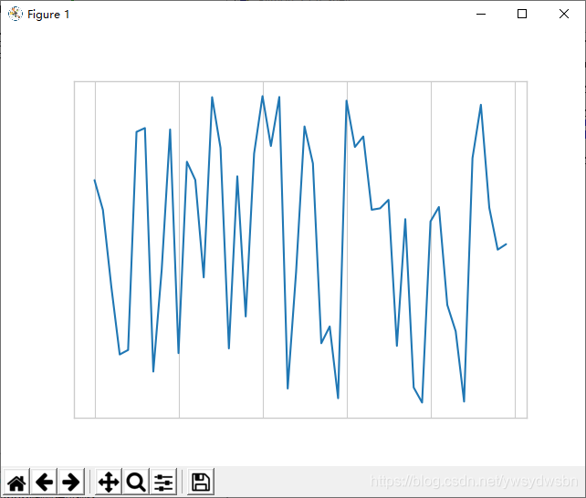
需要注意的是,我们移除了 x 轴的标签(但是保留了刻度线 / 网格线),以及 y 轴的刻度(标签也一并被移除)。
隐藏人脸图形的坐标轴
在许多场景中都不需要刻度线,比如当你想要显示一组图形时。举个例子,不同人脸的照片,就是经常用于研究有监督机器学习问题的示例:
fig, ax = plt.subplots(5, 5, figsize=(5, 5))
fig.subplots_adjust(hspace=0, wspace=0)
# 从scikit-learn获取一些人脸照片数据
from sklearn.datasets import fetch_olivetti_faces
faces = fetch_olivetti_faces().images
for i in range(5):
	for j in range(5):
		ax[i, j].xaxis.set_major_locator(plt.NullLocator())
		ax[i, j].yaxis.set_major_locator(plt.NullLocator())
		ax[i, j].imshow(faces[10 * i + j], cmap="bone")
import matplotlib.pyplot as plt
plt.style.use('seaborn-whitegrid')
import numpy as np
fig, ax = plt.subplots(5, 5, figsize=(5, 5))
fig.subplots_adjust(hspace=0, wspace=0)
# 从scikit-learn获取一些人脸照片数据
from sklearn.datasets import fetch_olivetti_faces
faces = fetch_olivetti_faces().images
for i in range(5):
    for j in range(5):
        ax[i, j].xaxis.set_major_locator(plt.NullLocator())
        ax[i, j].yaxis.set_major_locator(plt.NullLocator())
        ax[i, j].imshow(faces[10 * i + j], cmap="bone")
plt.show()
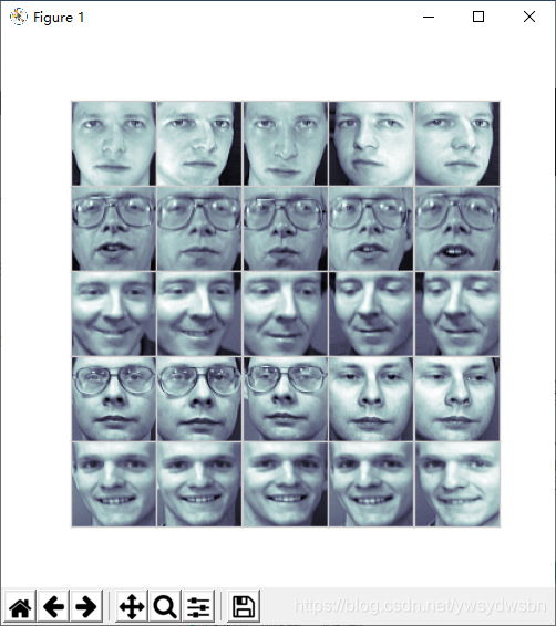
需要注意的是,由于每幅人脸图形默认都有各自的坐标轴,然而在这个特殊的可视化场景中,刻度值(本例中是像素值)的存在并不能传达任何有用的信息,因此需要将定位器设置为空。
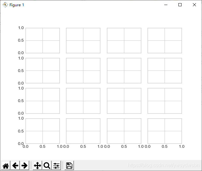
3 增减刻度数量
刻度拥挤的图形
默认刻度标签有一个问题,就是显示较小图形时,通常刻度显得十分拥挤。我们可以在下图的网格中看到类似的问题:
fig, ax = plt.subplots(4, 4, sharex=True, sharey=True)
自定义刻度数量
尤其是 x 轴,数字几乎都重叠在一起,辨识起来非常困难。我们可以用 plt.MaxNLocator()来解决这个问题,通过它可以设置最多需要显示多少刻度。根据设置的最多刻度数量,Matplotlib 会自动为刻度安排恰当的位置:
# 为每个坐标轴设置主要刻度定位器
for axi in ax.flat:
axi.xaxis.set_major_locator(plt.MaxNLocator(3))
axi.yaxis.set_major_locator(plt.MaxNLocator(3))
fig
import matplotlib.pyplot as plt
plt.style.use('seaborn-whitegrid')
import numpy as np
fig, ax = plt.subplots(4, 4, sharex=True, sharey=True)
# 为每个坐标轴设置主要刻度定位器
for axi in ax.flat:
    axi.xaxis.set_major_locator(plt.MaxNLocator(3))
    axi.yaxis.set_major_locator(plt.MaxNLocator(3))
fig
plt.show()
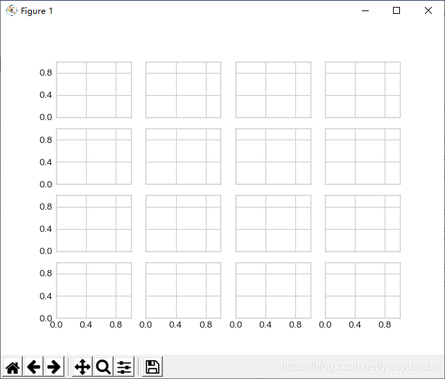
这样图形就显得更简洁了。如果你还想要获得更多的配置功能,那么可以试试 plt.MultipleLocator ,我们将在接下来的内容中介绍它。
4 花哨的刻度格式
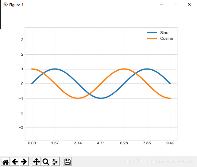
默认带整数刻度的图
Matplotlib 默认的刻度格式可以满足大部分的需求。虽然默认配置已经很不错了,但是有时候你可能需要更多的功能,例如下图中的正弦曲线和余弦曲线:
# 画正弦曲线和余弦曲线
fig, ax = plt.subplots()
x = np.linspace(0, 3 * np.pi, 1000)
ax.plot(x, np.sin(x), lw=3, label='Sine')
ax.plot(x, np.cos(x), lw=3, label='Cosine')
# 设置网格、图例和坐标轴上下限
ax.grid(True)
ax.legend(frameon=False)
ax.axis('equal')
ax.set_xlim(0, 3 * np.pi);
import matplotlib.pyplot as plt
plt.style.use('seaborn-whitegrid')
import numpy as np
# 画正弦曲线和余弦曲线
fig, ax = plt.subplots()
x = np.linspace(0, 3 * np.pi, 1000)
ax.plot(x, np.sin(x), lw=3, label='Sine')
ax.plot(x, np.cos(x), lw=3, label='Cosine')
# 设置网格、图例和坐标轴上下限
ax.grid(True)
ax.legend(frameon=False)
ax.axis('equal')
ax.set_xlim(0, 3 * np.pi);
plt.show()

在 π / 2 的倍数上显示刻度
我们可能想稍稍改变一下这幅图。首先,如果将刻度与网格线画在 π 的倍数上,图形会更加自然。可以通过设置一个 MultipleLocator 来实现,它可以将刻度放在你提供的数值的倍数上。为了更好地测量,在 π /4 的倍数上添加主要刻度和次要刻度
ax.xaxis.set_major_locator(plt.MultipleLocator(np.pi / 2))
ax.xaxis.set_minor_locator(plt.MultipleLocator(np.pi / 4))
fig
import matplotlib.pyplot as plt
plt.style.use('seaborn-whitegrid')
import numpy as np
# 画正弦曲线和余弦曲线
fig, ax = plt.subplots()
x = np.linspace(0, 3 * np.pi, 1000)
ax.plot(x, np.sin(x), lw=3, label='Sine')
ax.plot(x, np.cos(x), lw=3, label='Cosine')
# 设置网格、图例和坐标轴上下限
ax.grid(True)
ax.legend(frameon=False)
ax.axis('equal')
ax.xaxis.set_major_locator(plt.MultipleLocator(np.pi / 2))
ax.xaxis.set_minor_locator(plt.MultipleLocator(np.pi / 4))
fig
plt.show()
然而,这些刻度标签看起来有点奇怪:虽然我们知道它们是 π 的倍数,但是用小数表示圆周率不太直观。因此,我们可以用刻度格式生成器来修改。
自定义刻度标签
由于没有内置的格式生成器可以直接解决问题,因此需要用plt.FuncFormatter 来实现,用一个自定义的函数设置不同刻度标签的显示
def format_func(value, tick_number):
    # 找到 π /2的倍数刻度
    N = int(np.round(2 * value / np.pi))
    if N == 0:
        return "0"
    elif N == 1:
        return r"$\pi/2$"
    elif N == 2:
        return r"$\pi$"
    elif N % 2 > 0:
        return r"${0}\pi/2$".format(N)
    else:
        return r"${0}\pi$".format(N // 2)
ax.xaxis.set_major_formatter(plt.FuncFormatter(format_func))
fig
import matplotlib.pyplot as plt
plt.style.use('seaborn-whitegrid')
import numpy as np
# 画正弦曲线和余弦曲线
fig, ax = plt.subplots()
x = np.linspace(0, 3 * np.pi, 1000)
ax.plot(x, np.sin(x), lw=3, label='Sine')
ax.plot(x, np.cos(x), lw=3, label='Cosine')
# 设置网格、图例和坐标轴上下限
ax.grid(True)
ax.legend(frameon=False)
ax.axis('equal')
def format_func(value, tick_number):
    # 找到 π /2的倍数刻度
    N = int(np.round(2 * value / np.pi))
    if N == 0:
        return "0"
    elif N == 1:
        return r"$\pi/2$"
    elif N == 2:
        return r"$\pi$"
    elif N % 2 > 0:
        return r"${0}\pi/2$".format(N)
    else:
        return r"${0}\pi$".format(N // 2)
ax.xaxis.set_major_formatter(plt.FuncFormatter(format_func))
fig
plt.show()
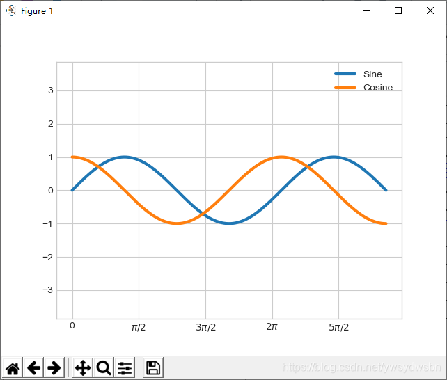
这样就好看多啦!其实我们已经用了 Matplotlib 支持 LaTeX 的功能,在数学表达式两侧加上美元符号( $ ),这样可以非常方便地显示数学符号和数学公式。在这个示例中, " $ \pi $"就表示圆周率符合 π 。
当你准备展示或打印图形时, plt.FuncFormatter() 不仅可以为自定义图形刻度提供十分灵活的功能,而且用法非常简单。
5 格式生成器与定位器小结
前面已经介绍了一些格式生成器与定位器,下面用表格简单地总结一下内置的格式生成器与定位器选项。关于两者更详细的信息,请参考各自的程序文档或者 Matplotlib 的在线文档。以下的所有类都在 plt 命名空间内。
| 定位器类 | 描述 |
|---|---|
| NullLocator | 无刻度 |
| FixedLocator | 刻度位置固定 |
| IndexLocator | 用索引作为定位器(如 x = range(len(y))) |
| LinearLocator | 从 min 到 max 均匀分布刻度 |
| LogLocator | 从 min 到 max 按对数分布刻度 |
| MultipleLocator | 刻度和范围都是基数(base)的倍数 |
| MaxNLocator | 为最大刻度找到最优位置 |
| AutoLocator | (默认)以 MaxNLocator 进行简单配置 |
| AutoMinorLocator | 次要刻度的定位器 |
| 格式生成器类 | 描述 |
|---|---|
| NullFormatter | 刻度上无标签 |
| IndexFormatter | 将一组标签设置为字符串 |
| FixedFormatter | 手动为刻度设置标签 |
| FuncFormatter | 用自定义函数设置标签 |
| FormatStrFormatter | 为每个刻度值设置字符串格式 |
| ScalarFormatter | (默认)为标量值设置标签 |
| LogFormatter | 对数坐标轴的默认格式生成器 |
备注
养成好习惯,大家来个三连击
