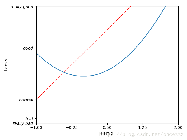
坐标轴设置
import matplotlib.pyplot as plt
import numpy as np
# 定义数据
x = np.linspace(-3, 3, 50)
y1 = 2*x + 1
y2 = x**2
# 定义figure
plt.figure()
# 绘图(x,y2)
plt.plot(x, y2)
# 绘图(x,y1)
plt.plot(x, y1, color='red', linewidth=1.0, linestyle='--')
# 设置坐标返回
plt.xlim((-1, 2))
plt.ylim((-2, 3))
# 设置坐标名称
plt.xlabel('I am x')
plt.ylabel('I am y')

# 设置x轴刻度 这里分为5个小刻度
new_ticks = np.linspace(-1, 2, 5)
print(new_ticks)
plt.xticks(new_ticks)
# 设置y轴刻度,这里将刻度以自定义的数字表示出来,比如-2显示为really bad
plt.yticks([-2, -1.8, -1, 1.22, 3],
           [r'$really\ bad$', r'$bad$', r'$normal$', r'$good$', r'$really\ good$'])
plt.show()