容器顾名思义是可以容纳其他 Widget 的,这一节我们学习Padding、DecoratedBox和ConstrainedBox。
一、Padding
在 Android 开发中我们给控件会设置内边距和外边距,也就是 padding 和 margin,当然父控件如果设置了 padding 实际上对子控件也会造成影响。Flutter 中 Padding 可以给其子节点添加填充。
  const Padding({
    Key key,
    @required this.padding,
    Widget child,
  })
padding ---- EdgeInsetsGeometry 类型,为子节点插入填充
EdgeInsetsGeometry 是一个抽象类,我们一般使用其子类 EdgeInsets
class EdgeInsets extends EdgeInsetsGeometry {
  /// 分别指定四个方向的填充。
  const EdgeInsets.fromLTRB(this.left, this.top, this.right, this.bottom);

  /// 所有方向均使用相同数值的填充。
  const EdgeInsets.all(double value)
    : left = value,
      top = value,
      right = value,
      bottom = value;

  /// 可以设置具体某个方向的填充。
  const EdgeInsets.only({
    this.left = 0.0,
    this.top = 0.0,
    this.right = 0.0,
    this.bottom = 0.0,
  });

  /// 设置对称方向的填充。
  const EdgeInsets.symmetric({
    double vertical = 0.0,
    double horizontal = 0.0,
  }) : left = horizontal,
       top = vertical,
       right = horizontal,
       bottom = vertical;
  ......
}
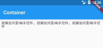
下面我们给 Padding 的 child 设置一个 Text 看一下效果。效果是 Text 周围预留 8px。
Padding(
  padding: const EdgeInsets.all(8.0),
  child: Text("观察如何影响子控件,观察如何影响子控件,观察如何影响子控件")
),
二、ConstrainedBox
Constrained 约束的意思,Box 盒子,所以这个容器实际上就是一个带有限制的框子!
  ConstrainedBox({
    Key key,
    @required this.constraints,
    Widget child,
  })
constraints ---- 对 child 施加的附加约束。
  const BoxConstraints({
    this.minWidth = 0.0,
    this.maxWidth = double.infinity,
    this.minHeight = 0.0,
    this.maxHeight = double.infinity,
  })
这些属性非常好理解,最小宽度、最大宽度、最小高度和最大高度。另外当设置为 double.infinity 代表无限大。
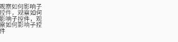
接下来我们对一个 Text 施加限制,观察 ConstrainedBox Widget 的效果。我们设置了最大宽度为 100,无法在一行内容纳所有的文字,要换行几次才行。
ConstrainedBox(
  constraints: BoxConstraints(maxWidth: 100),
  child: Text("观察如何影响子控件,观察如何影响子控件,观察如何影响子控件"))
三、DecoratedBox
可装饰的 Box,可以在其子 Widget 绘制前(或后)绘制一些装饰,如背景和边框等。
  const DecoratedBox({
    Key key,
    @required this.decoration,
    this.position = DecorationPosition.background,
    Widget child,
  })
decoration ---- 代表将要绘制的装饰,它的类型为 Decoration,我们一般使用它的子类 BoxDecoration。
position ---- 在哪里画框装饰。
enum DecorationPosition {
  /// 子 Widget 之后
  background,

  /// 子 Widget 之前
  foreground,
}
下面来详细学习 BoxDecoration。
  const BoxDecoration({
    this.color,
    this.image,
    this.border,
    this.borderRadius,
    this.boxShadow,
    this.gradient,
    this.backgroundBlendMode,
    this.shape = BoxShape.rectangle,
  })
color ---- 背景颜色
image ---- 背景图片
border ---- 边框,在背景 [color],[gradient] 或 [image] 上方绘制边框,依据 [shape] 和 [borderRadius] 绘制。
borderRadius ---- 边框圆角
boxShadow ---- 阴影
gradient ---- 渐变
backgroundBlendMode ---- 背景混合模式
shape ---- 背景形状
再来看 border ,它是一个 BoxBorder 类型,抽象类,我们一般使用其子类 Border。
  const Border({
    this.top = BorderSide.none,
    this.right = BorderSide.none,
    this.bottom = BorderSide.none,
    this.left = BorderSide.none,
  })
这不难看出是是个方向都可以控制,另外它们的类型是 BorderSide。
  const BorderSide({
    this.color = const Color(0xFF000000),
    this.width = 1.0,
    this.style = BorderStyle.solid,
  })
color ---- 颜色
width ---- 宽度
style ---- 样式
enum BorderStyle {
  none,
  /// 以实线绘制边框。
  solid,
}
borderRadius 是 BorderRadiusGeometry 类型,我们一般使用其子类 BorderRadius。
  /// 边框半径均为 [radius]。
  const BorderRadius.all(Radius radius) : this.only(
    topLeft: radius,
    topRight: radius,
    bottomLeft: radius,
    bottomRight: radius,
  );

  /// 创建垂直对称的边框半径,其中矩形的顶部和底部的半径相同。
  const BorderRadius.vertical({
    Radius top = Radius.zero,
    Radius bottom = Radius.zero,
  }) : this.only(
    topLeft: top,
    topRight: top,
    bottomLeft: bottom,
    bottomRight: bottom,
  );

  /// 创建水平对称的边框半径,其中矩形的左侧和右侧具有相同的半径。
  const BorderRadius.horizontal({
    Radius left = Radius.zero,
    Radius right = Radius.zero,
  }) : this.only(
    topLeft: left,
    topRight: right,
    bottomLeft: left,
    bottomRight: right,
  );

  /// 仅使用给定的非零值创建边框半径,其他角将是直角。
  const BorderRadius.only({
    this.topLeft = Radius.zero,
    this.topRight = Radius.zero,
    this.bottomLeft = Radius.zero,
    this.bottomRight = Radius.zero,
  });
boxShadow ---- 在框后面投射的阴影列表,其 list 内元素为 BoxShadow 类型。
  const BoxShadow({
    Color color = const Color(0xFF000000),
    Offset offset = Offset.zero,
    double blurRadius = 0.0,
    this.spreadRadius = 0.0,
  })
color 和 offset 很容易理解,即为颜色和偏移。
创建一个偏移量。 第一个参数设置[dx],水平分量,第二个参数[dy],垂直分量。
const Offset(double dx, double dy)
blurRadius ---- 模糊半径
spreadRadius ---- 在应用模糊效果之前,应先对 Box 扩展,设置宽展半径。
gradient 是 Gradient 类型,2D渐变,也就是填充 Box 时要使用的渐变。我们一般使用其子类 LinearGradient、RadialGradient 和 SweepGradient。
shape 是 BoxShape 类型。
enum BoxShape {
  /// 矩形
  rectangle,
  /// 圆形
  circle,
}
来看一个使用 DecoratedBox 的例子。
import 'package:flutter/material.dart';

void main() => runApp(MyApp());

class MyApp extends StatelessWidget {
  // This widget is the root of your application.
  @override
  Widget build(BuildContext context) {
    return MaterialApp(
      title: 'Flutter Demo',
      theme: ThemeData(
        primarySwatch: Colors.blue,
      ),
      home: ContainerRoute(),
    );
  }
}

class ContainerRoute extends StatefulWidget {
  @override
  _ContainerRouteState createState() => new _ContainerRouteState();
}

class _ContainerRouteState extends State<ContainerRoute> {
  @override
  Widget build(BuildContext context) {
    return Scaffold(
      appBar: AppBar(
        title: Text("Container"),
      ),
      body: Column(
        mainAxisAlignment: MainAxisAlignment.start,
        crossAxisAlignment: CrossAxisAlignment.start,
        children: <Widget>[
          Padding(
              padding: const EdgeInsets.all(8.0),
              child: Text("观察如何影响子控件,观察如何影响子控件,观察如何影响子控件")),
          ConstrainedBox(
              constraints: BoxConstraints(maxWidth: 100),
              child: Text("观察如何影响子控件,观察如何影响子控件,观察如何影响子控件")),
          Padding(
            padding: const EdgeInsets.all(8.0),
            child: DecoratedBox(
              decoration: BoxDecoration(
                gradient: LinearGradient(
                    colors: [Colors.red[600], Colors.green[600]]),
                borderRadius: BorderRadius.all(Radius.circular(6)),
                boxShadow: [
                  //阴影
                  BoxShadow(
                      color: Colors.grey,
                      offset: Offset(3.0, 3.0),
                      blurRadius: 4.0,
                      spreadRadius: 2.0),
                ],
              ),
              child: Padding(
                padding: const EdgeInsets.all(8.0),
                child: Text("观察如何影响子控件,观察如何影响子控件,观察如何影响子控件"),
              ),
            ),
          )
        ],
      ),
    );
  }
}

