前面的博客中我们介绍了一些常用的Flutter控件例如 文本控件,按钮控件,图片控件等并且单独的用了用、
但是,在开发过程中,我们的这些基本控件一般都是要放到布局中按照一定的顺序及距离进行排列以达到我们想要的效果。
类似于Android中的LinearLayout、RelativeLayout、FrameLayout等
所以,本期我们来看看布局类的控件。
在Flutter中,布局类控件大致分为以下两种
1. 只有一个子控件布局控件(child)
2. 可以有多个子控件的布局控件(children)
布局类的控件有很多,可以看官网的介绍
https://flutter.io/docs/development/ui/widgets/layout
只有单个子控件的布局控件
只有一个子控件的布局控件都有一个child属性,用于接收子控件,不同容器类的控件属性不同,作用也不同
下面我们来看看常用的
| 控件名称 | 作用 |
|---|---|
| Container | 可以设置宽高,颜色,定位,间距等,功能较多,比较常用,可以看做是很多其他布局控件的集合版 |
| Padding | 主要用于给子控件添加间距 |
| Center | 使子控件居中 |
| Align | 可以调整子控件相对于自身的对齐方式,并且可以设置宽高 |
| FittedBox | 设置子控件相对于父控件宽高的显示模式 |
| AspectRatio | 设置子控件的宽高比 |
| ConstrainedBox | 用于设置其子控件的宽高度,此时子控件本身设置的宽高度无效 |
| Offstage | 用于控制其子控件的显示与隐藏 |
| SizedBox | 可指定子控件的宽度及高度 |
| Transform | 可以控制子控件的平移,旋转以及缩放 |
Container
我们来着重看一下Container控件,这个可以说是功能最强大的,也是非常常用的布局类控件了
首先我们来看一下其构造方法
  Container({
    Key key,
    this.alignment,		//对齐方式
    this.padding,		//内间距
    Color color,		//颜色
    Decoration decoration,	 //背景装饰
    this.foregroundDecoration,  //前景装饰
    double width,  //宽度
    double height, //高度
    BoxConstraints constraints,  /约束
    this.margin,  //外边距
    this.transform,  //变换
    this.child,  //子控件
  })
可以看到,很多属性跟之前的基础控件属性用法一致,我们先来简单的用一用。
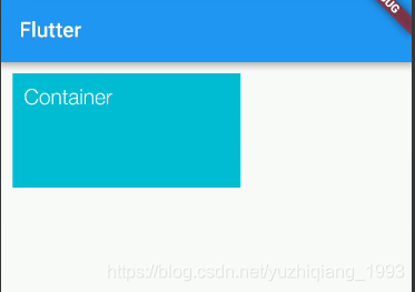
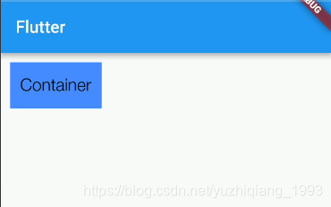
Container(
      width: 200,
      height: 100,
      color: Colors.cyan,
      padding: EdgeInsets.all(10),
      margin: EdgeInsets.all(10),
      child: Text(
        "Container",
        style: TextStyle(
          fontSize: 20,
          color: Colors.white,
        ),
      ),
    );
长这样。
下面我们来看看之前没有用过的属性
decoration
翻译后叫做“装饰器”,这个属性就是用来设置背景样式的,用decoration来设置样式可以更加的多样化。
decoration接收一个Decoration类型的值,Decoration是一个抽象类。
其继承关系如下,其中BoxDecoration和ShapeDecoration是配合Container使用的,而BoxDecoration中的功能比较齐全,基本上包含了ShapeDecoration中的所有属性,所以我们重点看一下BoxDecoration即可
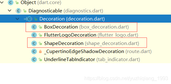

BoxDecoration
先来看看其构造方法
const BoxDecoration({
    this.color,    //颜色
    this.image,   //图片
    this.border,  //边框
    this.borderRadius,   //边角
    this.boxShadow,   //阴影
    this.gradient,   //渐变
    this.backgroundBlendMode,//背景混合模式
    this.shape = BoxShape.rectangle, //形状
  })
我们可以设置颜色,图片,边框,渐变,形状等,需要注意的是如果在decoration中设置了颜色或图片,那么container自身的color就不要设置了,不然会冲突
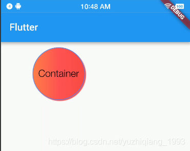
Container(
      width: 200,
      height: 100,
      alignment: Alignment.center,
      padding: EdgeInsets.all(10),
      margin: EdgeInsets.all(10),
      decoration: BoxDecoration(
          border: Border.all(color: Colors.blueAccent, width: 1),
          boxShadow: [BoxShadow(color: Colors.redAccent, offset: Offset(2, 2))],
          gradient: LinearGradient(
            colors: [Colors.orangeAccent, Colors.redAccent, Colors.red],
          ),
          shape: BoxShape.circle),
      child: Text(
        "Container",
        style: TextStyle(
          fontSize: 20,
          color: Colors.black,
        ),
      ),
    );
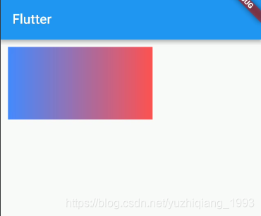
foregroundDecoration
前景装饰,一般foregroundDecoration和decoration不会同时使用,其使用方式跟decoration一致
Container(
      width: 200,
      height: 100,
      alignment: Alignment.center,
      padding: EdgeInsets.all(10),
      margin: EdgeInsets.all(10),
      foregroundDecoration: BoxDecoration(
          shape: BoxShape.rectangle,
          gradient: LinearGradient(colors: [
            Colors.blueAccent,
            Colors.redAccent,
          ])),
      child: Text(
        "Container",
        style: TextStyle(
          fontSize: 20,
          color: Colors.black,
        ),
      ),
    );
constraints
其值是BoxConstraints类型的,主要是用来限制Container的宽高,一般用来设置最大最小宽高度。
Container(
      width: 200,
      height: 100,
      color: Colors.blueAccent,
      alignment: Alignment.center,
      padding: EdgeInsets.all(10),
      margin: EdgeInsets.all(10),
      constraints: BoxConstraints(
        maxWidth: 100,
        maxHeight: 50,
      ),
      child: Text(
        "Container",
        style: TextStyle(
          fontSize: 20,
          color: Colors.black,
        ),
      ),
    );
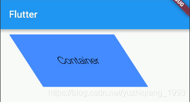
transform
变换,该属性可以设置旋转、平移、缩放。接收一个Matrix4类型的值,Matrix4中的方法有很多,也比较复杂,建议还是多看看API,都试一下。
Container(
      width: 200,
      height: 100,
      color: Colors.blueAccent,
      alignment: Alignment.center,
      padding: EdgeInsets.all(10),
      margin: EdgeInsets.all(10),
      transform: Matrix4.skewX(10),
      child: Text(
        "Container",
        style: TextStyle(
          fontSize: 20,
          color: Colors.black,
        ),
      ),
    );
Container相对于其他布局类容器时功能最齐全的一个,也就是说我们可以使用Container代替大部分的单个子控件的其他布局控件例如Padding、Center、ConstrainedBox等。这里就不再介绍了,比较简单,大家自行试一下就知道了。
下面我们来看看Container替代不了的其他控件
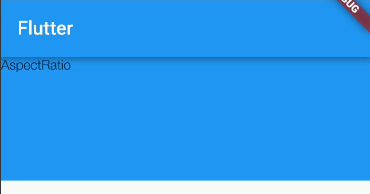
AspectRatio
这个控件可以通过设置宽高比来设置子控件的宽高
AspectRatio(
      aspectRatio: 3,//宽高比为3:1
      child: Container(
        color: Colors.blue,
        child: Text("AspectRatio"),
      ),
    );
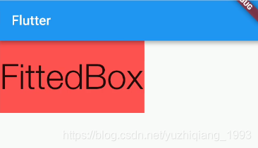
FittedBox
该控件可以设置子控件的显示模式,类似于图片中的缩放模式
Container(
      color: Colors.redAccent,
      width: 200,
      height: 100,
      child: FittedBox(
        fit: BoxFit.fitWidth,
        child: Text("FittedBox"),
      ),
    );
Offstage
该控件可以控制显示与隐藏, offstage: false即为隐藏,true为显示
Offstage(
      offstage: false,
      child: Text("Offstage"),
    );
好了,单个子控件的布局类控件大概就是这些,下一篇博客我们看看可以有多个子控件的布局类控件