文章目录
数据来源
本文使用的数据源来自https://lab.isaaclin.cn/nCoV/zh
数据可视化
import requests
import pyecharts
from pyecharts.charts import *
from pyecharts import options as opts
from pyecharts.commons.utils import JsCode
from datetime import date, datetime
import datetime
url = 'https://lab.isaaclin.cn/nCoV/api/area'
data = requests.get(url).json()

# 生成更新日期
update_date = date.today()
最新疫情数据
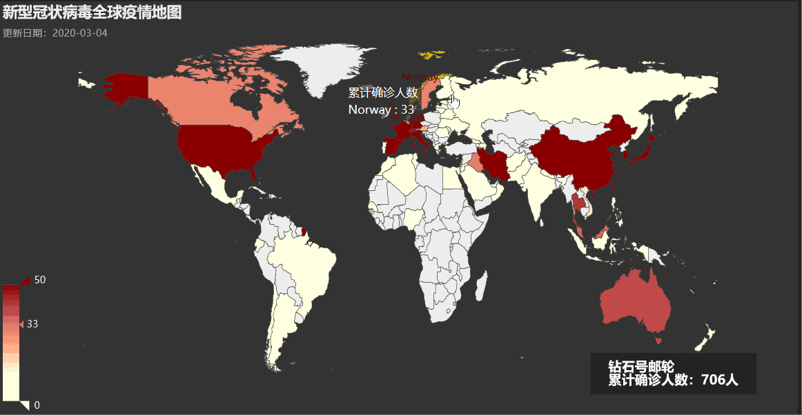
全球疫情地图
oversea_confirm = []
for item in data['results']:
    if item['countryEnglishName']:
        oversea_confirm.append((item['countryEnglishName'].replace('United States of America', 'United States')
                                                          .replace('United Kiongdom', 'United Kingdom'),
                                item['confirmedCount']))


_map = (
        Map(init_opts=opts.InitOpts(theme='dark', width='400'))
        .add("累计确诊人数", oversea_confirm, "world",is_map_symbol_show=False,  is_roam=False)
        .set_series_opts(label_opts=opts.LabelOpts(is_show=False))
        .set_global_opts(
            title_opts=opts.TitleOpts(title="新型冠状病毒全球疫情地图",
                                     subtitle="更新日期:{}".format(update_date)),
            legend_opts=opts.LegendOpts(is_show=False),
            visualmap_opts=opts.VisualMapOpts(is_show=True, max_=50,
                                              is_piecewise=False,
                                              range_color=['#FFFFE0', '#FFFFE0', '#FFA07A', '#CD5C5C', '#8B0000']),
            graphic_opts=[
                    opts.GraphicGroup(
                        graphic_item=opts.GraphicItem(
                            bounding="raw",
                            right=150,
                            bottom=50,
                            z=100,
                        ),
                        children=[
                            opts.GraphicRect(
                                graphic_item=opts.GraphicItem(
                                    left="center", top="center", z=100
                                ),
                                graphic_shape_opts=opts.GraphicShapeOpts(
                                    width=200, height=50
                                ),
                                graphic_basicstyle_opts=opts.GraphicBasicStyleOpts(
                                    fill="rgba(0,0,0,0.3)"
                                ),
                            ),
                            opts.GraphicText(
                                graphic_item=opts.GraphicItem(
                                    left="center", top="center", z=100
                                ),
                                graphic_textstyle_opts=opts.GraphicTextStyleOpts(
                                    text=JsCode("['钻石号邮轮', '累计确诊人数:{}人'].join('\\n')"
                                                .format(dict(oversea_confirm)['Diamond Princess Cruise Ship'])),
                                    font="bold 16px Microsoft YaHei",
                                    graphic_basicstyle_opts=opts.GraphicBasicStyleOpts(
                                        fill="#fff"
                                    ),
                                ),
                            ),
                        ],
                    )
                ],
        )
    )

_map.render_notebook()
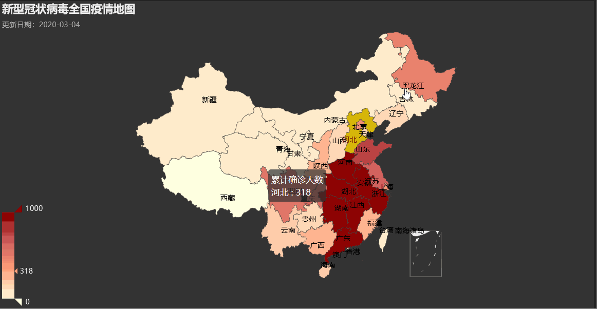
全国疫情地图
province_data = []
for item in data['results']:
    if item['countryName'] == '中国':
        province_data.append((item['provinceShortName'], item['confirmedCount']))

_map = (
        Map(init_opts=opts.InitOpts(theme='dark', width='400'))
        .add("累计确诊人数", province_data, "china",is_map_symbol_show=False,  is_roam=False)
        .set_series_opts(label_opts=opts.LabelOpts(is_show=True))
        .set_global_opts(
            title_opts=opts.TitleOpts(title="新型冠状病毒全国疫情地图",
                                     subtitle="更新日期:{}".format(update_date)),
            legend_opts=opts.LegendOpts(is_show=False),
            visualmap_opts=opts.VisualMapOpts(is_show=True, max_=1000,
                                              is_piecewise=False,
                                              range_color=['#FFFFE0', '#FFA07A', '#CD5C5C', '#8B0000'])
        )
)

_map.render_notebook()
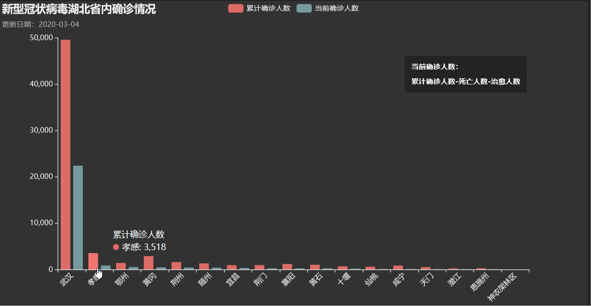
湖北省内确诊情况
for item in data['results']:
    if item['provinceShortName'] == '湖北':
        hubei_data = item['cities']

bar = (
        Bar(init_opts=opts.InitOpts(theme='dark', width='400'))
        .add_xaxis([x['cityName'] for x in hubei_data])
        .add_yaxis("累计确诊人数", [x['confirmedCount'] for x in hubei_data])
        .add_yaxis("当前确诊人数", [x['currentConfirmedCount'] for x in hubei_data])
        .set_series_opts(label_opts=opts.LabelOpts(is_show=False))
        .set_global_opts(
            title_opts=opts.TitleOpts(title="新型冠状病毒湖北省内确诊情况",
                                     subtitle="更新日期:{}".format(update_date)),
            xaxis_opts=opts.AxisOpts(axislabel_opts=opts.LabelOpts(rotate=45)),
            legend_opts=opts.LegendOpts(is_show=True),
            graphic_opts=[
                    opts.GraphicGroup(
                        graphic_item=opts.GraphicItem(
                            bounding="raw",
                            right=200,
                            top=120
                        ),
                        children=[
                            opts.GraphicRect(
                                graphic_item=opts.GraphicItem(
                                    left="center", top="center"
                                ),
                                graphic_shape_opts=opts.GraphicShapeOpts(
                                    width=200, height=60
                                ),
                                graphic_basicstyle_opts=opts.GraphicBasicStyleOpts(
                                    fill="rgba(0,0,0,0.3)"
                                ),
                            ),
                            opts.GraphicText(
                                graphic_item=opts.GraphicItem(
                                    left="center", top="center", z=1
                                ),
                                graphic_textstyle_opts=opts.GraphicTextStyleOpts(
                                    text=JsCode("['当前确诊人数:', '','累计确诊人数-死亡人数-治愈人数'].join('\\n')"),
                                    font="bold 12px Microsoft YaHei",
                                    graphic_basicstyle_opts=opts.GraphicBasicStyleOpts(
                                        fill="#fff"
                                    ),
                                ),
                            ),
                        ],
                    )
                ],
                )
        )

bar.render_notebook()
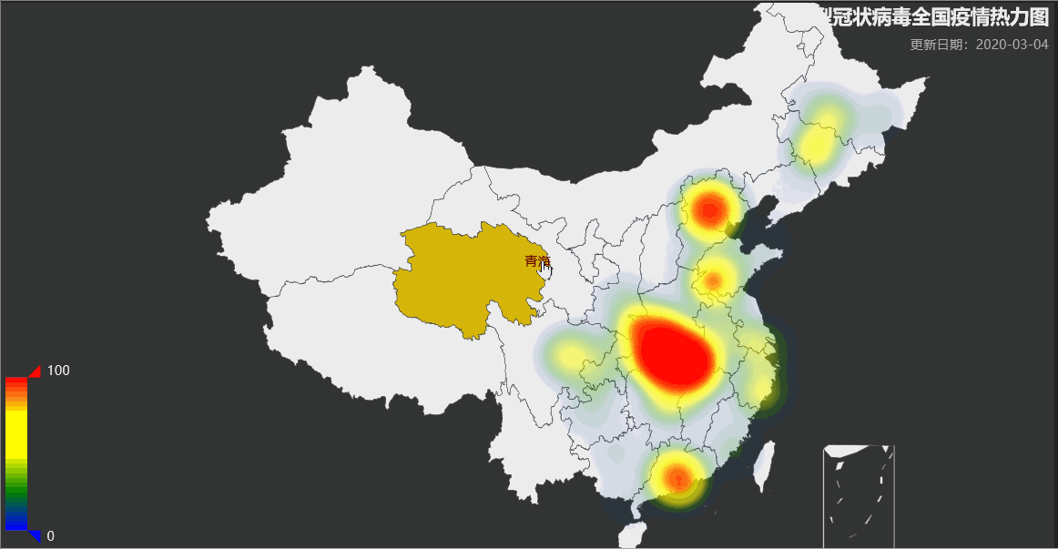
全国疫情热力图
cities_data = []
for item in data['results']:
    if item['countryName'] == '中国':
        cities_data.extend((item['cities']))

geo = (
        Geo(init_opts=opts.InitOpts(theme='dark', width='400'))
        .add_schema(maptype="china", zoom=3, center=[114.31,30.52])
        .add("累计确诊人数",
             [(i['cityName'], i['currentConfirmedCount']) for i in cities_data
              if i['cityName'] in pyecharts.datasets.COORDINATES.keys()],
             type_='heatmap',
             symbol_size=3,
             progressive=50)
        .set_series_opts(label_opts=opts.LabelOpts(is_show=False))
        .set_global_opts(
            title_opts=opts.TitleOpts(title="新型冠状病毒全国疫情热力图",
                                     subtitle="更新日期:{}".format(update_date),
                                     pos_left='right'),
            legend_opts=opts.LegendOpts(is_show=False),
            visualmap_opts=opts.VisualMapOpts(is_show=True,
                                              is_piecewise=False,
                                              range_color=['blue', 'green', 'yellow', 'yellow', 'red'])
        )
)

geo.render_notebook()
时间序列数据
数据处理
因为各地疫情数据更新时间不一致且存在缺失情况,需先对数据进行处理。
# 获取时间序列数据
# 细分到城市
area_data_timeline = requests.get('https://lab.isaaclin.cn/nCoV/api/area?latest=0').json()

# 全国数据
all_data_timeline = requests.get('http://lab.isaaclin.cn/nCoV/api/overall?latest=0').json()
def get_value(dic, key):
    try:
        return dic[key]
    except KeyError:
        return 0

def insert_data(to_update_date, to_update_area, dic, is_city):
    if to_update_date in format_data:
        if to_update_area in format_data[to_update_date]:
            pass
        else:
            format_data[to_update_date][to_update_area] = {}
    else:
        format_data[to_update_date] = {}
        format_data[to_update_date][to_update_area] = {}
    format_data[to_update_date][to_update_area]['currentConfirmedCount'] = get_value(dic, 'currentConfirmedCount')
    format_data[to_update_date][to_update_area]['confirmedCount'] = get_value(dic, 'confirmedCount')
    format_data[to_update_date][to_update_area]['deadCount'] = get_value(dic, 'deadCount')
    format_data[to_update_date][to_update_area]['suspectedCount'] = get_value(dic, 'suspectedCount')
    format_data[to_update_date][to_update_area]['curedCount'] = get_value(dic, 'curedCount')
    format_data[to_update_date][to_update_area]['countryName'] = get_value(dic, 'countryName')
    # 用于区分区域层级
    if is_city:
        format_data[to_update_date][to_update_area]['is_city'] = 1
    else:
        format_data[to_update_date][to_update_area]['is_city'] = 0

format_data = {}
for item in area_data_timeline['results'][::-1]:
    to_update_date = date.fromtimestamp(item['updateTime']/1000)
    to_update_area = item['provinceShortName']
    insert_data(to_update_date, to_update_area, item, 0)
    if 'cities' in item:
        if item['cities']:
            for city_data in item['cities']:
                insert_data(to_update_date, city_data['cityName'], city_data, 1)

for item in all_data_timeline['results'][::-1]:
    to_update_date = date.fromtimestamp(item['updateTime']/1000)
    insert_data(to_update_date, '全国', item, 0)

time_range = list(format_data.keys())
def area_data(area_name='湖北', type_='confirmedCount', get_total=True, date_list=time_range):
    # 用于pyecharts获取时间序列数据
    data_array = []
    for day in date_list:
        try:
            data_array.append(format_data[day][area_name][type_])
        except KeyError:
            if day + datetime.timedelta(days=-1) in format_data:
                if area_name in format_data[day + datetime.timedelta(days=-1)]:
                    # 当天未更新数据情况时,取前一天数据填充
                    data_array.append(format_data[day + datetime.timedelta(days=-1)][area_name][type_])
                else:
                    data_array.append(0)
            else:
                data_array.append(0)
    # 返回每日新增数据
    if not get_total:
        data_array = [data_array[i+1] - data_array[i] for i in range(len(data_array)-1)]
    return data_array
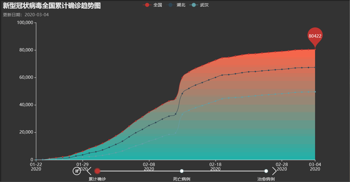
全国/湖北/武汉疫情趋势折线图
data_type = {'累计确诊': 'confirmedCount',
             '死亡病例': 'deadCount',
             '治愈病例': 'curedCount'}

tl = Timeline(init_opts=opts.InitOpts(theme='dark', width='400'))
tl.add_schema(is_auto_play=True, play_interval=5000)

for key_, value_ in data_type.items():
    line = (Line(init_opts=opts.InitOpts())
            .add_xaxis(time_range)
            .add_yaxis("全国", area_data('全国', value_),is_smooth=True,
                       areastyle_opts=opts.AreaStyleOpts(opacity=1,
                                                         color=JsCode("""new echarts.graphic.LinearGradient(0, 0, 0, 1,
                                                                        [{
                                                                            offset: 0,
                                                                            color: 'rgb(255,99,71)'
                                                                        }, {
                                                                            offset: 1,
                                                                            color: 'rgb(32,178,170)'
                                                                        }])""")),
                       markpoint_opts=opts.MarkPointOpts(data=[opts.MarkPointItem(type_="max", name="最新数据")], symbol_size=70))
            .add_yaxis("湖北", area_data('湖北', value_),is_smooth=True,
                       areastyle_opts=opts.AreaStyleOpts(opacity=0))
            .add_yaxis("武汉", area_data('武汉', value_),is_smooth=True,
                       areastyle_opts=opts.AreaStyleOpts(opacity=0))
            .set_series_opts(label_opts=opts.LabelOpts(is_show=False))
            .set_global_opts(
                title_opts=opts.TitleOpts(title="新型冠状病毒全国{}趋势图".format(key_),
                                         subtitle="更新日期:{}".format(update_date)),
                xaxis_opts=opts.AxisOpts(
                       type_="time",
                       splitline_opts=opts.SplitLineOpts(is_show=False)),
           ))
    tl.add(line, key_)

tl.render_notebook()
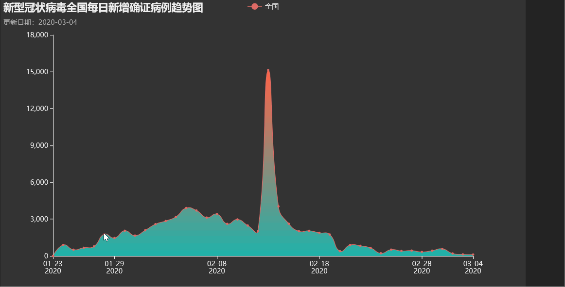
全国疫情新增趋势
line = (Line(init_opts=opts.InitOpts(theme='dark'))
        .add_xaxis(time_range[1:])
        .add_yaxis("全国", area_data('全国', get_total=False),is_smooth=True,
                   areastyle_opts=opts.AreaStyleOpts(opacity=1,
                                                     color=JsCode("""new echarts.graphic.LinearGradient(0, 0, 0, 1,
                                                                    [{
                                                                        offset: 0,
                                                                        color: 'rgb(255,99,71)'
                                                                    }, {
                                                                        offset: 1,
                                                                        color: 'rgb(32,178,170)'
                                                                    }])""")),)
        .set_series_opts(label_opts=opts.LabelOpts(is_show=False))
        .set_global_opts(
            title_opts=opts.TitleOpts(title="新型冠状病毒全国每日新增确证病例趋势图",
                                     subtitle="更新日期:{}".format(update_date)),
            xaxis_opts=opts.AxisOpts(
                   type_="time",
                   splitline_opts=opts.SplitLineOpts(is_show=False)),
       ))

line.render_notebook()
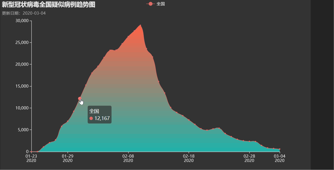
全国疑似病例趋势
line = (Line(init_opts=opts.InitOpts(theme='dark'))
        .add_xaxis(time_range[1:])
        .add_yaxis("全国", area_data('全国', 'suspectedCount', get_total=True),is_smooth=True,
                   areastyle_opts=opts.AreaStyleOpts(opacity=1,
                                                     color=JsCode("""new echarts.graphic.LinearGradient(0, 0, 0, 1,
                                                                    [{
                                                                        offset: 0,
                                                                        color: 'rgb(255,99,71)'
                                                                    }, {
                                                                        offset: 1,
                                                                        color: 'rgb(32,178,170)'
                                                                    }])""")),)
        .set_series_opts(label_opts=opts.LabelOpts(is_show=False))
        .set_global_opts(
            title_opts=opts.TitleOpts(title="新型冠状病毒全国疑似病例趋势图",
                                     subtitle="更新日期:{}".format(update_date)),
            xaxis_opts=opts.AxisOpts(
                   type_="time",
                   splitline_opts=opts.SplitLineOpts(is_show=False)),
       ))

line.render_notebook()
扫描二维码关注公众号,回复:
9778871 查看本文章

全国疫情蔓延趋势
tl = Timeline(init_opts=opts.InitOpts(theme='dark', width='400'))
tl.add_schema(axis_type='time', is_auto_play=True, is_timeline_show=False)

for day in time_range:
    geo = (
            Geo(init_opts=opts.InitOpts(theme='dark'))
            .add_schema(maptype="china", zoom=1)
            .add("累计确诊人数",
                 [(key_, value_['confirmedCount']) for key_, value_, in format_data[day].items()
                  if key_ in pyecharts.datasets.COORDINATES.keys() and value_['is_city']==1],
                 type_='heatmap',
                 symbol_size=3,
                 progressive=50)
            .set_series_opts(label_opts=opts.LabelOpts(is_show=False))
            .set_global_opts(
                title_opts=opts.TitleOpts(title="新型冠状病毒全国疫情热力图【自动轮播】",
                                         subtitle="更新日期:{}".format(update_date)),
                legend_opts=opts.LegendOpts(is_show=False),
                visualmap_opts=opts.VisualMapOpts(max_=50000, is_show=False,
                                                  is_piecewise=True,
                                                  pieces=[{"min": 50000},
                                                          {"min": 5000, "max": 50000},
                                                          {"min": 500, "max": 5000},
                                                          {"min": 10, "max": 500},
                                                          {"max": 10} ],
                                                  range_color=['blue', 'green', 'green', 'yellow', 'red']),
                graphic_opts=[opts.GraphicGroup(
                                                graphic_item=opts.GraphicItem(
                                                    rotation=JsCode("Math.PI / 4"),
                                                    bounding="raw",
                                                    right=110,
                                                    bottom=110,
                                                    z=100,
                                                ),
                                                children=[
                                                    opts.GraphicRect(
                                                        graphic_item=opts.GraphicItem(
                                                            left="center", top="center", z=100
                                                        ),
                                                        graphic_shape_opts=opts.GraphicShapeOpts(
                                                            width=400, height=50
                                                        ),
                                                        graphic_basicstyle_opts=opts.GraphicBasicStyleOpts(
                                                            fill="rgba(0,0,0,0.3)"
                                                        ),
                                                    ),
                                                    opts.GraphicText(
                                                        graphic_item=opts.GraphicItem(
                                                            left="center", top="center", z=100
                                                        ),
                                                        graphic_textstyle_opts=opts.GraphicTextStyleOpts(
                                                            text=day,
                                                            font="bold 26px Microsoft YaHei",
                                                            graphic_basicstyle_opts=opts.GraphicBasicStyleOpts(
                                                                fill="#fff"
                                                            ),
                                                        ),
                                                    ),
                                                ],
                                            )
                                ],
            )
    )

    tl.add(geo, day)

tl.render_notebook()

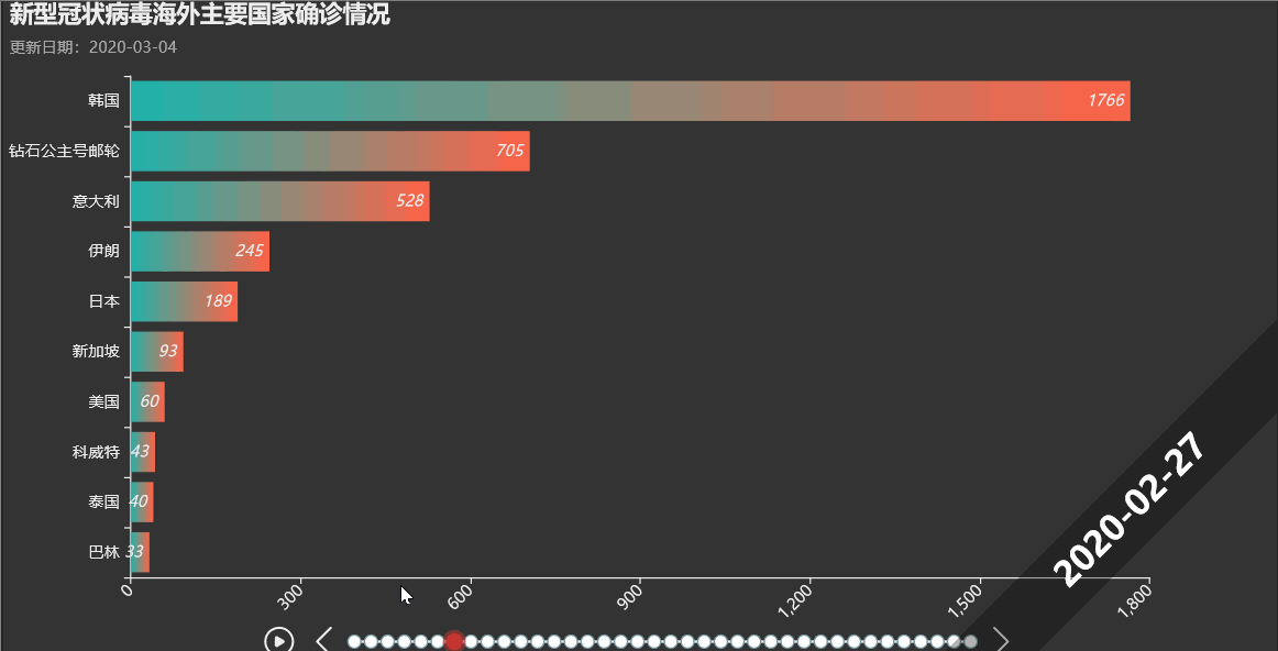
海外疫情
海外疫情趋势
在国内疫情得到有效控制的时候,海外地区却开始呈现爆发趋势。
def oversea_top(day=date.today(), top=10, d_type='confirmedCount'):
    oversea_data = filter(lambda x: x[0]!='全国' and x[1]['is_city']==0 and x[1]['countryName']!='中国',
                          format_data[day].items())
    oversea_data = sorted(oversea_data, key=lambda x: x[1]['confirmedCount'],  reverse=True)[:top]
    oversea_data = [(x[0], x[1][d_type]) for x in oversea_data]
    return oversea_data
tl = Timeline(init_opts=opts.InitOpts(theme='dark', width='400'))
tl.add_schema(axis_type='time', is_timeline_show=True,is_rewind_play=True, is_inverse=True,
             label_opts=opts.LabelOpts(is_show=False))

for day in time_range[::-1]:
    oversea_data = oversea_top(day)[::-1]
    if oversea_data:
        bar = (
            Bar(init_opts=opts.InitOpts(theme='dark'))
            .add_xaxis([x[0] for x in oversea_data])
            .add_yaxis("", [x[1] for x in oversea_data])
            .set_series_opts(label_opts=opts.LabelOpts(is_show=True,
                                                       position='insideRight',
                                                       font_style='italic'),
                            itemstyle_opts=opts.ItemStyleOpts(
                                color=JsCode("""new echarts.graphic.LinearGradient(1, 0, 0, 0,
                                             [{
                                                 offset: 0,
                                                 color: 'rgb(255,99,71)'
                                             }, {
                                                 offset: 1,
                                                 color: 'rgb(32,178,170)'
                                             }])"""))
                            )
            .set_global_opts(
                title_opts=opts.TitleOpts(title="新型冠状病毒海外主要国家确诊情况",
                                         subtitle="更新日期:{}".format(update_date)),
                xaxis_opts=opts.AxisOpts(axislabel_opts=opts.LabelOpts(rotate=45)),
                legend_opts=opts.LegendOpts(is_show=True),
                graphic_opts=[opts.GraphicGroup(graphic_item=opts.GraphicItem(
                                                   rotation=JsCode("Math.PI / 4"),
                                                   bounding="raw",
                                                   right=110,
                                                   bottom=110,
                                                   z=100),
                                               children=[
                                                   opts.GraphicRect(
                                                       graphic_item=opts.GraphicItem(
                                                           left="center", top="center", z=100
                                                       ),
                                                       graphic_shape_opts=opts.GraphicShapeOpts(
                                                           width=400, height=50
                                                       ),
                                                       graphic_basicstyle_opts=opts.GraphicBasicStyleOpts(
                                                           fill="rgba(0,0,0,0.3)"
                                                       ),
                                                   ),
                                                   opts.GraphicText(
                                                       graphic_item=opts.GraphicItem(
                                                           left="center", top="center", z=100
                                                       ),
                                                       graphic_textstyle_opts=opts.GraphicTextStyleOpts(
                                                           text=day,
                                                           font="bold 26px Microsoft YaHei",
                                                           graphic_basicstyle_opts=opts.GraphicBasicStyleOpts(
                                                               fill="#fff"
                                                           ),
                                                       ),
                                                   ),
                                               ],
                                            )
                                    ],)
            .reversal_axis()
        )
        tl.add(bar, day)

tl.render_notebook()
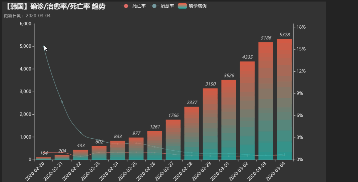
海外主要国家确诊/治愈率/死亡率趋势
country_list = ['韩国', '日本', '伊朗', '新加坡', '意大利']
date_list = [date.today() + datetime.timedelta(days=-i) for i in range(14)][::-1]
tab = Tab()

for country in country_list:
    cofirm = area_data(area_name=country, type_='confirmedCount', date_list=date_list)
    dead = area_data(area_name=country, type_='deadCount', date_list=date_list)
    cured = area_data(area_name=country, type_='curedCount', date_list=date_list)
    dead_rate = [i/j if j != 0 else 0. for i, j in zip(dead, cofirm)]
    cure_rate = [i/j if j != 0 else 0. for i, j in zip(cured, cofirm)]


    line = (Line(init_opts=opts.InitOpts(theme='dark'))
            .add_xaxis(date_list)
            .add_yaxis("死亡率", dead_rate, yaxis_index=1, is_smooth=True, color='red')
            .add_yaxis("治愈率", cure_rate, yaxis_index=1, is_smooth=True, color='green')
            .extend_axis(yaxis=opts.AxisOpts(
                    name="",
                    type_="value",
                    min_=0,
                    max_=max([max(cure_rate),max(dead_rate)])*1.2,
                    position="right",
                    axislabel_opts=opts.LabelOpts(
                                    formatter=JsCode("""function (value)
                                                    {return Number(value *100)+'%';}""")),)
            )
            .set_series_opts(label_opts=opts.LabelOpts(is_show=False))
            .set_global_opts(
                    title_opts=opts.TitleOpts(title="【{}】确诊/治愈率/死亡率 趋势".format(country),
                                             subtitle="更新日期:{}".format(update_date)),
                    tooltip_opts=opts.TooltipOpts(formatter=JsCode("""function (params)
                                                    {return Number(params.value[1] *100).toFixed(3)+'%';}""")),
                    xaxis_opts=opts.AxisOpts(axislabel_opts=opts.LabelOpts(rotate=45)),
                    legend_opts=opts.LegendOpts(is_show=True)
                    )
        )

    bar = (Bar()
                .add_xaxis(date_list)
                .add_yaxis("确诊病例", cofirm, yaxis_index=0)
                .set_series_opts(label_opts=opts.LabelOpts(is_show=True,
                                                           position='top',
                                                           font_style='italic'),
                                itemstyle_opts=opts.ItemStyleOpts(opacity=0.8,
                                    color=JsCode("""new echarts.graphic.LinearGradient
                                                (0, 0, 0, 1,
                                                 [{
                                                     offset: 0,
                                                     color: 'rgb(255,99,71)'
                                                 }, {
                                                     offset: 1,
                                                     color: 'rgb(32,178,170)'
                                                 }])"""))
                                )
                )
    line.overlap(bar)

    tab.add(line, country)

tab.render_notebook()