
OK… this one looked funnier in my head at 3 in the morning.
直线
/*使用边框的方式需要注意添加了几个方向的边框,默认border会添加四个方向的边框*/
#line1{
	width: 100px;
	height: 0;
	border: 2px solid red;
}

#line2{
	width: 100px;
	height: 4px;
	background: blue;
}
|
正方形
#square1
#square2
#square1{
	width: 100px;
	height: 100px;
	background: #35b558;
}

/*注意文本区*/
#square2{
	width: 0;
	height:0;
	border:50px solid yellow;
}
|
圆形
#circle1
#circle2
#circle1{
	width: 100px;
	height: 100px;
	border-radius: 50%;
	background: #35b558;
}

/*注意文本区*/
#circle2{
	width: 0;
	height:0;
	border-radius: 50%;
	border:50px solid yellow;
}
|
border-radius参数说明
语法
/*完整的圆角可以设置8个参数,左上角水平圆角半径大小 右上角水平圆角半径大小 右下角水平圆角半径大小 左下角水平圆角半径大小/左上角垂直圆角半径大小 右上角垂直圆角半径大小 右下角垂直圆角半径大小 左下角垂直圆角半径大小*/
border-radius: 1-4 length|% / 1-4 length|%;

border-radius: 10px;
/*等同于*/
border-top-left-radius: 10px;
border-top-right-radius: 10px;
border-bottom-right-radius: 10px;
border-bottom-left-radius: 10px;

/*注意对角补全,斜杠前为水平半径、后为垂直半径*/
border-radius: 2px 1px 4px / 0.5px 3px;

border-top-left-radius: 2px 0.5px;
border-top-right-radius: 1px 3px;
border-bottom-right-radius: 4px 0.5px;
border-bottom-left-radius: 1px 3px;
|
圆环
#circle-box{
	width: 100px;
	height: 100px;
	border:50px solid #35b558;
	border-radius: 50%;
}

/*调整单个参数可以得到更为复杂的图形*/
#circle2-box{
	width: 100px;
	height: 50px;
	border:20px solid red;
	border-radius: 100px 50px 100px 0px / 50px 20px 50px 0px}
|
三角形
#trangle .trangle1 {
        width: 0;
        height: 0;
        border-left: 50px solid transparent;
        border-right: 50px solid transparent;
        border-bottom: 100px solid red;
    }

    #trangle .trangle2 {
        width: 0;
        height: 0;
        border-left: 50px solid transparent;
        border-right: 50px solid transparent;
        border-top: 100px solid #35b558;
    }

    #trangle .trangle3 {
        width: 0;
        height: 0;
        border-left: 100px solid blue;
        border-top: 50px solid transparent;
        border-bottom: 50px solid transparent;
    }

    #trangle .trangle4 {
        width: 0;
        height: 0;
        border-right: 100px solid yellow;
        border-top: 50px solid transparent;
        border-bottom: 50px solid transparent;
} |
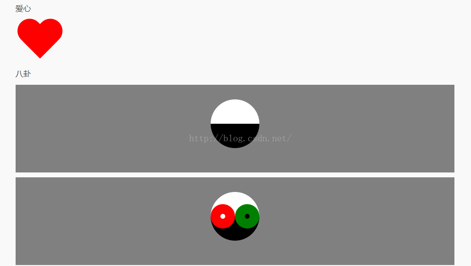

/*八卦*/
#baguai-wrap{
    padding-top: 30px;
    height: 150px;
    background-color: gray;
}

#baguai-wrap .b-circle{
    position: relative;
    width: 100px;
    height: 0;
    border-top: 50px solid #ffffff;
    border-bottom: 50px solid #000000;
    border-radius: 50%;
    margin: 0 auto;
    overflow: visible;
}

#baguai-wrap .b-circle:before{
    position: absolute;
    content: '';
    left: 0;
    top: -25px;
    width: 10px;
    height: 10px;
    border: 20px solid #000000;
    background: #ffffff;
    border-radius: 50%;
}

#baguai-wrap .b-circle:after{
    position: absolute;
    content: '';
    left: 50px;
    top: -25px;
    width: 10px;
    height: 10px;
    border: 20px solid #ffffff;
    background-color: #000000;
    border-radius: 50%;
} |
