三角形系列(三角形、倒三角、左三角、右三角、左上三角、右上三角、左下三角、右下三角)
主要用到的是:宽度高度设置为0, border的各个边的设置(各个边的透明或不透明);
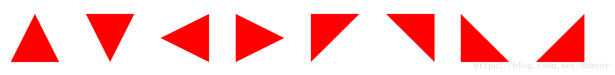
.triangle-up {
  /* 三角形 */
  width: 0;
  height: 0;
  border-left: 50px solid transparent;
  border-right: 50px solid transparent;
  border-bottom: 100px solid #f00;
}

.triangle-down {
  /* 倒三角 */
  width: 0;
  height: 0;
  border-left: 50px solid transparent;
  border-right: 50px solid transparent;
  border-top: 100px solid #f00;
}

.triangle-left {
  /* 左三角 */
  width: 0;
  height: 0;
  border-top: 50px solid transparent;
  border-bottom: 50px solid transparent;
  border-right: 100px solid #f00;
}

.triangle-right {
  /* 右三角 */
  width: 0;
  height: 0;
  border-top: 50px solid transparent;
  border-bottom: 50px solid transparent;
  border-left: 100px solid #f00;
}

.triangle-topleft {
  /* 左上三角 */
  width: 0;
  height: 0;
  border-right: 100px solid transparent;
  border-top: 100px solid #f00;
}

.triangle-topright {
  /* 右上三角 */
  width: 0;
  height: 0;
  border-left: 100px solid transparent;
  border-top: 100px solid #f00;
}

.triangle-downleft {
  /* 左下三角 */
  width: 0;
  height: 0;
  border-right: 100px solid transparent;
  border-bottom: 100px solid #f00;
}

.triangle-downright {
  /* 右下三角 */
  width: 0;
  height: 0;
  border-left: 100px solid transparent;
  border-bottom: 100px solid #f00;
}
圆形、椭圆、扇形、圆环、月牙
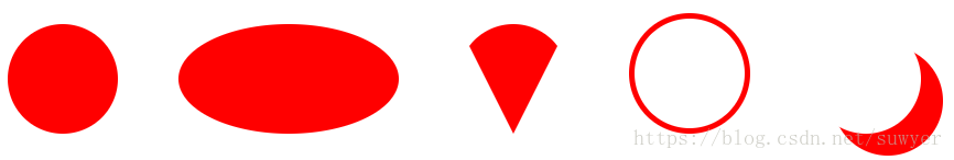
.circular {
    /* 圆形 */
    width: 100px;
    height: 100px;
    background: #f00;
    border-radius: 50%;
}

.oval {
    /* 椭圆 */
    width: 200px;
    height: 100px;
    background: #f00;
    border-radius: 100px / 50px;
}

.sector {
    /* 扇形 */
    width: 0;
    height: 0;
    border-left: 50px solid transparent;
    border-right: 50px solid transparent;
    border-top: 100px solid #f00;
    border-radius: 50%;
}

.ring {
    /* 圆环 */
    width: 100px;
    height: 100px;
    border: 5px solid #f00;
    border-radius: 50%;
}

.crescent {
    /* 月牙 */
    width: 100px;
    height: 100px;
    border-radius: 50%;
    box-shadow: 20px 20px 0 0 #f00;
}
正方形、长方形、菱形、平行四边形、梯形

.square {
    /* 正方形 */
    width: 100px;
    height: 100px;
    background: #f00;
}

.rectangle {
    /* 长方形 */
    width: 200px;
    height: 100px;
    background: #f00;
}

.rhomb {
    /* 菱形 */
    width: 100px;
    height: 100px;
    background: #f00;
    transform: rotate(45deg);
}

.parallelogram {
    /* 平行四边形 */
    width: 200px;
    height: 100px;
    background: #f00;
    transform: skew(-20deg);
}

.trapezoid {
    /* 梯形 */
    width: 100px;
    height: 0;
    border-bottom: 100px solid #f00;
    border-left: 50px solid transparent;
    border-right: 50px solid transparent;
}
五边形、六边形、八边形
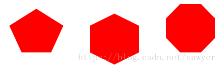
.pentagon {
    /* 五边形:三角形和梯形的结合 */
    width: 60px;
    height: 0;
    position: relative;
    border-top: 55px solid #f00;
    border-left: 25px solid transparent;
    border-right: 25px solid transparent;
}

.pentagon:before {
    content: "";
    position: absolute;
    width: 0px;
    height: 0;
    border-left: 55px solid transparent;
    border-right: 55px solid transparent;
    border-bottom: 35px solid #f00;
    left: -25px;
    top: -90px;
}

.hexagon {
    /*六边形:在长方形上面和下面各放置一个三角形*/
    width: 100px;
    height: 55px;
    background: #f00;
    position: relative;
}

.hexagon:before {
    content: "";
    width: 0;
    height: 0;
    position: absolute;
    top: -25px;
    left: 0;
    border-left: 50px solid transparent;
    border-right: 50px solid transparent;
    border-bottom: 25px solid #f00;
}

.hexagon:after {
    content: "";
    width: 0;
    height: 0;
    position: absolute;
    bottom: -25px;
    left: 0;
    border-left: 50px solid transparent;
    border-right: 50px solid transparent;
    border-top: 25px solid #f00;
}

.octagon {
    /* 八边形:长方形、上下各放置一个梯形 */
    width: 100px;
    height: 100px;
    background: #f00;
    position: relative;
}

.octagon:before {
    content: "";
    position: absolute;
    width: 42px;
    height: 0;
    border-left: 29px solid #fff;
    border-right: 29px solid #fff;
    border-bottom: 30px solid #f00;
    top: 0;
    left: 0;
}

.octagon:after {
    content: "";
    position: absolute;
    width: 42px;
    height: 0;
    border-left: 29px solid #fff;
    border-right: 29px solid #fff;
    border-top: 30px solid #f00;
    bottom: 0;
    left: 0;
}
爱心

.love {
    /* 爱心 */
    position: relative;
}

.love:before {
    content: "";
    width: 70px;
    height: 110px;
    background: #f00;
    position: absolute;
    border-top-left-radius: 50%;
    border-top-right-radius: 50%;
    transform: rotate(45deg);
}

.love:after {
    content: "";
    width: 70px;
    height: 110px;
    background: #f00;
    position: absolute;
    border-top-left-radius: 50%;
    border-top-right-radius: 50%;
    transform: rotate(-45deg);
    left: -30px;
}
无穷大符号

.infinity {
    /* 无穷大 */
    width: 190px;
    height: 100px;
    position: relative;
}

.infinity:before {
    content: "";
    width: 50px;
    height: 50px;
    position: absolute;
    top: 0;
    left: 0;
    border: 20px solid #f00;
    border-radius: 50px 50px 0 50px;
    transform: rotate(-45deg);
}

.infinity:after {
    content: "";
    width: 50px;
    height: 50px;
    position: absolute;
    top: 0;
    right: 0;
    border: 20px solid #f00;
    border-radius: 50px 50px 50px 0;
    transform: rotate(45deg);
}
鸡蛋
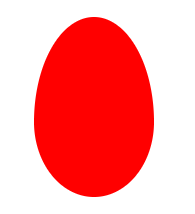
.egg {
    /* 鸡蛋 */
    width: 120px;
    height: 180px;
    background: #f00;
    border-radius: 60% 60% 60% 60% / 70% 70% 50% 50%;
}
食人豆
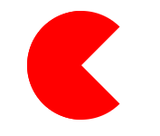
.pacman {
    /* 食人豆 */
    width: 0;
    height: 0;
    border: 60px solid #f00;
    border-right: 60px solid transparent;
    border-radius: 100%;
}
对话框
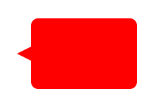
.alertDialog {
    /* 对话框:一个圆角矩形和一个小三角形 */
    width: 150px;
    height: 100px;
    background: #f00;
    border-radius: 10px;
    position: relative;
}

.alertDialog:before {
    content: "";
    width: 0;
    height: 0;
    position: absolute;
    left: -20px;
    top: 40px;
    border-top: 10px solid transparent;
    border-bottom: 10px solid transparent;
    border-right: 20px solid #f00;
}
钻石
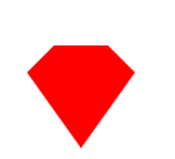
.diamond {
    /* 钻石:梯形和三角形组成 */
    width: 50px;
    height: 0;
    position: relative;
    border-bottom: 25px solid #f00;
    border-left: 25px solid transparent;
    border-right: 25px solid transparent;
}

.diamond:before {
    content: "";
    width: 0;
    height: 0;
    position: absolute;
    border-left: 50px solid transparent;
    border-right: 50px solid transparent;
    border-top: 70px solid #f00;
    left: -25px;
    top: 25px;
}
八卦图
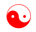
.eightDiagrams {
    /* 八卦:多个圆形组成 */
    width: 100px;
    height: 50px;
    border-color: #f00;
    border-width: 2px 2px 50px 2px;
    border-style: solid;
    border-radius: 50%;
    position: relative;
}

.eightDiagrams:before {
    content: "";
    position: absolute;
    width: 12px;
    height: 12px;
    background: #fff;
    border-radius: 50%;
    top: 50%;
    left: 0;
    border: 19px solid #f00;
}

.eightDiagrams:after {
    content: "";
    position: absolute;
    width: 12px;
    height: 12px;
    background: #f00;
    border-radius: 50%;
    top: 50%;
    left: 50%;
    border: 19px solid #fff;
}
五角星

.starFive {
    /* 五角星: */
    width: 0;
    height: 0;
    position: relative;
    border-left: 80px solid transparent;
    border-right: 80px solid transparent;
    border-bottom: 60px solid #f00;
    transform: rotate(35deg);
}

.starFive:before {
    content: "";
    position: absolute;
    width: 0;
    height: 0;
    border-left: 80px solid transparent;
    border-right: 80px solid transparent;
    border-bottom: 60px solid #f00;
    transform: rotate(-70deg);
    top: 3px;
    left: -80px;
}

.starFive:after {
    content: "";
    position: absolute;
    width: 0;
    height: 0;
    border-bottom: 60px solid #f00;
    border-right: 20px solid transparent;
    border-left: 20px solid transparent;
    transform: rotate(-35deg);
    top: -40px;
    left: -49px;
}
六角形、八角星、十二角星
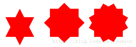
.starSix {
    /* 六角形:两个三角形组成 */
    width: 0;
    height: 0;
    position: relative;
    border-left: 50px solid transparent;
    border-right: 50px solid transparent;
    border-bottom: 100px solid #f00;
}

.starSix:before {
    content: "";
    width: 0;
    height: 0;
    position: absolute;
    top: 30px;
    left: -50px;
    border-left: 50px solid transparent;
    border-right: 50px solid transparent;
    border-top: 100px solid #f00;
}

.starEight {
    /* 八角星:两个正方形,旋转角度 */
    width: 100px;
    height: 100px;
    background: #f00;
    position: relative;
}

.starEight:before {
    content: "";
    width: 100px;
    height: 100px;
    background: #f00;
    position: absolute;
    top: 0;
    left: 0;
    transform: rotate(45deg);
}

.starTwelve {
    /* 十二角星:三个正方形,旋转角度 */
    width: 100px;
    height: 100px;
    background: #f00;
    position: relative;
}

.starTwelve:before {
    content: "";
    width: 100px;
    height: 100px;
    background: #f00;
    position: absolute;
    top: 0;
    left: 0;
    transform: rotate(-30deg)
}

.starTwelve:after {
    content: "";
    width: 100px;
    height: 100px;
    background: #f00;
    position: absolute;
    top: 0;
    left: 0;
    transform: rotate(30deg)
}