废话开篇:简单记录下一些图形绘制
一、开始
.special_shape_1 {width: 20%;height: 65px;border-radius: 3px;filter: drop-shadow(1px 1px 4px darkgray);background: radial-gradient(circle at 30% 0,transparent 0 ,transparent 12px ,lightgreen 12px),radial-gradient(circle at 30% 100%,transparent 0 ,transparent 12px ,lightgreen 12px);background-size:100% 50%,100% 50%;background-position:30% 0,30% 100%;background-repeat: no-repeat,no-repeat;
}
.special_shape_2 {width: 20%;height: 65px;border-radius: 3px;filter: drop-shadow(1px 1px 4px darkgray);background: linear-gradient(#666 0%,#666 35%,transparent 35%,transparent 100%),radial-gradient(circle at 30% 0,transparent 0 ,transparent 12px ,yellowgreen 12px),radial-gradient(circle at 30% 100%,transparent 0 ,transparent 12px ,yellowgreen 12px);background-size:1px 10px,100% 50%,100% 50%;background-position:40% 0, 30% 0,30% 100%;background-repeat:repeat-y,no-repeat,no-repeat;
}
.special_shape_3 {width: 20%;height: 65px;background-color: gold;clip-path: polygon(0 0,calc(100% - 65px) 0,100% 100%,0 100%);
}
.special_shape_4 {width: 20%;height: 65px;filter: drop-shadow(1px 1px 5px darkgray);background: linear-gradient(-135deg,transparent 46px,lightblue 0px) top right;
}
.special_shape_5 {width: 20%;height: 65px;background-color: pink;clip-path: polygon(65px 0,calc(100% - 65px) 0,100% 100%,0 100%);
}
.special_shape_6 {width: 20%;height: 65px;background-color: lightgreen;clip-path: polygon(50% 0,100% 100%,0 100%);
}
.special_shape_7 {width: 20%;height: 75px;background: linear-gradient(burlywood,burlywood),linear-gradient(burlywood,burlywood);background-repeat: no-repeat;background-position: 0px 15px,15px 0;background-size: calc(100%) calc(100% - 30px),calc(100% - 30px) calc(100%);
}
.special_shape_8 {width: 20%;height: 75px;background:radial-gradient(circle at 15px 15px,green 0 ,green 15px,transparent 15px),radial-gradient(circle at 15px 15px,green 0 ,green 15px,transparent 15px),radial-gradient(circle at 15px 15px,green 0 ,green 15px,transparent 15px),radial-gradient(circle at 15px 15px,green 0 ,green 15px,transparent 15px),linear-gradient(green,green),linear-gradient(green,green);background-repeat: no-repeat;background-position:0px 15px,100% 15px,0px 100%,100% 100%,0px 30px,15px 0;background-size:30px 30px,30px 30px,30px 30px,30px 30px,calc(100%) calc(100% - 45px),calc(100% - 30px) calc(100%);clip-path: polygon(0 15px,calc(70% - 10px) 15px,70% 0,calc(70% + 10px) 15px,100% 15px,100% 100%,0 100%);
}
.special_shape_9 {width: 0px;position: relative;border-left: solid 50px transparent;border-top: solid 50px red;
}
.special_shape_10 {width: 0px;position: relative;border-left: solid 50px blue;border-top: solid 50px transparent;
}
.dotted_line_1 {background-image: linear-gradient(to right ,#000 30%, rgba(255,255,255,0) 0%);background-position: bottom;background-size: 10px 1px;background-repeat: repeat-x;
}
.dotted_line_2 {background-image: linear-gradient(#000 0%,#000 35%,transparent 35%,transparent 100%);background-repeat: repeat-y;background-size: 1px 10%;background-position: left;
}
.dotted_line_3 {background: linear-gradient(#fff,#fff),repeating-linear-gradient(45deg,#000 0%,#000 2%,#fff 2%,#fff 4%);background-repeat: no-repeat;background-position: 1px 1px,0 0;background-size: calc(100% - 2px) calc(100% - 2px),100% 100%;
}
.dotted_line_4 {background-image: linear-gradient(#000 0%,#000 35%,transparent 35%,transparent 100%),linear-gradient(#000 0%,#000 35%,transparent 35%,transparent 100%),linear-gradient(to right ,#000 30%, rgba(255,255,255,0) 0%),linear-gradient(to right ,#000 30%, rgba(255,255,255,0) 0%);background-repeat: repeat-y,repeat-y,repeat-x,repeat-x;background-size: 1px 10px,1px 10px,10px 1px,10px 1px;background-position: left ,right,bottom,top;
}
二、小刀
<div class="knife"><div class="knife_blade"></div><div class="knife_handle"></div>
</div>
.knife {width: 100%;margin-bottom: 150px;padding-bottom: 100px;position: relative;
}

.knife > div {margin-top: 30px;margin-left: auto;margin-right: auto;
}

.knife_blade {width: 20%;height: 56px;position: absolute;top: 60px;left: calc(40% + 10px);background-color: rgb(184, 183, 180);transform: rotateZ(-45deg);transform-origin: 18px 18px;clip-path: polygon(0 0,calc(100% - 65px) 0,100% 100%,0 100%);
}

.knife_handle {position: absolute;top: 60px;left: 40%;width: 20%;height: 56px;background:radial-gradient(circle at 10px 10px,white 0,white 10px,rgb(72, 6, 6) 10px),radial-gradient(circle at 28px 0px,white 0,white 28px,rgb(72, 6, 6) 20px),radial-gradient(circle at 0 28px,rgb(72, 6, 6) 0,rgb(72, 6, 6) 28px,transparent 28px),radial-gradient(circle at 28px 28px,rgb(72, 6, 6) 0,rgb(72, 6, 6) 28px,transparent 28px),linear-gradient(rgb(72, 6, 6),rgb(72, 6, 6));background-position:18px 18px,calc(100% - 50px) 0px,100% 0px,0px 0px,28px 0px;background-repeat: no-repeat;background-size:20px 20px,56px 28px,28px 56px,28px 56px,calc(100% - 56px) 56px;
}
最后
最近还整理一份JavaScript与ES的笔记,一共25个重要的知识点,对每个知识点都进行了讲解和分析。能帮你快速掌握JavaScript与ES的相关知识,提升工作效率。
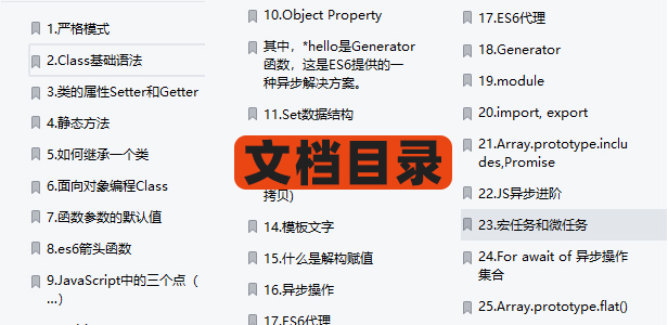
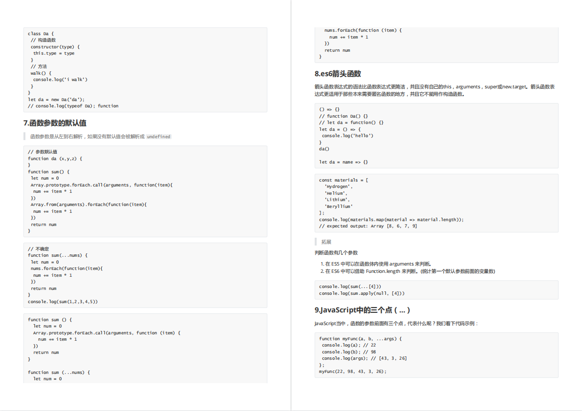

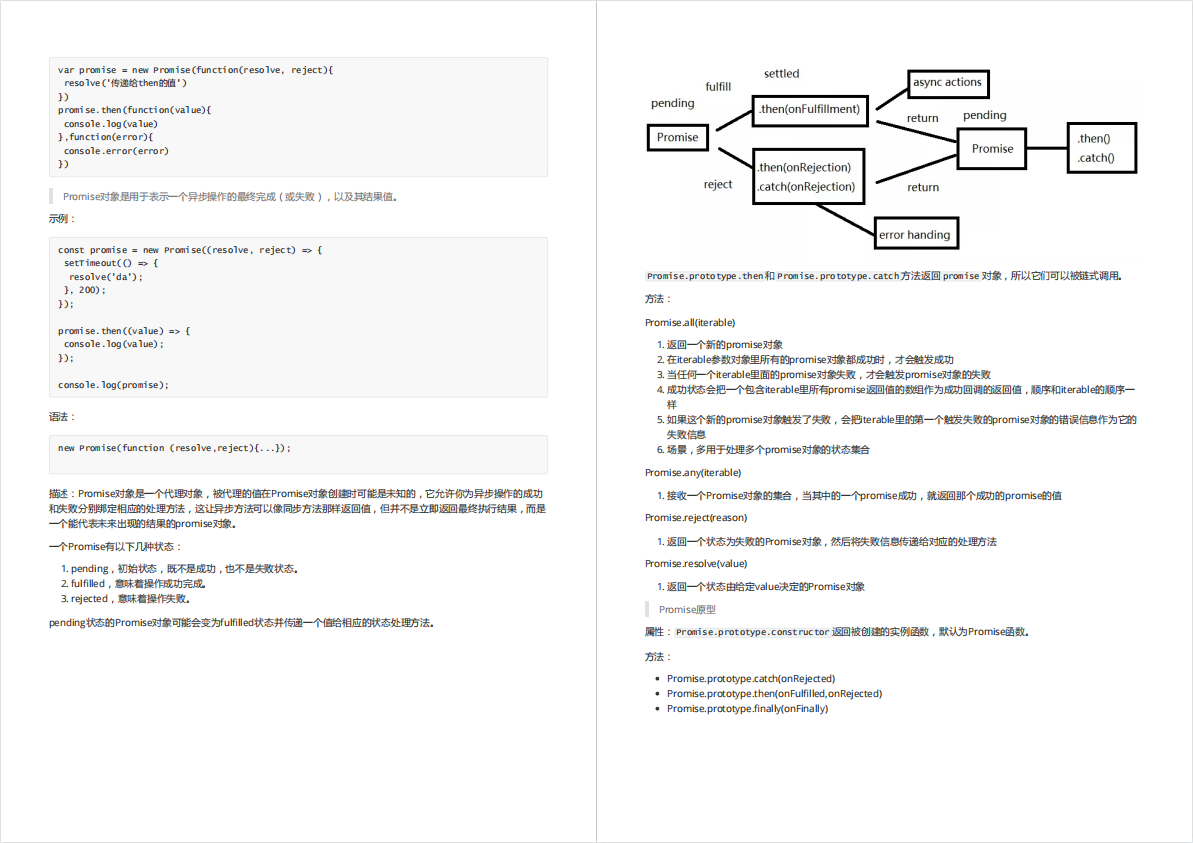
有需要的小伙伴,可以点击下方卡片领取,无偿分享