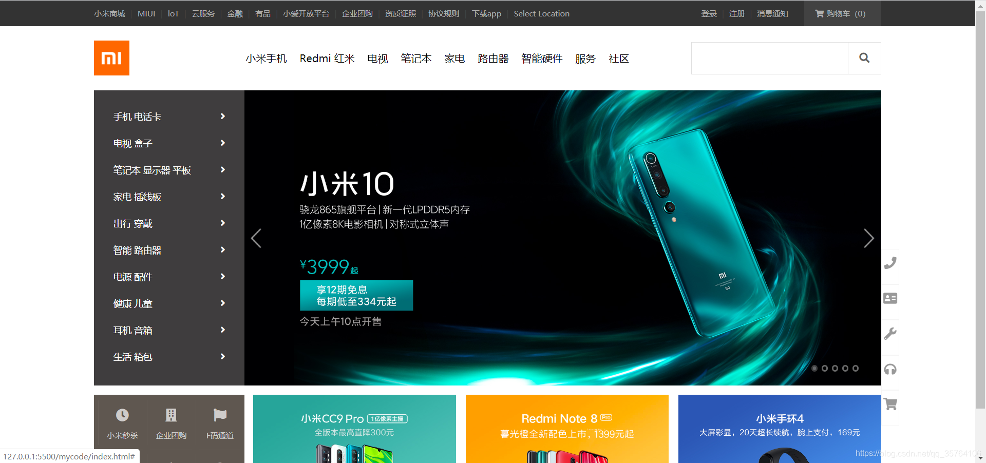
效果图
index.html
<!DOCTYPE html>
<html lang="zh">

<head>
    <meta charset="UTF-8">
    <meta name="viewport" content="width=device-width, initial-scale=1.0">
    <title>
        小米官网 - 小米10 Pro、Redmi K30、小米MIX Alpha,小米电视官方网站
    </title>
    <!-- <link rel="stylesheet" href="./css/reset.css"> -->
    <link rel="stylesheet" href="./fa/css/all.css">
    <!-- <link rel="stylesheet" href="./css/base.css"> -->
    <!-- <link rel="stylesheet" href="./css/index.css"> -->
    <!-- 为提高加载速度,需要使用压缩后的css文件 -->
    <!-- 压缩主要是删除注释、空行等 -->
    <link rel="stylesheet" href="./css/base.min.css">
    <link rel="stylesheet" href="./css/index.min.css">
    <link rel="stylesheet" href="./css/reset.min.css">
    <!-- 网页的图标,会显示在标题栏和收藏夹中 -->
    <!-- 一般放在根目录下 -->
    <link rel="icon" href="./favicon.ico">
</head>

<body>
    <!-- 顶部导航条 -->
    <!-- 顶部导航条的外部容器 -->
    <div class="top-bar-wrapper">
        <!-- 顶部导航条的主体 -->
        <!-- 添加w类使其居中 -->
        <!-- 添加clearfix类避免高度塌陷或外边距重叠 -->
        <div class="top-bar w clearfix">
            <!-- 主体的左侧服务部分 -->
            <ul class="service">
                <li><a href="#">小米商城</a></li>
                <li class="line">|</li>
                <li><a href="#">MIUI</a></li>
                <li class="line">|</li>
                <li><a href="#">loT</a></li>
                <li class="line">|</li>
                <li><a href="#">云服务</a></li>
                <li class="line">|</li>
                <li><a href="#">金融</a></li>
                <li class="line">|</li>
                <li><a href="#">有品</a></li>
                <li class="line">|</li>
                <li><a href="#">小爱开放平台</a></li>
                <li class="line">|</li>
                <li><a href="#">企业团购</a></li>
                <li class="line">|</li>
                <li><a href="#">资质证照</a></li>
                <li class="line">|</li>
                <li><a href="#">协议规则</a></li>
                <li class="line">|</li>
                <li class="app-wrapper">
                    <a class="app" href="#">下载app
                        <!-- 下拉二维码图片也能点击,将其设置为a的子元素 -->
                        <div class="qrcode">
                            <img src="./img/download.png">
                            <span>小米商城APP</span>
                        </div>
                    </a>
                </li>
                <li class="line">|</li>
                <li><a href="#">Select Location</a></li>
            </ul>
            <!-- 主体的右侧购物车部分,放置在用户信息的前面,以便向右浮动后样式满足要求 -->
            <ul class="shop-cart">
                <li>
                    <a href="#">
                        <i class="fas fa-shopping-cart"></i>购物车(0)
                    </a>
                    <div class="cart-info">
                        <span>购物车中还没有商品,赶紧选购吧!</span>
                    </div>
                </li>
            </ul>
            <!-- 主体的右侧用户信息部分 -->
            <ul class="user-info">
                <li><a href="#">登录</a></li>
                <li class="line">|</li>
                <li><a href="#">注册</a></li>
                <li class="line">|</li>
                <li><a href="#">消息通知</a></li>
            </ul>
        </div>


    </div>
    <!-- 网页头部 -->
    <!-- 网页头部的外部容器 -->
    <div class="header-wrapper">
        <!-- 网页头部的主体 -->
        <div class="header w clearfix">
            <!-- 头部左侧的logo部分 -->
            <!-- h1添加title属性便于搜索引擎检索 -->
            <h1 class="logo" title="小米">
                <!-- h1中添加文字内容便于搜索引擎检索 -->
                小米官网
                <!-- 此处不设置img标签,通过background-image来引入logo图片 -->
                <!-- /表示主页 -->
                <a href="/" class="mi-home"></a>
                <a href="/" class="mi-logo"></a>
            </h1>
            <!-- 头部中间的导航条 -->
            <!-- 导航条的外部容器 -->
            <div class="header-nav-wrapper">
                <!-- 导航条的主体-->
                <ul class="header-nav">
                    <!-- 设置wrapper类方便管理 -->
                    <li class="all-goods-wrapper">
                        <a class="all-goods" href="#">全部商品分类
                            <!-- 左侧菜单 -->
                            <ul class="left-menu">
                                <li>
                                    <a href="#">手机 电话卡
                                        <i class="fas fa-angle-right"></i>
                                    </a>
                                </li>
                                <li>
                                    <a href="#">电视 盒子
                                        <i class="fas fa-angle-right"></i>
                                    </a>
                                </li>
                                <li>
                                    <a href="#">笔记本 显示器 平板
                                        <i class="fas fa-angle-right"></i>
                                    </a>
                                </li>
                                <li>
                                    <a href="#">家电 插线板
                                        <i class="fas fa-angle-right"></i>
                                    </a>
                                </li>
                                <li>
                                    <a href="#">出行 穿戴
                                        <i class="fas fa-angle-right"></i>
                                    </a>
                                </li>
                                <li>
                                    <a href="#">智能 路由器
                                        <i class="fas fa-angle-right"></i>
                                    </a>
                                </li>
                                <li>
                                    <a href="#">电源 配件
                                        <i class="fas fa-angle-right"></i>
                                    </a>
                                </li>
                                <li>
                                    <a href="#">健康 儿童
                                        <i class="fas fa-angle-right"></i>
                                    </a>
                                </li>
                                <li>
                                    <a href="#">耳机 音箱
                                        <i class="fas fa-angle-right"></i>
                                    </a>
                                </li>
                                <li>
                                    <a href="#">生活 箱包
                                        <i class="fas fa-angle-right"></i>
                                    </a>
                                </li>
                            </ul>
                        </a>
                    </li>
                    <li class="show-goods"><a href="#">小米手机</a></li>
                    <li class="show-goods"><a href="#">Redmi 红米</a></li>
                    <li class="show-goods"><a href="#">电视</a></li>
                    <li class="show-goods"><a href="#">笔记本</a></li>
                    <li class="show-goods"><a href="#">家电</a></li>
                    <li class="show-goods"><a href="#">路由器</a></li>
                    <li class="show-goods"><a href="#">智能硬件</a></li>
                    <li><a href="#">服务</a></li>
                    <li><a href="#">社区</a></li>
                    <!-- 下拉部分 -->
                    <div class="goods-info"></div>
                </ul>
            </div>
            <!-- 头部右侧的搜索框 -->
            <form action="#" class="search-wrapper">
                <input type="text" class="search-inp">
                <button type="submit" class="search-btn">
                    <i class="fas fa-search"></i>
                </button>
            </form>
        </div>
    </div>
    <!-- banner部分 -->
    <!-- banner的外部容器 -->
    <div class="banner-wrapper">
        <!-- banner主体 -->
        <div class="banner w clearfix">
            <a class="img-list" href="#">
                <img src="./img/banner1.jpg">
            </a>
            <a class="img-list" href="#">
                <img src="./img/banner2.jpg">
            </a>
            <a class="img-list" href="#">
                <img src="./img/banner3.jpg">
            </a>
            <a class="img-list" href="#">
                <img src="./img/banner4.jpg">
            </a>
            <a class="img-list" href="#">
                <img src="./img/banner5.jpg">
            </a>
            <!-- 选择图片的小白点 -->
            <div class="point">
                <a href="#" class="active"></a>
                <a href="#"></a>
                <a href="#"></a>
                <a href="#"></a>
                <a href="#"></a>
            </div>
            <!-- 左右两个箭头 -->
            <div class="pre-next">
                <a href="#" class="pre"></a>
                <a href="#" class="next"></a>
            </div>
        </div>
    </div>
    <!-- 固定于视口的右侧帮助栏 -->
    <!-- 帮助栏的外部容器 -->
    <div class="helper-bar-wrapper">
        <!-- 帮助栏的主体 -->
        <ul class="helper-bar">
            <li><a href="#"><i class="fas fa-phone"></i></a></li>
            <li><a href="#"><i class="fas fa-address-card"></i></a></li>
            <li><a href="#"><i class="fas fa-wrench"></i></a></li>
            <li><a href="#"><i class="fas fa-headphones"></i></a></li>
            <li><a href="#"><i class="fas fa-shopping-cart"></i></a></li>
        </ul>
    </div>
    <!-- 底部的广告条 -->
    <!-- 广告条的外部容器 -->
    <div class="ad-wrapper w">
        <!-- 左侧的快捷方式 -->
        <ul class="shortcut">
            <li><a href="#">
                    <i class="fas fa-clock"></i>小米秒杀
                </a></li>
            <li><a href="#">
                    <i class="fas fa-building"></i>企业团购
                </a></li>
            <li><a href="#">
                    <i class="fas fa-flag"></i>F码通道
                </a></li>
            <li><a href="#">
                    <i class="fas fa-sim-card"></i>米粉卡
                </a></li>
            <li><a href="#">
                    <i class="fas fa-robot"></i>话费充值
                </a></li>
            <li><a href="#">
                    <i class="fas fa-clock"></i>小米秒杀
                </a></li>
        </ul>
        <!-- 其余的3个图片广告 -->
        <ul class="other-ads">
            <li><a href="#">
                    <img src="./img/1.jpg">
                </a></li>
            <li><a href="#">
                    <img src="./img/2.jpg">
                </a></li>
            <li><a href="#">
                    <img src="./img/3.jpg">
                </a></li>
        </ul>
    </div>
</body>

</html>
base.css
.clearfix::before,
.clearfix::before{
    content: '';
    display: table;
    clear: both;
}

body{
    font: 14px/1.5 Helvetica Neue,Helvetica,Arial,Microsoft Yahei,Hiragino Sans GB,Heiti SC,WenQuanYi Micro Hei,sans-serif;
    /* 设置min-width,防止网页因缩放过小而布局混乱 */
    min-width: 1226px;

}

a{
    text-decoration: none;
}

/* 网页主体内容,要设置居中 */
.w{
    width: 1226px;
    margin: 0 auto;
}
index.css
/* 开始设置顶部导航条的样式 */
.top-bar-wrapper{
    width: 100%;
    background-color: #333333;
    height: 40px;
    line-height: 40px;
}

/* 把a设置为块元素,使鼠标移动到文字的上下部分也能点击 */
.top-bar a{
    display: block;
    font-size: 12px;
    color: #b0b0b0;
}

.top-bar a:hover{
    color: #f5f5f5;
}

/* 设置分割线左右两侧外边距 */
.top-bar .line{
    font-size: 13px;
    color: #424242;
    margin: 0 8px;
}

.service,
.top-bar li{
    float: left;
}

.app{
    position: relative;
}

/* “下载APP下方的小三角” */
/* 设置app-wrapper:hover才有效,要设置父元素的鼠标移入效果*/
/* 若设置成.app:hover,会找不到.app:after */
/* .app-wrapper:hover .app::after */
.app::after{
    position: absolute;
    display: none;
    content: '';
    width: 0;
    height: 0;
    border: 8px transparent solid;
    border-top: none;
    border-bottom-color: #ffffff;
    bottom: 0;
    left: 0;
    right: 0;
    margin: auto;
}

/* 设置“下载APP”的下拉部分 */
.app .qrcode{
    /* display: none; */
    width: 124px;
    /* height: 148px; */
    /* 把高度设置为0,用hidden裁剪溢出部分,也能起到不显示的效果 */
    height: 0;
    overflow: hidden;
    box-shadow: 0 0 10px rgba(0, 0, 0, .3);
    background-color: #ffffff;
    /* top-bar-wrapper的行高设置为40px,后代也会继承 */
    /* 需要重新设置qrcode为1倍行高,避免“小米商城APP”几个字被图片挤出去 */
    line-height: 1;
    /* 父元素中设置text-align为center,使其下的文字居中 */
    text-align: center;
    position: absolute;
    left: -38px;
    /* 通过transition设置过渡效果 */
    transition: height .3s;
    z-index: 9999;
}

.qrcode img{
    width: 90px;
    margin: 17px;
    margin-bottom: 10px;

}

.qrcode span{
    font-size: 14px;
    color: #000000;

}

/* 设置小三角的显示效果要注意,正确写法是.app:hover::after */
/* 错误写法:.app:hover .app:after */
.app:hover .qrcode,
.app:hover::after{
    display: block;
    /* 该表qrcode的高度,使其显式*/
    height: 148px;
}


.shop-cart,
.user-info{
    float: right;
}

/* 设置购物车部分内容水平居中 */
.shop-cart{
    text-align: center;
    margin-left: 25px;
    position: relative;
    background-color: #424242;
}

.shop-cart a{
    width: 120px;
}

.shop-cart i{
    margin-right: 5px;
}

/* 设置购物车下拉部分 */
.shop-cart .cart-info{
    width: 315px;
    height: 0;
    overflow: hidden;
    background-color: #ffffff;
    box-shadow: 0 10px 10px rgba(0, 0, 0, .1);
    position: absolute;
    left:-195px;
    transition: height .3s;
    z-index: 9999;
}

.cart-info span{
    display:block;
    position: absolute;
    font-size: 12px;
    height: 12px;
    line-height: 12px;
    top: 0;
    bottom: 0;
    left: 0;
    right: 0;
    margin: auto;
}

 .shop-cart:hover a{
    color:#ff6700;
    background-color: #ffffff;
}

/* 设置高度,使得鼠标移入后能显示购物车下拉部分*/
.shop-cart:hover .cart-info{
    height: 100px;
}

/* 开始设置网页头部的样式 */
.header-wrapper{
    width: 100%;
    height: 100px;
    background-color: #ffffff;
    position: relative;

}

.header .logo{
    width: 55px;
    height: 55px;
    float: left;
    margin-top: 22px;
    position: relative;
    /* background-color不要设置在a标签中,会出现两个a标签之间有空白缝隙 */
    background-color: #ff6700;
    /* 设置ovverflow裁剪左侧的mi-home,需要时再让它出现 */
    overflow: hidden;
    /* 用text-indent隐藏h1中"小米官网"这几个字 */
    text-indent: -9999px;
}

/* 统一设置mi-logo和mi-home的样式 */
.logo a{
    position: absolute;
    width: 100%;
    height: 100%;
    /* 在CSS中通过background-imag设置默认图片为mi-logo.png */
    background-image: url(../img/mi-logo.png);
    background-position: center;
    /* 为a设置transition添加过渡效果 */
    /* transition检测left值的变化,因此需要先把left值设置为0 */
    left: 0;
    transition: left .3s;
}

.logo .mi-home{
    background-image: url(../img/mi-home.png);
    /* 将home图片隐藏起来 */
    left: -55px;
}

/* 设置鼠标移入时mi-home出现*/
.logo:hover .mi-home{
    left: 0;
}

/* 设置鼠标移入时mi-logo消失 */
.logo:hover .mi-logo{
    left: 56px;
}

.header-nav-wrapper{
    height: 100px;
    line-height: 100px;
    background-color: #ffffff;
    margin-left: 7px;
    float: left;
}

.header-nav{
    padding-left: 58px;
}

.header-nav>li{
    /* 修改成header-nav的子元素而不是后代元素li浮动 */
    /* 否则会影响左侧菜单,使其变成横向 */
    float: left;
}

.header-nav a{
    display: block;
    margin-right: 20px;
    color: #000000;
    font-size: 16px;
}

.header-nav a:hover{
    color: #ff6700;
}

.header-nav .all-goods-wrapper{
    position: relative;
}

.header-nav .all-goods{
    /* “全部商品分类”在首页不出现,要用visibility设置 */
    /* 若用display:none设置,会影响其他元素的布局 */
    visibility: hidden;

}

.left-menu{
    box-sizing: border-box;
    position: absolute;
    background-color: rgba(105, 101, 101, 0.6);
    left: -120px;
    width: 234px;
    height: 460px;
    z-index: 999;
    /* 分别为menu和a单独设置padding */
    /* menu设置上下的padding */
    padding: 20px 0;
}

.left-menu a{
    box-sizing: border-box;
    color: #ffffff;
    width: 100%;
    font-size: 14px;
    line-height: 42px;
    /* a设置左右的padding,保证一行全部属于a的范围 */
    padding: 0 30px;
}

.left-menu a:hover{
    color: #ffffff;
    background-color: #ff6700;
}

.left-menu a i{
    float: right;
    /* i标签也可设置行高,使图片居中 */
    line-height: 42px;
}

.goods-info{
    position: absolute;
    width: 100%;
    height: 0px;
    overflow: hidden;
    background-color: #ffffff;
    top: 100px;
    /* 需要写出left:0,否则宽度显示不完整 */
    left: 0;
    z-index: 9999;
    transition: height .3s;
}

/* 鼠标移到被隐藏的“全部商品分类”、“服务”、“社区”处不会显示下拉部分 */
/* 此时要想鼠标移到下拉部分时,仍存在,不能设置父元素的hover */
/* 而是增加一个goods-info的hover,此时它已经显示出来,可以设置hover */
.header-nav .show-goods:hover ~.goods-info,
.goods-info:hover{
    height: 228px;
    border-top: 1px solid #e0e0e0;
    box-shadow: 0 5px 5px rgba(0, 0, 0, .1);
}

.search-wrapper{
    width: 296px;
    height: 50px;
    float: right;
    margin-top: 25px;
}

.search-wrapper:hover .search-inp,
.search-wrapper:hover .search-btn{
    border-color: #b0b0b0;
}

/* 设置点击效果用focus */
/* 注意是search-inp的focus */
.search-wrapper .search-inp:focus,
.search-wrapper .search-inp:focus+.search-btn{
    border-color: #ff6700;
}


/* 直接写search-btn:hover是无效的 */
/* 需要显示写出其父元素的类 */
/* 是因为前面没有编写过search-btn的属性,如果这段代码放在后面,则不需要再显示写出父元素的类 */
.search-wrapper .search-btn:hover{
    color: #ffffff;
    background-color: #ff6700;
    border: none;
}


.search-wrapper .search-inp{
    /* 设置border-box避免计算边框等琐碎数值 */
    box-sizing: border-box;
    float: left;
    height: 100%;
    width: 244px;
    /* 去除原有的焦点效果 */
    outline: none;
    /* 设置padding使得输入内容不会紧贴左侧边框 */
    padding-left: 10px;
    border: 1px solid #e0e0e0;
    border-right: none;
    font-size: 16px;

}

.search-wrapper .search-btn{
    float: left;
    box-sizing: border-box;
    height: 100%;
    width: 52px;
    font-size: 16px;
    color: #616161;
    background-color: #ffffff;
    border: 1px solid #e0e0e0;
    outline: none;
}

/* 开始设置banner的样式 */
.banner-wrapper{
    width: 100%;
}

.banner{
    position: relative;
    height: 460px;
}

.banner img{
    position: absolute;
    width: 100%;
    vertical-align: bottom;
}

.banner .point{
    position: absolute;
    bottom: 22px;
    right: 35px;
}

.banner .point a{
    width: 6px;
    height: 6px;
    float: left;
    background-color: rgba(0, 0, 0, .4);
    border-radius: 50%;
    border: 2px solid rgba(255, 255, 255, .4);
    margin-left: 6px;
}


.banner .point .active,
.banner .point a:hover{
    background-color: rgba(255, 255, 255, .4);
    border-color: rgba(0,0, 0, .4);
}

.banner .pre-next a{
    width: 41px;
    height: 69px;
    top: 0;
    bottom: 0;
    margin: auto 0;
    position: absolute;
    /* 通过雪碧图设置左右两个箭头 */
    background-image: url('../img/icon-slides.png');
}

.pre-next .pre{
    left: 234px;
    background-position: -84px 0;
}

.pre-next .next{
    right: 0;
    background-position: -125px;
}

.pre-next .pre:hover{
    background-position: 0 0;
}

.pre-next .next:hover{
    background-position: -42px;
}

/* 开始设置固定于视口的帮助栏样式 */
.helper-bar-wrapper{
    width: 26px;
    position: fixed;
    /* 固定定位的垂直方向是不动的,容易设置 */
    bottom: 60px;
    /* 但是水平方向在浏览器缩小到一定程度后要消失不见,需要紧贴banner的右侧 */
    /* 由水平方向9个参数的等式,left和right默认auto,margin-left和margin-right默认0 */
    /* 想让帮助栏向右移动,让浏览器自动调整其left即可 */
    /* 此时可以在margin-right设置一个负数,left便自动增加对应的值 */
    right: 50%;
    margin-right: -639px;
}

.helper-bar a{
    display: block;
    width: 100%;
    height: 42px;
    background-color: #ffffff;
    color: #999999;
    border: 1px solid #f5f5f5;
    text-align: center;
    font-size: 19px;
    padding-top:11px ;
}

.helper-bar a:hover{
    color: #ff6700;
}

/* 开始设置底部广告栏的样式 */
.ad-wrapper{
    height: 170px;
    margin-top: 14px;
}

.shortcut,
.other-ads li,
.shortcut li{
    float: left;
}

.shortcut{
    /* 外层容器可设置border-box,防止后面子元素设置宽高时无意将其挤大 */
    box-sizing: border-box;
    width: 234px;
    height: 170px;
    padding-top: 2px;
    padding-left: 6px;
    background-color: #5f5750;
    margin-right: 14px;
}

.shortcut li{
    width: 76px;
    height: 84px;
    text-align: center;
    line-height: 84px;
    position: relative;
}

/* 各个快捷方式的边框在四个角是没有的 */
/*可通过伪元素before和after设置 */
/* before伪元素设置上边框 */
.shortcut li::before{
    content: '';
    position: absolute;
    width: 64px;
    height: 1px;
    background-color: #665e57;
    left: 0;
    top: 0;
    right: 0;
    margin: auto;
}

/* after伪元素设置左边框 */
.shortcut li::after{
    content: '';
    position: absolute;
    width: 1px;
    height: 70px;
    background-color: #665e57;
    left: 0;
    top: 0;
    bottom: 0;
    margin: auto;
}

.shortcut a{
    display: block;
    color: #cfccca;
    width: 100%;
    height: 100%;
    font-size: 12px;
}

.shortcut a:hover{
    color: #ffffff;
}

.shortcut a i{
    display: block;
    font-size: 20px;
    height: 0;
    margin-top: 20px;
}

.other-ads li{
    width: 316px;
    margin-right: 15px;
}

.other-ads a img{
    width: 100%;
    vertical-align: bottom;
}

.other-ads li:last-child{
    margin-right: 0;
}
