1.简单

<!DOCTYPE html>
<html lang="en">
<head>
    <meta charset="UTF-8">
    <meta http-equiv="X-UA-Compatible" content="IE=edge">
    <meta name="viewport" content="width=device-width, initial-scale=1.0">
    <title>Document</title>
 <style>
     .a1{


         background-color: pink;
         width: 1240px;
         height: 50px;

     }
     .a2{


         float: left;
         width: 240px;
         height: 300px;
         background-color:yellow;
     }
         .a3{


             float: left;
             width: 1000px;
             height: 300px;
             background-color:skyblue;
         }
 </style>
</head>
<body>
    <div class="a1"></div>
    <div class="a2"></div>
    <div class="a3"></div>
</body>
</html>
大米商城布局

<!DOCTYPE html>
<html lang="en">
<head>
<meta charset="UTF-8">
<meta http-equiv="X-UA-Compatible" content="IE=edge">
<meta name="viewport" content="width=device-width, initial-scale=1.0">
<title>Document</title>
</head>
<style>
.a1{
float: left;
width: 192px;
height: 614px;
background-color: purple;
}
.b1
{
float: left;
width: 992px;
height: 614px;
background-color: pink;
}
ul{
margin:0px;
padding:0px;
}
li{
float:left;
list-style:none;
width: 234px;
height: 300px;
background-color:skyblue;
margin-left: 14px;
margin-bottom: 14px;
}
</style>
<body>
<div class="a1"></div>
<div class="b1">
<ul class="b11">
<li></li>
<li></li>
<li></li>
<li></li>
<li></li>
<li></li>
<li></li>
<li></li>
</ul>
</div>
</body>
</html>
新闻导航
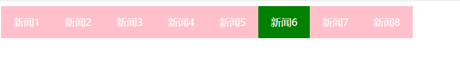
<!DOCTYPE html>
<html lang="en">
<head>
<meta charset="UTF-8">
<meta http-equiv="X-UA-Compatible" content="IE=edge">
<meta name="viewport" content="width=device-width, initial-scale=1.0">
<title>Document</title>
</head>
<style>
nav{
width: 640px;
height: 50px;
}
ul{
margin: 0px;
padding:0px;
}
li{
float: left;
list-style: none;
width: 80px;
height: 50px;
background-color: pink;
font-size: 16;
text-align: center;
line-height: 50px;
}
a{
text-decoration: none;
color: #fff;
}
li:hover{
background-color: green;
}
</style>
<body>
<div class="nav">
<ul>
<a href="#"></a>
<li> <a href="#">新闻1</a></li>
<li> <a href="#">新闻2</a></li>
<li> <a href="#">新闻3</a></li>
<li> <a href="#">新闻4</a></li>
<li> <a href="#">新闻5</a></li>
<li> <a href="#">新闻6</a></li>
<li> <a href="#">新闻7</a></li>
<li> <a href="#">新闻8</a></li>
</ul>
</div>
</body>
</html>