1.导入数据
import numpy as np
import pandas as pd
df = pd.read_csv('iris.data')
df.head()

2.修改列名
df.columns=['sepal_len', 'sepal_wid', 'petal_len', 'petal_wid', 'class']
df.head()

3.赋值
# split data table into data X and class labels y

X = df.iloc[:,0:4].values
y = df.iloc[:,4].values
4.绘图
plt.hist函数讲解
matplotlib.pyplot.hist(x, bins=None, range=None, normed=False, weights=None, cumulative=False, bottom=None, histtype=’bar’, align=’mid’, orientation=’vertical’, rwidth=None, log=False, color=None, label=None, stacked=False, hold=None, data=None, **kwargs)
x : 这个参数是指定每个bin(箱子)分布的数据,对应x轴;
bins:这个参数指定bin(箱子)的个数,也就是总共有几条条状图;
range : 设置显示的范围,范围之外的将被舍弃;
normed : 这个参数指定密度,也就是每个条状图的占比例比,默认为1;
histtype : 选择展示的类型,默认为bar;
align : 对齐方式;
orientation : 直方图方向;
log : log刻度;
color : 颜色设置;
label : 刻度标签。
from matplotlib import pyplot as plt
import math

label_dict = {1: 'Iris-Setosa',
              2: 'Iris-Versicolor',
              3: 'Iris-Virgnica'}

feature_dict = {0: 'sepal length [cm]',
                1: 'sepal width [cm]',
                2: 'petal length [cm]',
                3: 'petal width [cm]'}


plt.figure(figsize=(8, 6))
for cnt in range(4):
    plt.subplot(2, 2, cnt+1)
    for lab in ('Iris-setosa', 'Iris-versicolor', 'Iris-virginica'):
        plt.hist(X[y==lab, cnt],
                     label=lab,
                     bins=10,
                     alpha=0.3,)
    plt.xlabel(feature_dict[cnt])
    plt.legend(loc='upper right', fancybox=True, fontsize=8)

plt.tight_layout()
plt.show()

from sklearn.preprocessing import StandardScaler
X_std = StandardScaler().fit_transform(X)
print (X_std)

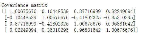
5. 求协方差矩阵
mean_vec = np.mean(X_std, axis=0)
cov_mat = (X_std - mean_vec).T.dot((X_std - mean_vec)) / (X_std.shape[0]-1)
print('Covariance matrix \n%s' %cov_mat)
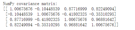
6.转置
print('NumPy covariance matrix: \n%s' %np.cov(X_std.T))
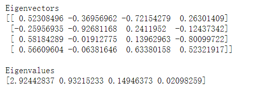
7.特征值和特征向量
numpy.cov()
Numpy中的 cov() 可以直接求得矩阵的协方差矩阵。
numpy.linalg.eig(a)
参数:
- a:想要计算奇异值和右奇异值的方阵。
返回值:
- w:特征值。每个特征值根据它的多重性重复。这个数组将是复杂类型,除非虚数部分为0。当传进的参数a是实数时,得到的特征值是实数。
- v:特征向量。
cov_mat = np.cov(X_std.T)

eig_vals, eig_vecs = np.linalg.eig(cov_mat)

print('Eigenvectors \n%s' %eig_vecs)
print('\nEigenvalues \n%s' %eig_vals)
扫描二维码关注公众号,回复:
9470631 查看本文章

8.将特征值做成特征对
# Make a list of (eigenvalue, eigenvector) tuples
eig_pairs = [(np.abs(eig_vals[i]), eig_vecs[:,i]) for i in range(len(eig_vals))]
print (eig_pairs)
print ('----------')
# Sort the (eigenvalue, eigenvector) tuples from high to low
eig_pairs.sort(key=lambda x: x[0], reverse=True)

# Visually confirm that the list is correctly sorted by decreasing eigenvalues
print('Eigenvalues in descending order:')
for i in eig_pairs:
    print(i[0])

9.COMSUM
tot = sum(eig_vals)
# 归一化成百分制
var_exp = [(i / tot)*100 for i in sorted(eig_vals, reverse=True)]
print (var_exp)
cum_var_exp = np.cumsum(var_exp)
cum_var_exp
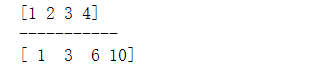
 COMSUM使用举例
a = np.array([1,2,3,4])
print (a)
print ('-----------')
print (np.cumsum(a))
10.绘图操作
bar
绘制柱形图
step
绘制动态越阶函数
plt.figure(figsize=(6, 4))

plt.bar(range(4), var_exp, alpha=0.5, align='center',
            label='individual explained variance')
plt.step(range(4), cum_var_exp, where='mid',
             label='cumulative explained variance')
plt.ylabel('Explained variance ratio')
plt.xlabel('Principal components')
plt.legend(loc='best')
plt.tight_layout()
plt.show()

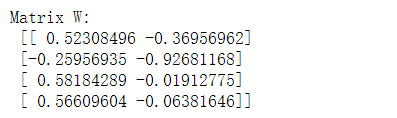
11.水平组合
matrix_w = np.hstack((eig_pairs[0][1].reshape(4,1),
                      eig_pairs[1][1].reshape(4,1)))

print('Matrix W:\n', matrix_w)
Y = X_std.dot(matrix_w)
Y

12.原始绘图
plt.figure(figsize=(6, 4))
for lab, col in zip(('Iris-setosa', 'Iris-versicolor', 'Iris-virginica'),
                        ('blue', 'red', 'green')):
     plt.scatter(X[y==lab, 0],
                X[y==lab, 1],
                label=lab,
                c=col)
plt.xlabel('sepal_len')
plt.ylabel('sepal_wid')
plt.legend(loc='best')
plt.tight_layout()
plt.show()

13.PCA后绘图
plt.figure(figsize=(6, 4))
for lab, col in zip(('Iris-setosa', 'Iris-versicolor', 'Iris-virginica'),
                        ('blue', 'red', 'green')):
     plt.scatter(Y[y==lab, 0],
                Y[y==lab, 1],
                label=lab,
                c=col)
plt.xlabel('Principal Component 1')
plt.ylabel('Principal Component 2')
plt.legend(loc='lower center')
plt.tight_layout()
plt.show()

