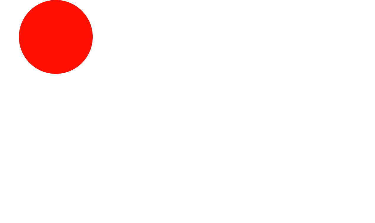
预计效果

代码
该代码可在我的GitHub中找到,链接在此
<!DOCTYPE html>
<html lang="en">
<head>
    <meta charset="UTF-8">
    <title>DIV做矩形运动</title>
    <style>
        div
        {
            width:200px;
            height:200px;
            background:red;
            border-radius: 200px;
            position:relative;
            animation-name:mymove;
            animation-duration:10s;
            animation-timing-function:linear;
            animation-delay:1s;
            animation-iteration-count:infinite;
            /*animation-direction:alternate;*/    /*这一行让div块原路返回而不是绕一个方向转*/
            animation-play-state:running;
        }

        @keyframes mymove
        {
            0%   {background:red; left:0px; top:0px;}
            25%  {background:yellow; left:800px; top:0px;}
            50%  {background:blue; left:800px; top:400px;}
            75%  {background:green; left:0px; top:400px;}
            100% {background:red; left:0px; top:0px;}
        }
    </style>
</head>
<body>
<div>
</div>
</body>
</html>
关键代码解释
width:200px;
height:200px;
background:red;
宽为200px,高为200px,背景色为红色
border-radius: 200px;
向 div 元素添加圆角边框
position:relative
position 属性把元素放置到一个静态的、相对的、绝对的、或固定的位置中,即绝对定位
animation-name:mymove;
为 @keyframes 动画规定一个名称,名称为mymove
animation-duration:10s;
animation-duration 属性定义动画完成一个周期所需要的时间,以秒或毫秒计,此处为10秒
@keyframes mymove
{
	0%   {background:red; left:0px; top:0px;}
    25%  {background:yellow; left:800px; top:0px;}
    50%  {background:blue; left:800px; top:400px;}
    75%  {background:green; left:0px; top:400px;}
    100% {background:red; left:0px; top:0px;}
}
表示这个动画的变化流程。
- 在0%时,背景色为红色,位置在(0,0);
- 在25%时,背景色为黄色,位置在(800,0);
- 在50%时,背景色为蓝色,位置在(800,400);
- 在75%时,背景色为绿色,位置在(0,400);
- 在100%时,背景色为红色,位置在(0,0);
结果展示