散点图
HSSZ.head()
Out[1]:
日期 沪深300涨跌幅 上证180涨跌幅
0 2016-01-04 -0.070206 -0.067217
1 2016-01-05 0.002800 0.004071
2 2016-01-06 0.017543 0.016765
3 2016-01-07 -0.069333 -0.066546
4 2016-01-08 0.020392 0.020349
HSSZ.corr()
Out[2]:
沪深300涨跌幅 上证180涨跌幅
沪深300涨跌幅 1.000000 0.985249
上证180涨跌幅 0.985249 1.000000
plt.figure(figsize=(9,6))
plt.scatter(x=HSSZ.iloc[:,1],y=HSSZ.iloc[:,2],c='r',marker='o')
plt.xlabel('沪深300涨跌幅')
plt.ylabel('上证180涨跌幅')
plt.title('沪深300涨跌幅与上证180涨跌幅散点图')
plt.grid()

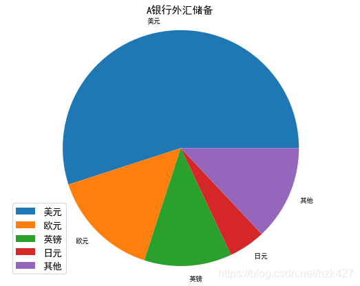
饼图
| A银行外汇储备占比 |
比值 |
| 美元 |
55% |
| 欧元 |
15% |
| 英镑 |
12% |
| 日元 |
5% |
| 其他 |
13% |
c=['美元','欧元','英镑','日元','其他'];per=[0.55,0.15,0.12,0.05,0.13]
plt.figure(figsize=(9,7))
plt.pie(x=per,labels=c)
plt.axis('equal')
plt.legend(fontsize=14)
plt.title('A银行外汇储备',fontsize=15)
Out[4]: Text(0.5,1,'A银行外汇储备')
Pyplot常用绘图函数总结
| 函数 |
常用参数 |
| figure:定义画布大小 |
figsize,facecloor(背景颜色),edgecolor |
| plot:曲线图 |
x,y,‘r-’(曲线格式字串),label(曲线标签) |
| subplot:子图 |
行,列,序号 |
| hist:直方图 |
x,label,bins(矩形数量),facecolor,edgecolor |
| bar:垂直条形图 |
x,height(条形图高度),width(条形图宽度),label |
| scatter:散点图 |
x,y,c(散点颜色),marker(散点样式) |
| pie:饼图 |
x(每一块的占比列表),labels(每一块的标签列表) |
| xticks:x轴的刻度 |
fontsize,rotation |
| xlabel:x轴标签 |
‘str’,fontsize,rotation |
| xlim:x轴刻度范围 |
xmin,xmax |
| title:标题 |
‘str’,fontsize |
| legend:图例 |
loc,fontsize |
| grid:网格线 |
通常不输入参数 |
| annotate:添加注释 |
‘str’,xy(标注位置),xytext(注释位置),arrowprops(箭头特征,dict格式) |
