CSS3d——立体几何效果(正方体)实现
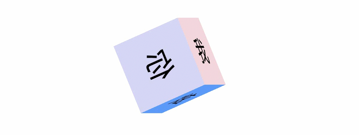
1.效果图:
2.全局代码:
- 代码如下:
	<!doctype html>
	<html lang="en">
	 <head>
	  <meta charset="UTF-8">
	  <meta name="Generator" content="EditPlus®">
	  <meta name="Author" content="">
	  <meta name="Keywords" content="">
	  <meta name="Description" content="">
	  <title>Document</title>
		<style type="text/css">
			*{
				margin:0;
				padding:0;
			}

			ul[class="container"]{
				width:200px;
				height:200px;
				transform-style:preserve-3d;
				position:relative;
				box-shadow:0 2px 2px transparent;
				margin:100px auto;
				transform:perspective(400px)  rotateY(45deg) rotateX(45deg);
				animation:play 10s linear infinite;
			}

			ul li{
				list-style-type:none;
				width:200px;
				height:200px;
				position:absolute;
				top:0;
				left:0;
				text-align:center;
				line-height:200px;
				font-size:80px;
			}

			ul li:first-child{
				background-color:#D6D6F5;
				transform:translateX(-100px) rotateY(90deg);
			}

			ul li:nth-child(2){
				background-color:#D06CE8;
				transform:translateX(100px) rotateY(90deg);
			}

			ul li:nth-child(3){
				background-color:#F5D6DC;
				transform:translateY(-100px) rotateX(90deg);
			}

			ul li:nth-child(4){
				background-color:#88CCBE;
				transform:translateY(100px) rotateX(90deg);
			}

			ul li:nth-child(5){
				background-color:#CCE372;
				transform:translateZ(-100px);
			}

			ul li:last-child{
				background-color:#5B9AFA;
				transform:translateZ(100px);
			}

			@keyframes play{
				0%{
					transform:rotateY(0deg) rotateX(0deg);
				}

				25%{
					transform:rotateY(180deg) rotateX(-180deg);
				}

				50%{
					transform:rotateY(360deg) rotateX(-360deg);
				}

				75%{
					transform:rotateY(540deg) rotateX(360deg);
				}

				100%{
					transform:rotateY(720deg) rotateX(180deg);
				}
			}
		</style>
	 </head>

	 <body>
		<ul class="container">
			<li>你</li>
			<li>看</li>
			<li>我</li>
			<li>我</li>
			<li>真</li>
			<li>炫</li>
		</ul>
	 </body>
	</html>
3.总结:
针对该3d变幻效果,就是对CSS里面的一些变形与动画的一些运用。详情请看:https://www.imooc.com/learn/33
更加炫酷的动画请参考:https://www.cnblogs.com/1wen/p/9064011.html
熟能生巧。
