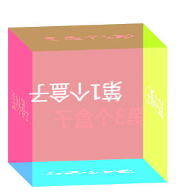
一、效果图
二、源码
<!DOCTYPE html>
<html lang="en">
<head>
    <meta charset="UTF-8">
    <title>CSS3之立方体</title>
    <style>
        *{ margin: 0; padding: 0;}

        ul {
            list-style-type: none;
            margin: 100px auto;
            width: 200px;
            height: 200px;
            position: relative;
            transform-style: preserve-3d;
            transition: all 6s;

        }
        ul li {
            width: 100%;
            height: 100%;
            line-height: 200px;
            text-align: center;
            font-size: 30px;
            color: white;
            position: absolute;
        }
        ul li:nth-child(1) {
            background-color: rgba(255, 82, 94, 0.6);
            transform: rotateX(0deg) translateZ(100px);
        }
        ul li:nth-child(2) {
             background-color: rgba(0,255,0,.6);
             transform: rotateX(-90deg) translateZ(100px);
         }
        ul li:nth-child(3) {
            background-color: rgba(177, 255, 248, 0.6);
            transform: rotateX(-180deg) translateZ(100px);
        }
        ul li:nth-child(4) {
            background-color: rgba(0,255,255,.6);
            transform: rotateX(-270deg) translateZ(100px);
        }
        ul li:nth-child(5) {
            background-color: rgba(255,255,0,.6);
            transform: rotateY(-90deg) translateZ(100px);
        }
        ul li:nth-child(6) {
           background-color: rgba(255,0,255,.6);
            transform: rotateY(90deg) translateZ(100px);
        }
        ul:hover {
            transform: rotateX(360deg) rotateY(360deg);
        }
    </style>
</head>
<body>
    <ul>
        <li>第1个盒子</li>
        <li>第2个盒子</li>
        <li>第3个盒子</li>
        <li>第4个盒子</li>
        <li>第5个盒子</li>
        <li>第6个盒子</li>
    </ul>
</body>
</html>