这是最近在公司做一个产品的官网遇到的。
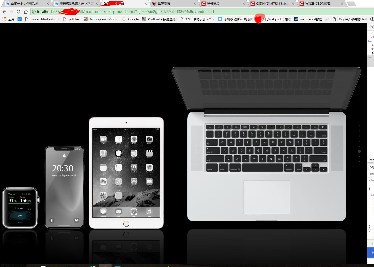
这是谷歌显示效果。
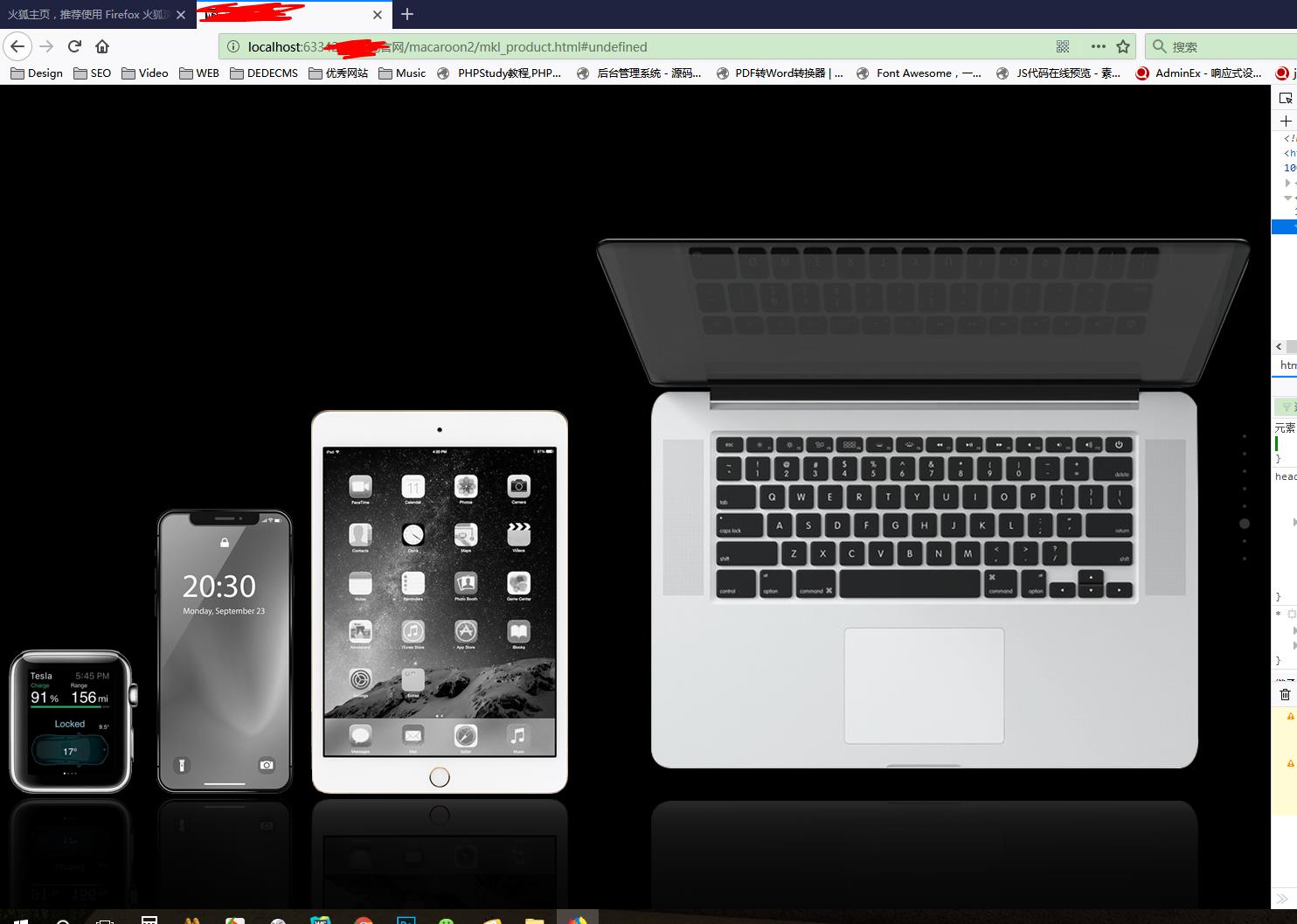
这是兼容之后火狐的效果。
贴上代码:
<ul class="wifi-device">
    <li><img id="wifi-watch" src="img/mkl_watch.png" alt=""></li>
    <li><img id="wifi-iphone" src="img/mkl_iphone.png" alt=""></li>
    <li><img id="wifi-ipad" src="img/mkl_ipad.png" alt=""></li>
    <li><img id="wifi-mac" src="img/mkl_mac.png" alt=""></li>
    <li></li>
</ul>
.wifi-device{
    display: flex;
    align-items:flex-end;
    justify-content: space-around;
    position: relative;
}
.wifi-device li{
    padding-top: 110px;
}
.wifi-device li img{
    -webkit-box-reflect: below 5px -webkit-linear-gradient(transparent,transparent 60%,rgba(0,0,0,.2));
}
.wifi-device li:nth-child(4) img{
    -webkit-box-reflect: below -27px -webkit-linear-gradient(transparent,transparent 60%,rgba(0,0,0,.2));
}
/*兼容火狐倒影*/
.wifi-device li:after{
    position: absolute;
    opacity: 0.4;
    content: "";
    display: block;
    width: 100%;
    -moz-transform: scaleY(-1);
}
.wifi-device li:nth-child(1):after {
    background: -moz-element(#wifi-watch) no-repeat;
    height: 165px;
}
.wifi-device li:nth-child(2):after {
    background: -moz-element(#wifi-iphone) no-repeat;
    height: 325px;
}
.wifi-device li:nth-child(3):after {
    background: -moz-element(#wifi-ipad) no-repeat;
    height: 440px;
}
.wifi-device li:nth-child(4):after {
    background: -moz-element(#wifi-mac) no-repeat;
    height: 610px;
}
.wifi-device li:nth-child(5){
    position: absolute;
    height: 200px;
    width: 100%;
    top: 100%;
    padding: 0;
    background: -moz-linear-gradient(rgba(0,0,0,0),1%,rgba(0,0,0,1))
}