文章目录
线性渐变 linear-gradient
语法
background-image: linear-gradient(direction, color-stop1, color-stop2, ...);
示例
<!doctype html>
<html lang="en">
<head>
  <meta charset="UTF-8">
  <meta name="viewport"
        content="width=device-width, user-scalable=no, initial-scale=1.0, maximum-scale=1.0, minimum-scale=1.0">
  <meta http-equiv="X-UA-Compatible" content="ie=edge">
  <title>线性渐变</title>
  <style>
    .box {


        width: 200px;
        height: 200px;
        margin: 0 auto;
    }
  </style>
</head>
<body>
<div class="box"></div>
</body>
</html>
方向
预定义方向
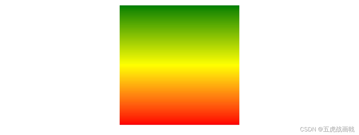
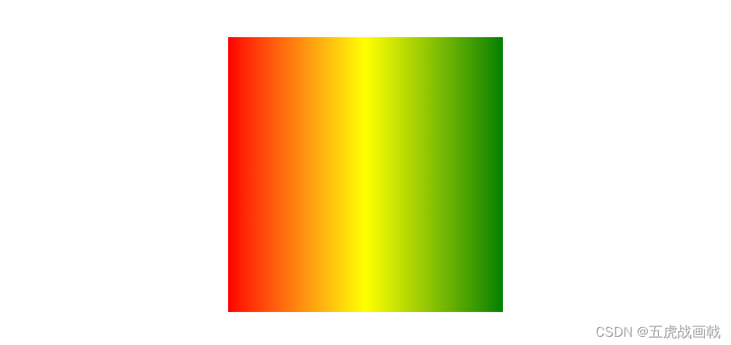
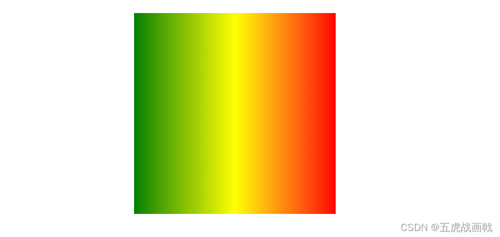
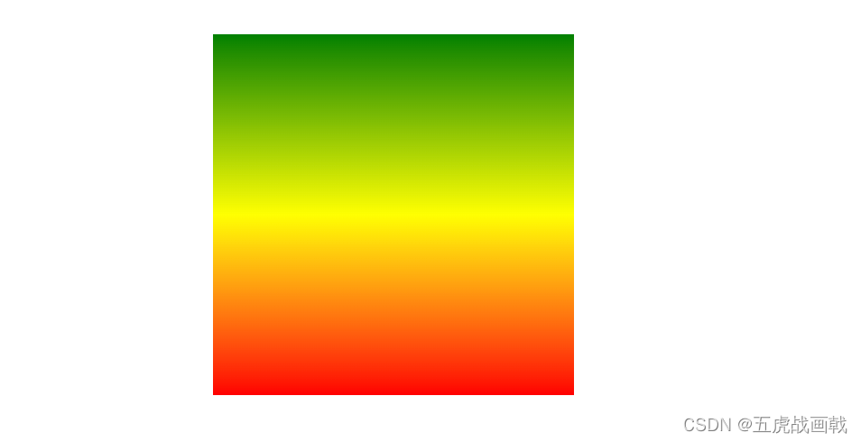
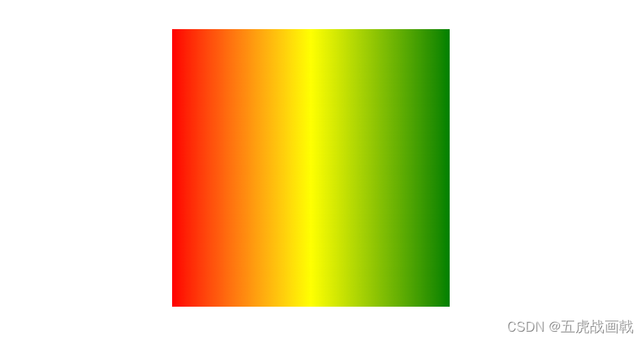
| background-image: linear-gradient(green, yellow, red); 默认(从上到下) |
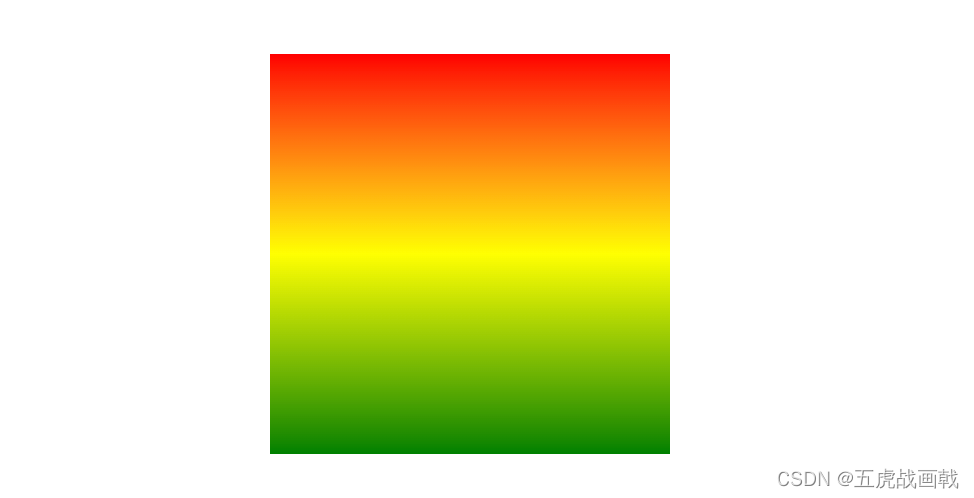
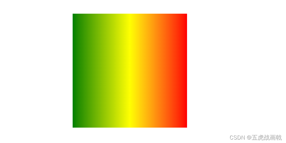
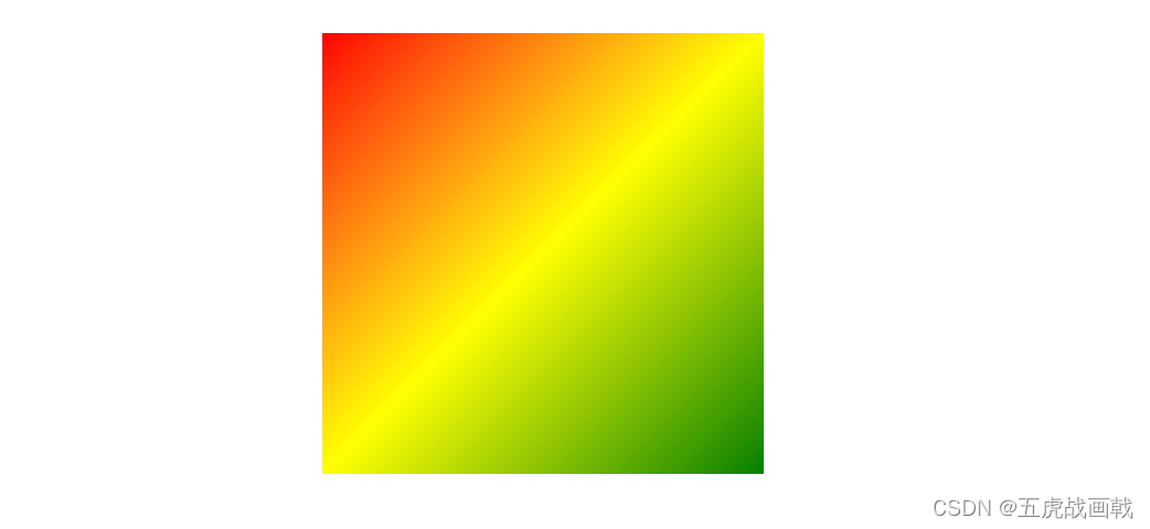
background-image: linear-gradient(to top, green, yellow, red); | background-image: linear-gradient(to right, green, yellow, red); | background-image: linear-gradient(to left, green, yellow, red); | background-image: linear-gradient(to left top, green, yellow, red); |
|---|---|---|---|---|
 |
 |
 |
 |
 |
使用角度 (deg)
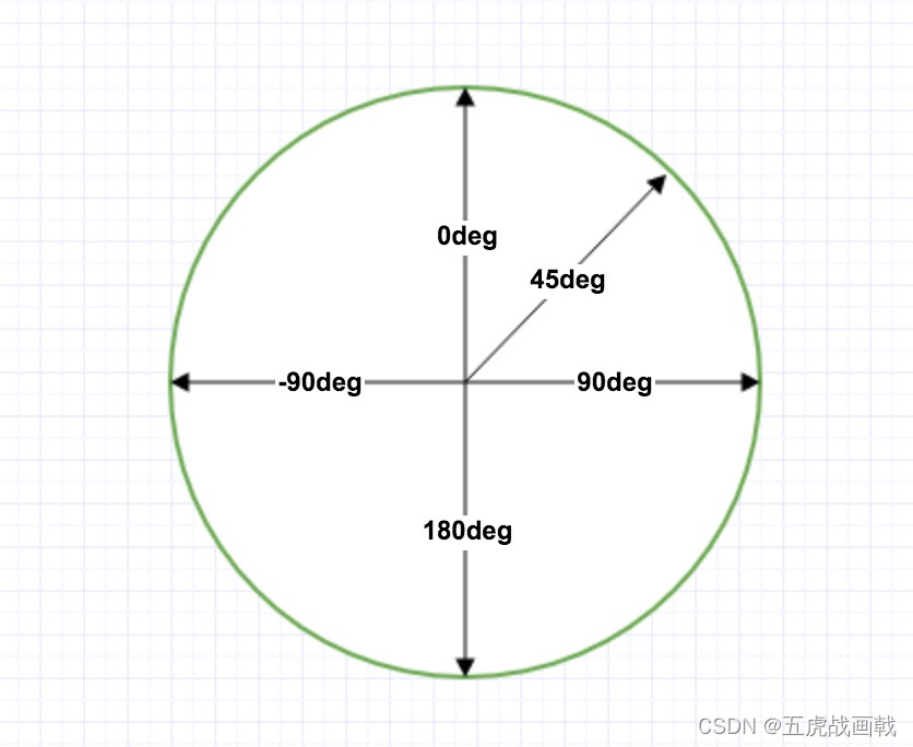
角度是指水平线和渐变线之间的角度,逆时针方向计算。换句话说,0deg 将创建一个从下到上的渐变,90deg 将创建一个从左到右的渐变。
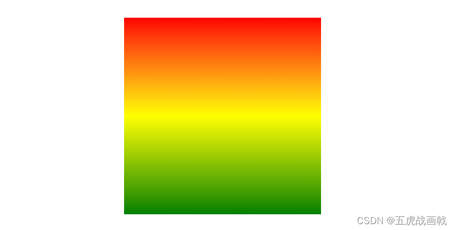
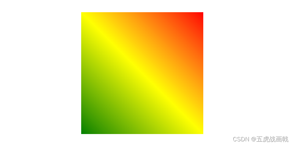
| background-image: linear-gradient(0deg, green, yellow, red); | background-image: linear-gradient(45deg, green, yellow, red); | background-image: linear-gradient(90deg, green, yellow, red); | background-image: linear-gradient(180deg, green, yellow, red); | background-image: linear-gradient(-90deg, green, yellow, red); |
|---|---|---|---|---|
 |
 |
 |
 |
 |
使用透明度(transparent)
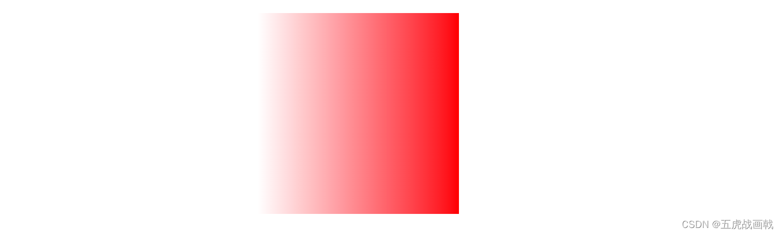
background-image: linear-gradient(to right, rgba(255,0,0,0), rgba(255,0,0,1));
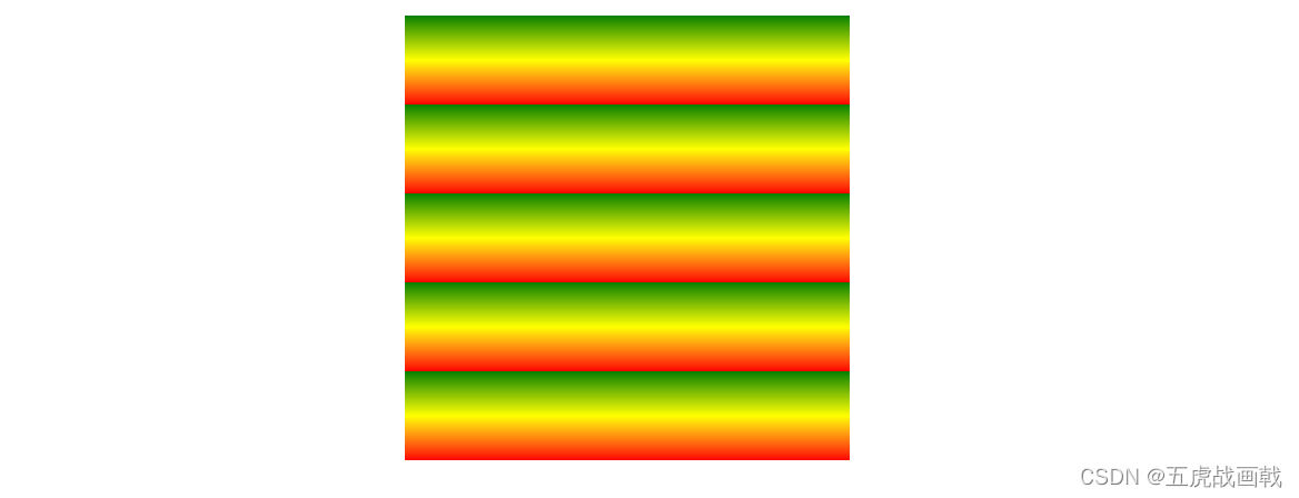
重复的线性渐变
background-image: repeating-linear-gradient(green, yellow 10%, red 20%);
径向渐变 radial-gradient
语法
background-image: radial-gradient(shape size at position, start-color, ..., last-color);
示例
<!doctype html>
<html lang="en">
<head>
  <meta charset="UTF-8">
  <meta name="viewport"
        content="width=device-width, user-scalable=no, initial-scale=1.0, maximum-scale=1.0, minimum-scale=1.0">
  <meta http-equiv="X-UA-Compatible" content="ie=edge">
  <title>径向渐变</title>
  <style>
    .box {


        width: 200px;
        height: 200px;
        margin: 50px auto;
    }
  </style>
</head>
<body>
<div class="box"></div>
</body>
</html>
颜色节点分布比例
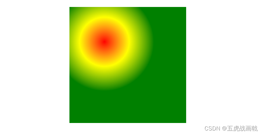
| background-image: radial-gradient(red, yellow, green); 默认(均匀分布) |
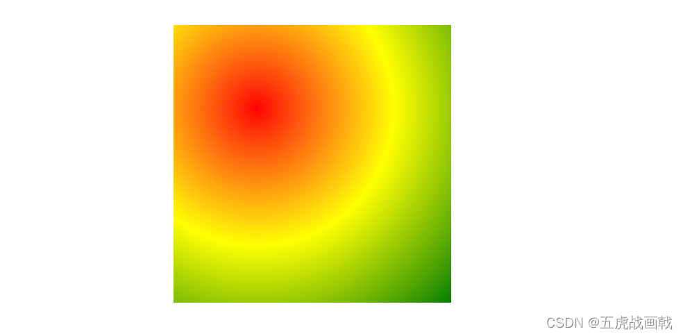
background-image: radial-gradient(red 5%, yellow 15%, green 60%); 不均匀分布, |
background-image: radial-gradient(red 30px, yellow 100px, green 150px); 不均匀分布,像素 |
|---|---|---|
 |
 |
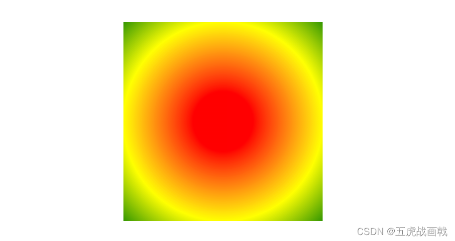 |
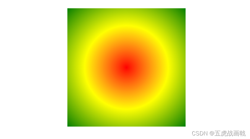
设置形状 (shape)
shape 参数定义了形状。它可以是值 circle 或 ellipse。其中,circle 表示圆形,ellipse 表示椭圆形。默认值是 ellipse。
.box {


    width: 200px;
    height: 300px;
}
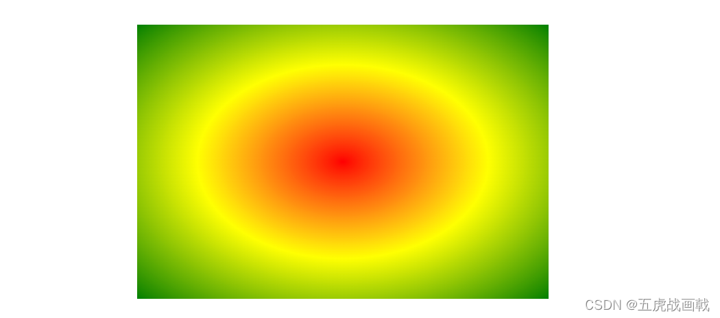
| background-image: radial-gradient(red, yellow, green); 默认( ellipse,椭圆) |
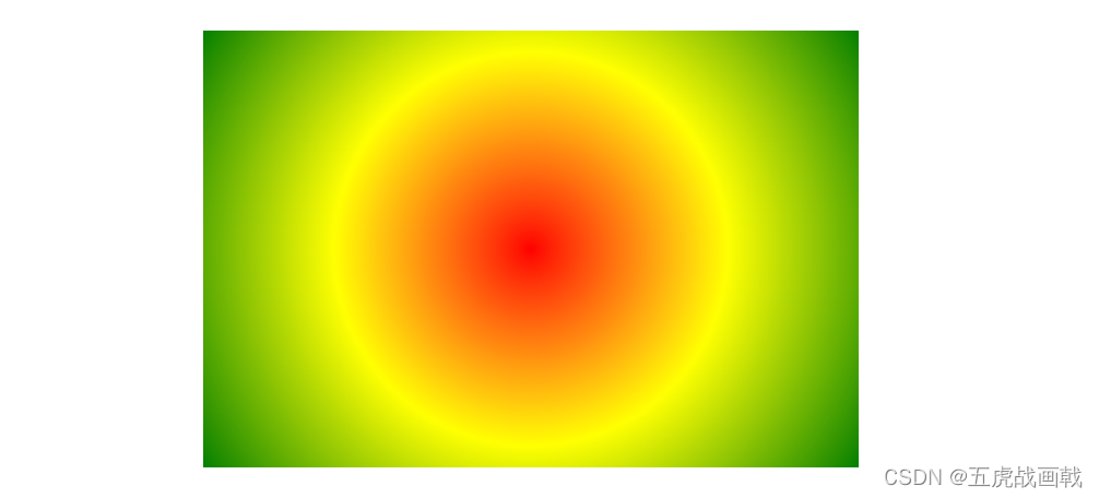
background-image: radial-gradient(circle, red, yellow, green);circle 圆形 |
|---|---|
 |
 |
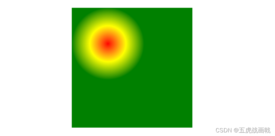
中心 (at position)
background-image: radial-gradient(at x y, start-color, ..., last-color);
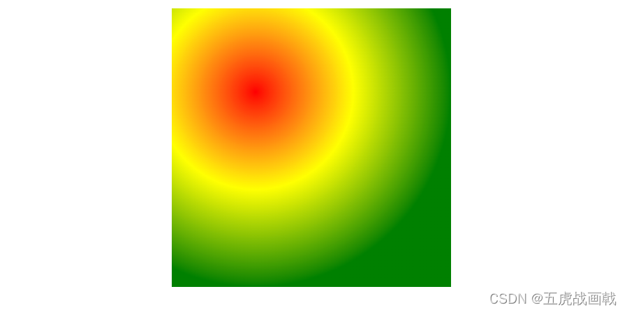
不同尺寸大小关键字的使用 (size)
size 参数定义了渐变的大小。它可以是以下四个值:
closest-side 最近边
farthest-side 最远边
closest-corner 最近角
farthest-corner 最远角 (默认)
| closest-side | farthest-side | closest-corner | farthest-corner |
|---|---|---|---|
 |
 |
 |
 |
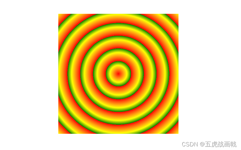
重复的径向渐变
repeating-radial-gradient() 函数用于重复径向渐变
background-image: repeating-radial-gradient(red, yellow 10%, green 15%);