1.线性渐变
a)从左到右渐变
div:nth-child(1){
background-image: -webkit-linear-gradient(left,red,black);
}
b)不指定方向默认是从上到下
div:nth-child(2){
background-image: linear-gradient(yellow,green);
}
c)按照指定角度
div:nth-child(3){
width:200px;
height:200px;
background-image: linear-gradient(145deg,yellow,blue);
}
d)斑马线渐变
div:nth-child(6){
background-image: linear-gradient(45deg,#000 0%,#000 25%,#fff 25%,#fff 50%,
#000 50%,#000 75%,#fff 75%,#fff 100%);
background-repeat:no-repeat;
background-size:100px 100%;
}
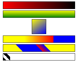
2.颈项渐变
radial-gradient(辐射半径,中心的位置,起始颜色,终止颜色);
中心点位置:at left right center bottom top
    div{
        width: 250px;
        height:250px;
        border:1px solid #000000;
        margin:20px auto;
    }
    div:nth-child(1){
        background-image: radial-gradient(at left top,yellow,green);
    }
    div:nth-child(2){
        background-image: radial-gradient(at 50px 50px ,yellow,green);
    }
    div:nth-child(3){
        background-image: radial-gradient(100px at center,yellow,green);
    }
    div:nth-child(4){
        background-image: radial-gradient(100px at center,
        yellow 0%,
        green 30%,
        blue 30%,
        red 100%);
    }

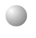
3.渐变应用球体
    .box{
        width:300px;
        height:300px;
        /*background-color: blue;*/
        border-radius: 50%;
        margin: 100px auto;
        background-image: radial-gradient(at 80px 80px,rgba(0,0,0,0),rgba(0,0,0,0.3));
    }
4.渐变过程体验
a)transition:width(属性) 2S(时间)
如果多个属性特征都是一样的,可以简写all
设置变化的速度用Linear
    .box{
        width:200px;
        height:200px;
        border: 1px solid #000000;
        background-color: red;
        margin: 100px auto;
        /*过渡属性*/
       transition:all 2s linear 1s;
        transition:width 2s,background-color 2s;
    }
    .box:hover{
        width:800px;
        background-color: #4A00AB;
        height: 400px;
    }


5.渐变过程属性
b)transition-property:width;改变属性
c)transition-duration:4s;运动时间
d)transition-timing-function:ease(减速)
e)ease-in加速 ease-out减速 ease-in-out先加速后减速
f)过渡延迟:transition-delay
    .box{
        width:200px;
        height:200px;
        background-color: red;
        margin: 100px auto;
        /*过渡详解*/
        transition-property: width ;
        transition-duration:4s;
        transition-timing-function:ease ;
        /*过渡延迟*/
       /* transition-delay: 3s;*/
    }
    .box:hover{
        width:800px;
    }