渐变是CSS3中比较丰富多彩的一个特性,通过渐变我们可以实现许多绚丽的效果。渐变可分为线性渐变和径向渐变。
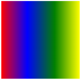
(1)线性渐变:沿着某条直线朝一个方向产生渐变效果
语法:linear-gradient([<point> || angle]? <stop>,<stop>[,<stop>]*)
参数说明:
第一个参数表示线性渐变的方向。有四个取值,分别是:
to left:设置渐变从右到左。相当于270deg。
to right:设置渐变从左向右。相当于90deg。
to top:设置渐变从下到上。相当于0deg。
to bottom:设置渐变从上到下。相当于180deg。这是默认值。
第二个参数是起点颜色,可以指定颜色开始的位置
第三个参数是终点颜色。
示例:
div {
            width: 300px;
            height: 300px;
            background: linear-gradient(to right,red 0%, blue 33%, green 68%, yellow 100%);
     }
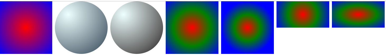
(2)径向渐变:从一个中心点开始向四周产生渐变效果。
语法:radial-gradient([[<shape> || <size>] [at <position>]?, | at <position>]?<color-stop>[,<color-stop>]+)
参数说明:
position:确顶圆心的位置。如果提供2个参数,第一个代表横坐标,第二个代表纵坐标;如果只提供一个,第二个值默认为50%,即center。
shape:渐变的形状。ellipse表示椭圆形,circle表示圆形。默认为ellipse。另外,如果元素形状为正方形,则ellipse和circle的显示一样。
size:渐变的大小,即渐变到哪里停止。有四个取值:closest-side | closest-corner | farthest-side | farthest-corner。默认值为farthest-corner。
color:指定颜色。
示例:
     .div1 {
            width: 200px;
            height: 200px;

            background: radial-gradient(circle at center, red, blue);
        }

        .div2 {
            width: 200px;
            height: 200px;
            border-radius: 100px;

            background: radial-gradient(circle at 50px 50px, #eeffff,#334455);
        }
        .div3 {
            width: 200px;
            height: 200px;
            border-radius: 100px;

            background: radial-gradient(circle at 50px 50px,#eeffff 0%, #666 70%, rgba(33,33,33,0.8) 80%);
        }
        .div4 {
            width: 200px;
            height: 200px;

            background: radial-gradient(ellipse at center, red, green, blue);
        }
        .div5 {
            width: 200px;
            height: 200px;

            background: radial-gradient(circle closest-side at center, red, green, blue);
        }
        .div6 {
            width: 200px;
            height: 100px;

            background: radial-gradient(circle at center, red, green, blue);
        }
        .div7 {
            width: 200px;
            height: 100px;

            background: radial-gradient(ellipse at center, red, green, blue);
        }
(3)重复渐变效果: 利用repeating-linear-gradient或者repeating-radial-gradient设置。
示例:
     .div1 {
            width: 300px;
            height: 300px;
            background: repeating-radial-gradient(circle at center, red 0%, green 10%, pink 20%);
        }

     .div2 {
            width: 300px;
            height: 100px;
            margin-top: 20px;
            background: repeating-linear-gradient(45deg,#fff 0%, yellow 10%);
        }
