一、卡片Card分类
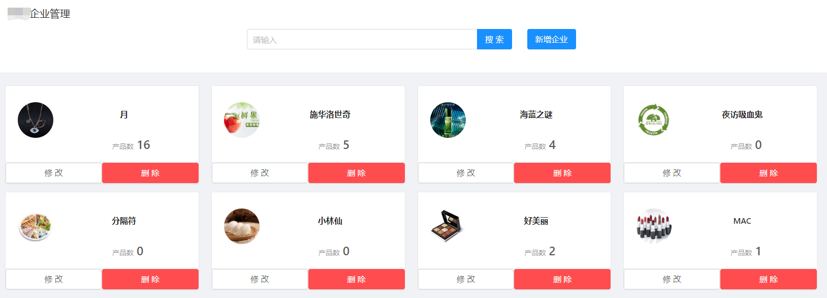
- 与普通卡片使用区别:底部按钮及内容样式
<Card
        hoverable
        bodyStyle={{ paddingBottom: 20 }}
        actions={[          // 卡片操作组,位置在卡片底部
           <Button size='large' onClick={() => this.showEditModal(item)}>修改</Button>,
            <Popconfirm title="是否要删除此孵化企业?" onConfirm={() => this.deleteItem(item)}>
                 <Button type='danger' size='large'>删除</Button>
             </Popconfirm>
        ]}
 >
        <Card.Meta avatar={<Avatar size="small" src={`${setFileHost() + item.comLogo}`} />} title={item.comName} />   //头像、类名、描述等,位置在卡片左侧
            <div className={styles.cardItemContent}>
            <CardInfo
                      productCount={item.productCount}
             />
             </div>
</Card>

- 动态添加卡片分类:List的dataSource数组第一个位置为空串,遍历时,遇到item渲染卡片,否则ListItem中包裹自定义按钮
<List
       rowKey="id"
       loading={loading}
       grid={{ gutter: 24, lg: 3, md: 2, sm: 1, xs: 1 }}
       dataSource={['', ...list]}    // 构建第一个位置为空串的list数组
       renderItem={item =>
              item ? (
                <List.Item key={item.id}>
                  <Card hoverable className={styles.card}
                        actions={[ <a onClick={() => this.editCategory(item)}>修改</a>,
                          <Popconfirm title="是否要删除此分类?" onConfirm={() => this.deleteCategory(item)}>
                            <a style={{color: 'red'}}>删除</a>
                          </Popconfirm>
                        ]}>
                    <Card.Meta
                      avatar={<img alt="" className={styles.cardAvatar} src={`${setFileHost() + item.categoryLogo }`} />}
                      title={<a style={{ fontWeight: 600 }}>{item.categoryName}</a>}
                      description={
                        <Ellipsis className={styles.item} lines={3}>
                          {`共 ${item.productCount}个商品`}
                        </Ellipsis>
                      }
                    />
                  </Card>
                </List.Item>
              ) : (
                <List.Item>       // 空串位置 渲染按钮
                  <Button type="dashed" className={styles.newButton} onClick={() => this.addCategory()}>
                    <Icon type="plus" /> 新增分类
                  </Button>
                </List.Item>
              )
/>
二、分布表单
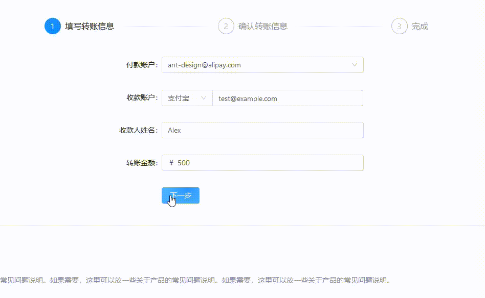
- <Step/>步骤条组件的使用,current指定当前步骤,从 0 开始记数
export default class StepForm extends PureComponent {
  getCurrentStep() {
    const { location } = this.props;
    const { pathname } = location;
    const pathList = pathname.split('/');
    switch (pathList[pathList.length - 1]) {
      case 'info':
        return 0;
      case 'confirm':
        return 1;
      case 'result':
        return 2;
      default:
        return 0;
    }
  }

  render() {
    const { location, children } = this.props;

    return (
      <PageHeaderWrapper
        title="分步表单"
        tabActiveKey={location.pathname}
        content="将一个冗长或用户不熟悉的表单任务分成多个步骤,指导用户完成。"
      >
        <Card bordered={false}>
          <Fragment>
            <Steps current={this.getCurrentStep()} className={styles.steps}>
              <Step title="填写转账信息" />
              <Step title="确认转账信息" />
              <Step title="完成" />
            </Steps>
            {children}    // 可直接写为三个状态对应的三个表单子组件
          </Fragment>
        </Card>
      </PageHeaderWrapper>
    );
  }
}
有个疑问:框架自带Mock页面Form->StepForm->index.js、step1.js、step2.js、step3.js实现切换表单的方式还没弄明白。。。
注:转载请注明出处